The enterprise platform to build, deliver, and govern AI
Watch the 15 minute on-demand demo to get an overview of the Domino Enterprise AI Platform.
In this guest post, Sean Owen, writes about three data situations that provide ambiguous results and how causation helps clarifies the interpretation of data. A version of this post previously appeared on Quora. Domino would like to extend special thanks to Sean for updating the Quora post for our blog.
Correlation is not causation. Just because ice cream sales and suntan lotion sales go up and down together doesn't mean that one causes the other. However, as humans, we think in terms of causation. You probably already realized that sales of both are caused by hot sunny weather in the summertime. What, then, is the role of causation?
A new data scientist may have the impression that causation is a topic to avoid. This would be a mistake. We use data to decide things like, "Which ad will cause more clicks?" There is an ecosystem of easy, open tools to create models from data, models that feel like they answer questions about cause and effect. When do they actually do this, and when are we fooled into thinking they do?
That subtle gap between what data can say and what we think data says is a source of confusion and mistakes. The new citizen data scientist, armed with powerful modeling tools, may be a victim of "unknown unknowns" in even simple analysis.
It's worrying! As a public service, this post will illustrate three seemingly simple data situations that produce surprisingly ambiguous results. Spoiler alert: in all cases, causation is the essential ingredient that clarifies the interpretation of data. There are in fact whole fields of exciting tools, including probabilistic graphical models and the "do-calculus", that let us reason about causation and data together to achieve powerful conclusions.
Consider the cars data set built into R. It's a small, simple data set that gives the stopping distance for a car traveling at various speeds. Assume for the sake of argument that the relation between the two is linear at low speeds: a car going twice as fast takes twice as long to stop.
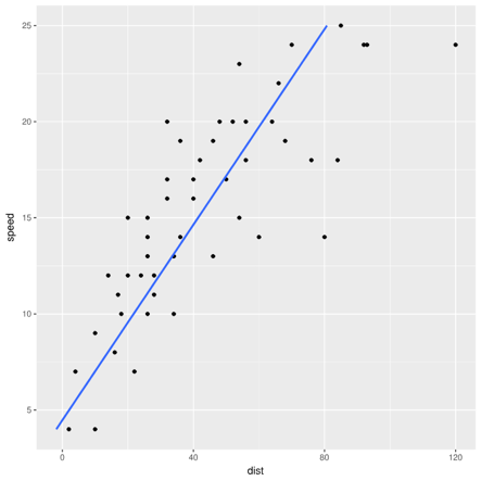
Nothing could be simpler than applying linear regression to find the best-fit line that expresses the linear relation between speed and stopping distance, right? Just regress distance as a function of speed (note the axes).
Equally, one could say that a car that took twice as long to stop was going twice as fast and could regress speed as a function of distance.
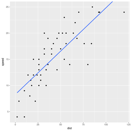
Despite seeming to be two ways of saying the same thing, the two regressions will give different best-fit lines. Both can't be best. Which one is best, and why?
To follow along at home, feel free to review and run the code that creates these plots, available in this shared project.
The following data set may look familiar. It shows the success rate of two treatments for kidney stones, broken down by two groups of patients: some with small kidney stones and some with large ones.You may notice something odd about the tallies. Treatment B is clearly more successful overall. Yet Treatment A is more successful for small kidney stones. It's also more successful for everyone else. How can this be? Add up the numbers yourself.

Many people will immediately recognize this as a classic instance of Simpson's paradox. (This example is the one from Wikipedia.) Recognizing it is important. However, recognizing it doesn't answer the real question: which treatment is better?
This question is worth answering now because there's an even deeper question in Simpson's paradox. Here, Treatment A is better. Large kidney stones are harder to treat and have a lower success rate overall. Treatment A was given to these harder cases more often. It actually performed better, but the overall success rate was lower because it was applied to harder cases. Stone size was a confounding variable, and the rows of the table control for stone size. So, is it right to always control for all variables like this in order to avoid this paradox?
Consider the following data:This is the same data but now it is broken down by pH (acidity) of patients' blood after the treatment. Which treatment is better based on this data? If it's different, why?

Lastly, consider the common mtcars data set built into R. It gives stats on several cars from the early 1970s, like engine size, fuel efficiency, number of cylinders, and so on. Consider the correlation between drat (axle ratio) and carb (number of carburetors -- older counterpart of fuel injectors).
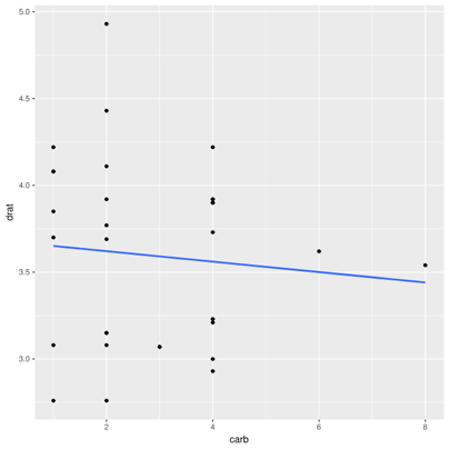
There's almost no correlation (r=-0.09). It stands to reason, as the transmission design and engine design are fairly orthogonal. (Admittedly, this isn't the most intuitive example, but is the one most readily apparent from easy, built-in data sets.)
However, consider just cars with 6- and 8-cylinder engines:
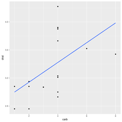
There's a clear positive correlation (r=0.52). What about all the other cars?
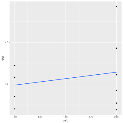
There is also a positive correlation, albeit small (r=0.22). How can two variables be correlated in part of the data, and in the rest of the data, but not overall?
There are answers, of course. In the first example, the two different lines arise from two different sets of assumptions. Regressing dist ~ speed means distance is a linear function of speed, plus Gaussian noise, and the line minimizes squared errors between actual and predicted distance. The alternative minimizes squared errors between actual and predicted speed. The former corresponds to the assumption that speed causes stopping distance, which makes sense; the latter implies that distance causes the car's speed, which is nonsensical. The line arising from dist ~ speed is the correct best-fit line. Deciding that, however, required appealing to information outside the data itself.
The simple idea that speed causes distance could be drawn as a (very simple) directed graph:

Likewise, in the second Simpson's paradox example, blood pH is no longer a confounder but a mediator. It doesn't cause the choice of treatment but is caused by the choice of treatment. Controlling for it would remove the primary effect of the treatment. In this case, Treatment B appears to be better because it drives lower blood pH and that causes better outcomes (although Treatment A does seem to have some positive secondary effect).
That is, whereas the original scenario is:

... the second scenario is:
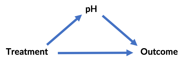
The "paradox" here is likewise resolvable. In both cases, external information about causal relationships resolves it -- and resolves it differently!
The third example is an instance of Berkson's paradox. The conclusion that axle ratio and carburetors are uncorrelated is the correct one, assuming that both factors actually influence the number of cylinders in the car. (The example stretches here, but for sake of argument assume this is true of engine design!) Controlling for cylinders creates a correlation where there is none because the number of cylinders is a "colliding" variable with respect to axle ratio and carburetors:
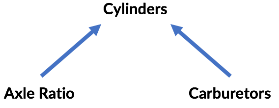
Again, the data doesn't tell us this; knowledge of the causal relationships among variables allows these conclusions.
There is a purpose to drawing the graphs above, frequently called probabilistic graphical models (PGMs). These graphs express the kind of conditional probability dependencies that arise from cause-and-effect relationships. While fairly trivial in these cases, they can rapidly become complex. However, graphs can be analyzed to detect the same sorts of relationships between the variables above that were necessary for correct analysis of the data.
PGMs are an interesting topic. (Coursera has a whole course from Daphne Koller on the subject.) Understanding that causal relationships matter and how to analyze them to correctly interpret data is an essential step in the data scientist's journey.
This type of analysis gives rise to perhaps an even more exciting capability. It's possible to reason about what would have happened if one variable had taken on a different value. The idea sounds like conditional probability: given that ice cream sales are high (IC) today, what's the probability that suntan lotion sales (ST) are high? That is, what is [latex]P(IC | ST)[/latex]? This is easily answerable from a data set. If these are positively correlated, we'd further expect that [latex]P(IC | ST) > P(IC)[/latex] -- that is, when suntan lotion sales are high, ice cream sales are more likely to be high.
However, would ice cream sales increase if we increased suntan lotion sales (which might be called [latex]do(ST)[/latex])? It's fairly clear that [latex]P(IC) | do(ST)[/latex] isn't the same thing as [latex]P(IC | ST)[/latex] because we don't expect there to be any causal link between the two.
Data only provides simple conditional probabilities. Is it possible to evaluate the counterfactual probability of things that didn't happen in the data to evaluate these statements about do-ing?
The happy and surprising example is, yes, it's possible, with the aid of causal models and the "do-calculus" championed years ago by Judea Pearl, and now the topic of his new book, “The Book of Why.” As a summary of the history of causal thinking, Bayesian networks, graphical models and Pearl's own significant contributions to the field, it's highly recommended.
Perhaps the most compelling demonstration of this calculus in action is the book's retroactive analysis of the studies that ultimately concluded that smoking causes cancer. As Pearl tells it, there was some question about whether smoking caused cancer via tar buildup in the lungs, or whether there was an unseen genetic factor that caused both the desire to smoke and lung cancer. Unfortunately, this genetic factor was, unobservable and impossible to control for. It is easy to reason about this now by drawing the implied causal model.
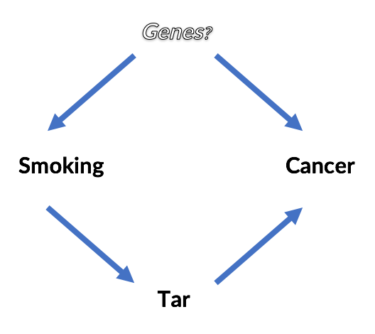
Even without resolving whether or not a genetic factor exists, is it possible to answer questions like, "Does smoking cause cancer?" Is [latex]P(Cancer | do(Smoking)) > P(Cancer)[/latex] ?
Without recounting the details, which are best left to papers and the book, suffice it to say that it is possible by applying three simple rules of the "do-calculus". It looks like this, and ends up involving only conditional probability statements about smoking, tar and cancer, all of which would have been available from a real-life data set:
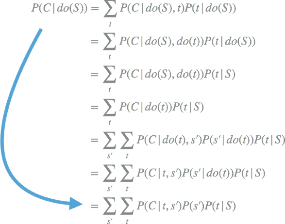
Just by reading the conditional probability from the data, it's possible to know whether smoking causes an increased risk of cancer, even without knowing whether unknown confounders exist.
The veteran data scientist doesn't just know how to wield tools as black boxes. She knows that the correct interpretation of models and data is often ambiguous or even counterintuitive. Avoiding common pitfalls is the mark of a seasoned practitioner.
Fortunately, many of these paradoxes resolve themselves and stem from a few simple common sources that can be analyzed by reasoning about networks of causal effects. Probabilistic graphical models are as important as statistical methods.
Together with the do-calculus, these tools allow for interpretations and analysis from data that seem frankly amazing to those who have been conditioned to believe that causal or counterfactual conclusions aren't possible from just data!

Domino Data Lab empowers the largest AI-driven enterprises to build and operate AI at scale. Domino’s Enterprise AI Platform provides an integrated experience encompassing model development, MLOps, collaboration, and governance. With Domino, global enterprises can develop better medicines, grow more productive crops, develop more competitive products, and more. Founded in 2013, Domino is backed by Sequoia Capital, Coatue Management, NVIDIA, Snowflake, and other leading investors.
Watch the 15 minute on-demand demo to get an overview of the Domino Enterprise AI Platform.
Watch the 15 minute on-demand demo to get an overview of the Domino Enterprise AI Platform.