The enterprise platform to build, deliver, and govern AI
Watch the 15 minute on-demand demo to get an overview of the Domino Enterprise AI Platform.
This article provides insight on the mindset, approach, and tools to consider when solving a real-world ML problem. It covers questions to consider as well as collecting, prepping and plotting data.
Collecting and prepping data are core research tasks. While the most ideal situation is to start a project with clean well-labeled data, the reality is that data scientists spend countless hours obtaining and prepping data. As Domino is committed to supporting data scientists and accelerating research, we reached out to Addison-Wesley Professional (AWP) Pearson for the appropriate permissions to excerpt “Predicting Social-Media Influence in the NBA” from the book, Pragmatic AI: An Introduction to Cloud-Based Machine Learning by Noah Gift. The excerpt dives into techniques for collecting, prepping, and plotting data. Many thanks to AWP Pearson for providing the permissions to excerpt the work.
Sports is a fascinating topic for data scientists because there is always a story behind every number. Just because an NBA player scores more points than another player, it doesn’t necessarily mean [they] add more value to the team. As a result, there has been a recent explosion in individual statistics that try to measure a player’s impact. ESPN created the Real Plus-Minus, FiveThirtyEight came up with the CARMELO NBA Player Projections, and the NBA has the Player Impact Estimate. Social media is no different; there is more to the story than just a high follower count.
This chapter will explore the numbers behind the numbers using ML and then creating an API to serve out the ML model. All of this will be done in the spirit of solving real-world problems in a real-world way. This means covering details like setting up your environment, deployment, and monitoring, in addition to creating models on clean data.
Coming from a cold start in looking at social media and the NBA, there are many interesting
questions to ask. Here are some examples.
To get the answers to these questions and others, data will need to be collected. As previously discussed, the 80/20 rule applies here. Eighty percent of this problem is collecting the data and then transforming the data. The other 20 percent is ML- and data science-related tasks like finding the right model, doing EDA, and feature engineering.
In Figure 6.1, there is a list of data sources to extract and transform.
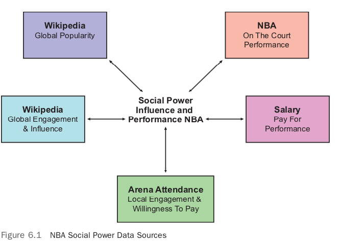
Gathering this data represents a nontrivial software engineering problem. There are many obstacles to overcome, such as finding a good data source, writing code to extract it, abiding by the limitations of the API, and finally getting the data into the correct shape. The first step to collecting all of the data is to figure out which data source to collect first, and where to get it.
Knowing that the ultimate goal is to compare the social-media influence and power of NBA players, a great place to start is with the roster of the NBA players in the 2016–2017 season. In theory, this would be an easy task, but there are a few traps to collecting NBA data. The intuitive place to start would be to go to the official website at nba.com. For some reason, however, many sports leagues make it difficult to download raw data from their sites. The NBA is no exception, and grabbing stats from their official website is doable but challenging.
This brings up an interesting point about how to collect data. Often it is easy to collect data manually, that is, downloading from a website and cleaning it up manually in Excel, Jupyter Notebook, or RStudio. This can be a very reasonable way to get started with a data science problem. If collecting one data source and cleaning it starts to take a few hours, however, it is probably best to look at writing code to solve the problem. There is no hard and fast rule, but experienced people figure out how to continuously make progress on a problem without getting blocked.
Instead of starting with a thorny data source such as the official NBA website, which actively prevents you from downloading its data, we are going to start with something relatively easy. To collect a first data source from basketball, you can download it directly from this book’s GitHub project or from Basketball Reference.
Doing ML in the real world is beyond just finding the right model for clean data; it means understanding how to set up your local environment as well.
To start running the code, a few steps are needed.
Listing 6.1 shows a setup command that creates a virtual environment for Python 3.6 and installs the packages listed in the requirements.txt file in Listing 6.2. This can be executed all at once with this one-liner.
make setup && install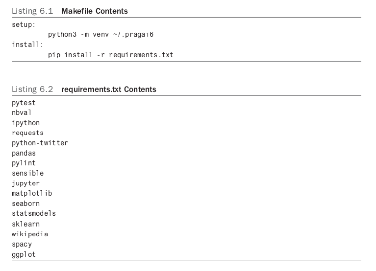
Another handy trick in dealing with Python virtual environments is to create an alias in your .bashrc or .zshrc file that automatically activates the environment and changes into the directory all in one operation. The way I typically do this is by adding this snippet.
alias pragai6top="cd ~/src/pragai/chapter6\&& source ~/. Pragai6 /bin/activate"
To work on this chapter’s project, type pragai6top into the shell, and you will cd into the correct project checkout and start your virtual environment. This is the power of using shell aliases in action. There are other tools that automatically do this for you, like pipenv; it may be worth exploring them as well.
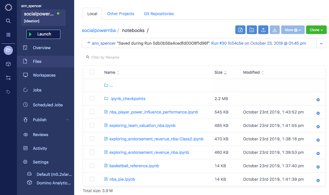
To inspect the data, start a Jupyter Notebook using the command: jupyter notebook. Running this will launch a web browser that will allow you to explore existing notebooks or create new ones. If you have checked out the source code for this book’s GitHub project, you will see a file named basketball_reference.ipynb.
This is a simple, hello world–type notebook with the data loaded into it. Loading a data set into Jupyter Notebook, or in the case of R, RStudio, is often the most convenient way to do initial validation and exploration of a data set. Listing 6.3 shows how you can also explore the data from a regular IPython shell in addition to or instead of Jupyter.

Another useful technique is to get in the habit of ensuring Jupyter Notebooks are runnable using the nbval plugin for pytest. You can add a Makefile command test that will run all of your notebooks by issuing
make test
You can see what that would look like in a Makefile in the snippet below.
test:py.test --nbval notebooks/*.ipynb
Loading a CSV file into Pandas is easy if the CSV file has names for the columns and if the rows of each column are of equal length. If you are dealing with prepared data sets, then it is often if not always the case that the data will be in a suitable shape to load. In the real world, things are never this easy, and it is a battle to get the data into the correct shape as we will see later in this chapter.
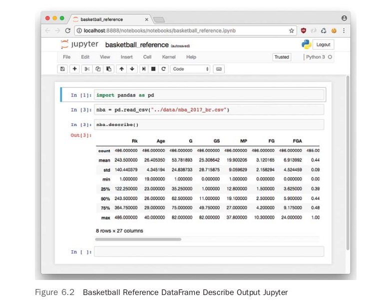
Figure 6.2 shows the output in the Jupyter Notebook of the describe command. The describe function on a Pandas DataFrame provides descriptive statistics, including the number of columns, in this case 27, and median (this is the 50 percent row), for each column. At this point, it might be a good idea to play around with the Jupyter Notebook that was created and see what other insights you can observe. One of the things this data set doesn’t have, however, is a single metric to rank both offensive and defensive performance in a single statistic. To get this, we will need to combine this data set with other sources from ESPN and the NBA. This will raise the difficulty of the project significantly from simply using data to finding it, and then transforming it. One approach that is reasonable is to use a scraping tool like Scrapy, but in our situation, we can use a more ad hoc method. By going to the ESPN and NBA websites, it is possible to cut and paste the data and put it into Excel. Then the data can be manually cleaned up and saved as a CSV file. For a small data set, this is often much quicker than trying to write a script to perform the same tasks.
Later, if this data needs to turn into a bigger project, this approach becomes a poor idea—but for prototyping, it is one of the strongest options. A key takeaway for messy data science problems is to continue to make forward progress without getting bogged down in too much detail. It is very easy to spend a lot of time automating a messy data source only to realize later that the signals are not helpful.
Grabbing the data from ESPN is a similar process as FiveThirtyEight, so I won’t describe how to collect it again. A couple of other data sources to collect are salary and endorsements. ESPN has the salary information, and Forbes has a small subset of the endorsement data for eight players. Table 6.1 describes the shape of the data sources, summarizes their content, and defines their source. Mostly accomplished through manual work, there is a fairly impressive list of data sources.
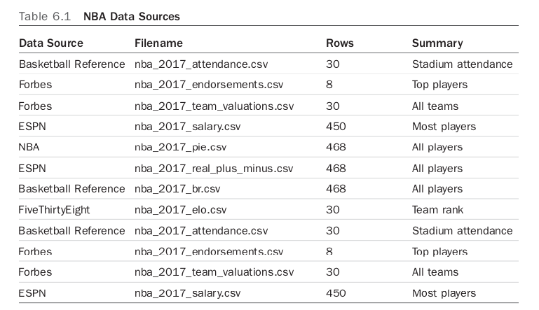
There is still a lot of work left to get the rest of the data, mainly from Twitter and Wikipedia, and transform it into a unified data set. A couple of initially interesting possibilities are exploring the top eight player’s endorsements and exploring the valuation of the teams themselves.
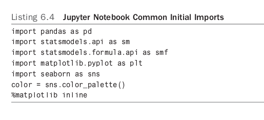
The first thing to do is to use a new Jupyter Notebook. In the GitHub repository, this has already been done for you, and it is called exploring_team_valuation_nba. Next, import a common set of libraries that are typically used in exploring data in a Jupyter Notebook. This is shown in Listing 6.4.
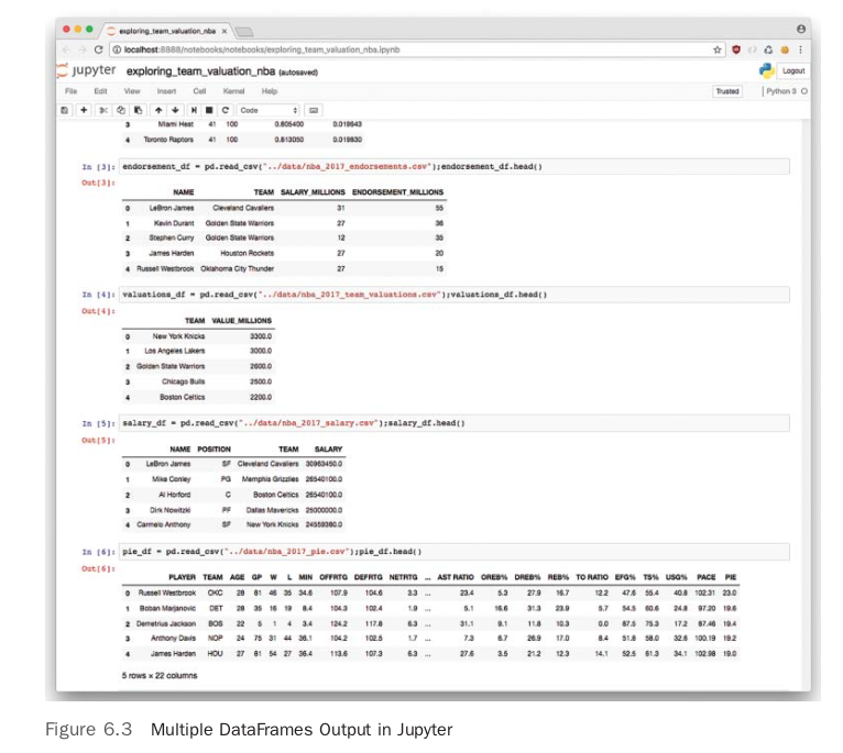
Next, create a Pandas DataFrame for each source, as shown in Listing 6.5.
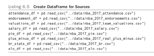
In Figure 6.3, a chain of DataFrames is created—a common practice when collecting data in the wild.
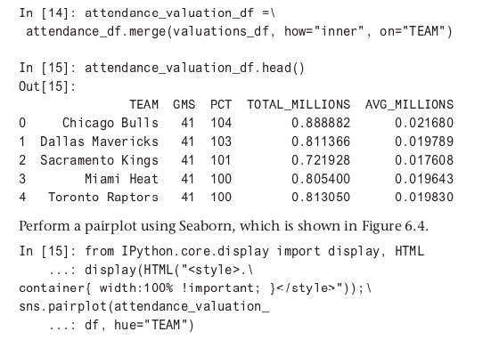
Here is a merge of attendance data with valuation data and a look at the first few rows.
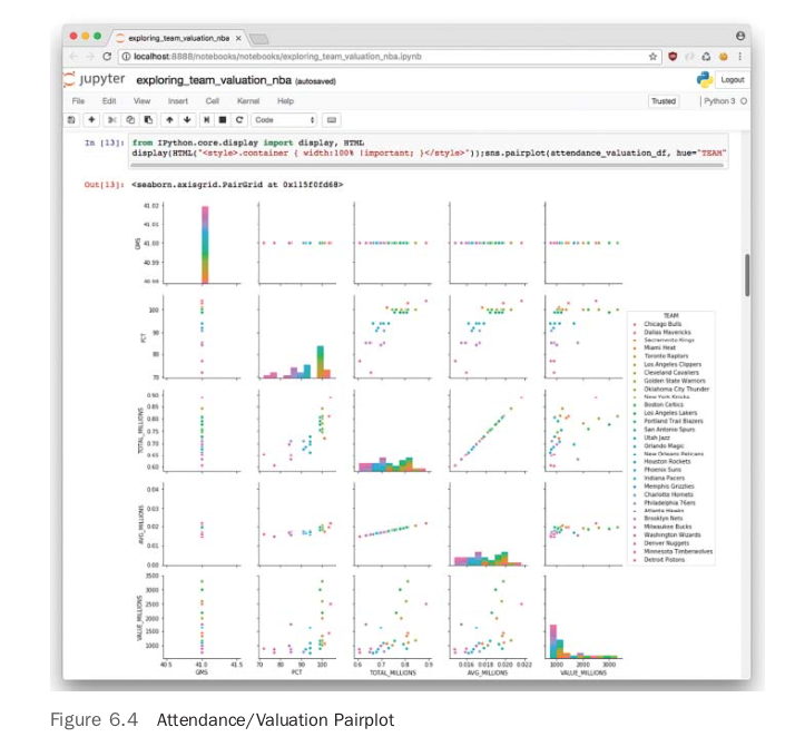
In looking at the plots there appears to be a relationship between attendance, either average or total, and the valuation of the team. Another way to dig deeper into this relationship is to create a correlation heatmap, shown in Figure 6.5.

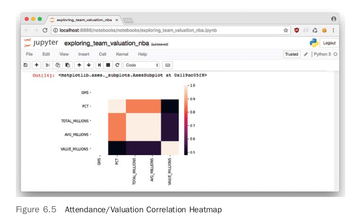
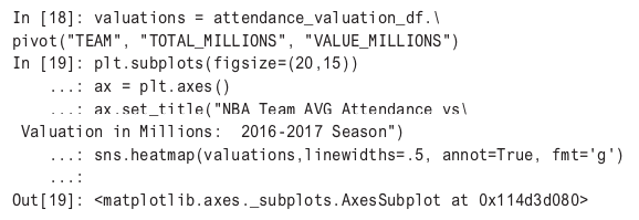
The relationship visible in the pairplot is now more quantifiable. The heatmap shows a medium correlation between valuation and attendance, hovering around 50 percent. Another heatmap shows average attendance numbers versus valuation for every team in the NBA. To generate this type of heatmap in Seaborn, it is necessary to convert the data into a pivot table first.
The plot can then be seen in Figure 6.5.
In Figure 6.6, a heatmap shows that there may be some interesting patterns to graph further, perhaps in a 3D plot. There are outliers in New York and Los Angeles.
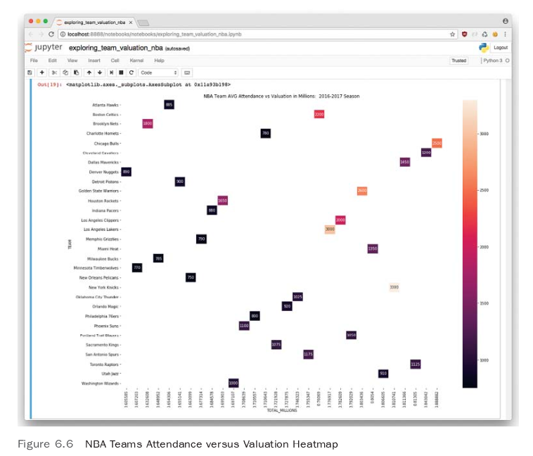
Figure 6.5 shows some fascinating outliers, for example, the Brooklyn Nets are valued at 1.8 billion dollars, yet they have one of the lowest attendance rates in the NBA. Something is going on here that is worth looking at. One way to further investigate is to use linear regression to try to explain the relationship. There are a few different ways to do this if you include both Python and R. In Python, two of the more common approaches are the StatsModels package and scikit-learn. Let’s explore both approaches.
With StatsModels, there is a great diagnostic output about performing a linear regression, and it has the feel of classic linear regression software like Minitab and R.

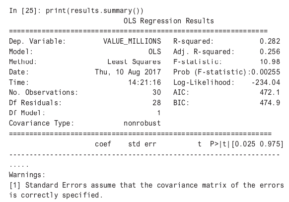
In looking at the results of the regression, it does appear that the variable TOTAL_MILLIONS, which is total attendance in millions is statistically significant (measured in a P value of less than .05) in predicting changes in attendance. The R-squared value of .282 (or 28 percent) shows a “goodness of fit”; that is, how well the regression line perfectly fits the data.
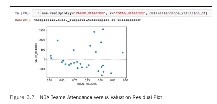
Doing a bit more plotting and diagnostics will show how well this model is able to predict. Seaborn has a built-in and very useful residplot that plots the residuals. This is shown in Figure 6.7. Having randomly distributed residuals is the ideal scenario; if there are patterns in the plot, it could indicate issues with the model. In this case, there doesn’t seem to be a uniformly random pattern.

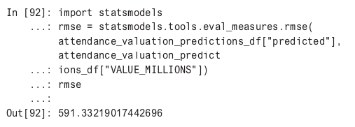
A common way to measure the accuracy of an ML or statistics prediction is to look at the root mean squared error (RMSE). Here is how to do it with the StatsModels.
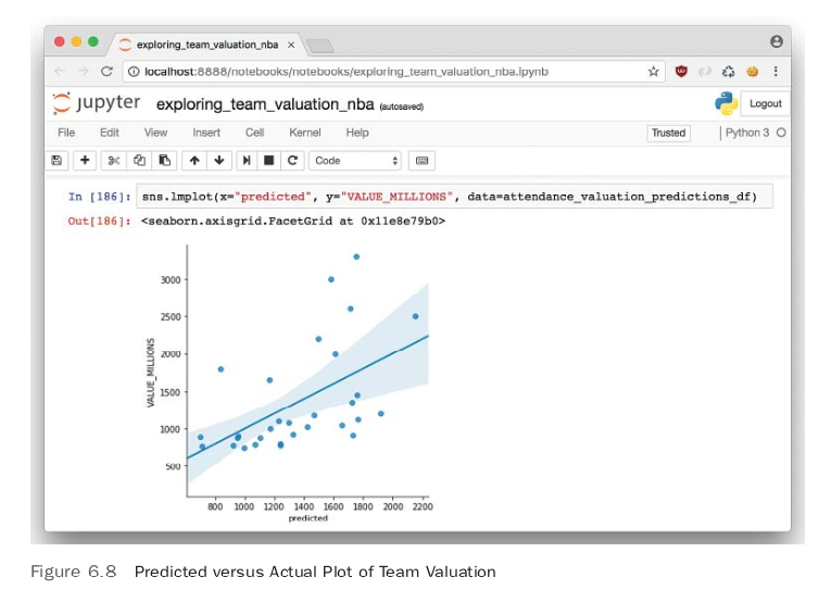
The lower the RMSE, the better the prediction. To get a better prediction accuracy, we need to figure out a way to lower this RMSE. In addition, having a larger set of data such that the model could be split into test versus training data would ensure better accuracy and reduce the chance of overfitting. A further diagnostic step is to plot the predicted values of the linear regression versus the actual values. In Figure 6.8, an lmplot of the predicted and actual is shown, and it is obvious that this isn’t that great a prediction model. It is a good start though, and often this is how ML models are created— by finding correlations and/or statistically significant relationships, then deciding it is worth the effort to collect more data.
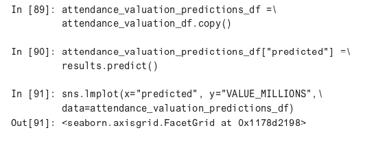
An initial conclusion is that while there is a relationship between attendance and valuation of an NBA team, there are missing or latent variables. An initial hunch is that population of the region, median real estate prices, and how good the team is (ELO ranking and winning percentage) all could play a role here.
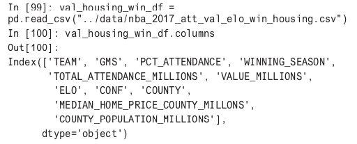
A next step in learning more about NBA teams is to use unsupervised ML to cluster the data to find more insights. I was able to manually find median home price data for a county and the population for each county from the census.
All this new data can be loaded with a new DataFrame.
k-nearest neighbors (kNN) clustering works by determining the Euclidean distance between points. Attributes being clustered needed to be scaled so one attribute doesn’t have a different scale than another, which would distort the clustering. In addition, clustering is more art than science, and picking the correct number of clusters can be a trial-and-error process.
Here is how scaling works in practice.
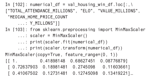
In this example, MinMaxScaler is being used from scikit-learn. It converts all numerical values to a value between 0 and 1. Next, sklearn.cluster is performed against the scaled data, and then the cluster results are attached to a new column.
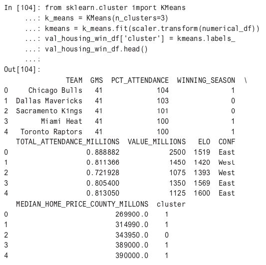
At this point, there is enough of a solution to provide instant value to a company, and the beginning of a data pipeline is forming. Next let’s use R and ggplot to plot the clusters. In order to bring this data set into R, we can write this out to a CSV file.

A highlight of the R language is the ability to create advanced plots with meaningful text. Being capable of coding solutions in R and Python opens up a wider variety of solutions in ML. In this particular situation, we are going to use the R 3D scatter plot library along with RStudio to make a sophisticated plot of the relationships we have learned about using kNN cluster. In the GitHub project for this chapter, there is R markdown notebook that has the code and plot; you can also follow along by using the preview function in RStudio for notebooks.
To get started in the console in RStudio (or an R shell), import the scatterplot3d library and load the data using the following commands.

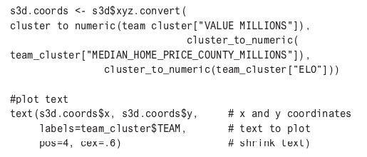
Next, a function is created to convert the data types into a format that the scatterplot3d library is expecting.

To plot the text in the correct location on the 3D space requires a little bit of work.
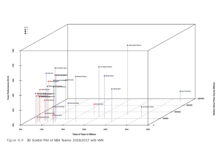
The plot shown in Figure 6.9 shows some unusual patterns. The New York Knicks and the Los Angeles Lakers are two of the worst teams in basketball, yet are the most valuable. In addition, you can see that they are in cities that have some of the highest median home prices, which is playing a role in their high valuation. As a result of all of this, they are in their own cluster.
The blue cluster is mostly a collection of the best teams in the NBA. They also tend to be in cities with higher median home prices but a wide variety of actual value. This makes me suspect that real estate plays a bigger role in team valuation than actual performance (which lines up with previous linear regressions).
The red cluster shows teams that are generally below average in performance, have a below-average valuation and have below-average real estate prices. The exception is the Brooklyn Nets, which is on its way to being a Los Angeles Lakers– and New York Knicks–type team: low performing, yet highly valued.
R has yet one more way to visualize these relationships in multiple dimensions. Next, we are going to create a plot using ggplot in R.
The first thing to do in plotting the relationship in the new graph is to make a logical name for the clusters. The 3D plot gave us some great ideas about how to name clusters. Cluster 0 appears to be a low valuation/low-performance cluster, Cluster 1 is a medium valuation/high-performance cluster, and Cluster 2 is a high valuation/low-performance cluster. One note to add is that cluster number selection is a complex subject. (See Appendix B for more information on the topic.)
Next, we can use these cluster names to facet (create multiple plots in each plot). In addition, ggplot has the ability to create many other dimensions, and we are going to use them all: color to show winning team percentages and losing team percentages, size to show the differences in median home prices in the county, and the shape to represent the Eastern or Western Conference of the NBA.
> team_cluster <- read_csv("nba_cluster.csv",
+ col_types = cols(X1 = col_skip())) > library("ggplot2")
>
> #Name Clusters
> team_cluster$cluster_name[team_cluster$cluster == 0] <- "Low" Unknown or uninitialised column: 'cluster_name'. > team_cluster$cluster_name[team_cluster$
       cluster == 1] <- "Medium Valuation/High Performance" > team_cluster$cluster_name[team_cluster$
       cluster == 2] <- "High Valuation/Low Performance"
Notice that geom_text only prints the name of the team if the valuation is over 1200. This allows the plot to be more readable and not overwhelmed with overlapping text. In the final snippet, the legend titles are changed. Note also the color is changed to be a factor with one of two values, versus the default of 0, .25, .50, 1. The output of the plot appears in Figure 6.10. The faceting feature of ggplot really shows how clustering has added value to the exploration of data. Using R to do advanced plotting is a great idea even if you are an expert at another ML language like Python or Scala. The results speak for themselves.
> p <- ggplot(data = team_cluster) +
+      geom_point(mapping = aes(x = ELO,
+                               y = VALUE_MILLIONS,
+                               color =
factor(WINNING_SEASON, labels=
c("LOSING","WINNING")),
+size = MEDIAN_HOME_PRICE_COUNTY_MILLIONS,
+                              shape = CONF))
+     facet_wrap(~ cluster_name)
+     ggtitle("NBA Teams 2016-2017 Faceted Plot")
+     ylab("Value NBA Team in Millions")
+     xlab("Relative Team Performance (ELO)")
+     geom_text(aes(x = ELO, y = VALUE_MILLIONS,
+ label=ifelse(VALUE_MILLIONS>1200,
+ as.character(TEAM),'')),hjust=.35,vjust=1)
Notice that geom_text only prints the name of the team if the valuation is over 1200. This allows the plot to be more readable and not overwhelmed with overlapping text. In the final snippet, the legend titles are changed. Note also the color is changed to be a factor with one of two values, versus the default of 0, .25, .50, 1. The output of the plot appears in Figure 6.10. The faceting feature of ggplot really shows how clustering has added value to the exploration of data. Using R to do advanced plotting is a great idea even if you are an expert at another ML language like Python or Scala. The results speak for themselves.
#Change legends
p+
   guides(color = guide_legend(title = "Winning Season")) +
   guides(size = guide_legend(
+ title = "Median Home Price County in Millions" )) +
   guides(shape = guide_legend(title = "NBA Conference"))
With a good set of data around teams already collected, it is time to get into more challenging data sources. This is where things start to get more real. There are some huge issues with collecting random data sources: API limits, undocumented APIs, dirty data, and more.
Here are a few of the problems to solve.
Here is how to accomplish this in Python. The entire source for this example is in the GitHub repo for the book, but it will be analyzed in these sections. Below is the example URL for Wikipedia pageviews and the four modules needed. The requests library will make the HTTP calls, Pandas will convert the results into a DataFrame, and the Wikipedia library will be used for a heuristic around detecting the proper Wikipedia URL for an athlete.
"""Example Route To Construct:

https://wikimedia.org/api/rest_v1/ +
metrics/pageviews/per-article/ +
en.wikipedia/all-access/user/ +
LeBron_James/daily/2015070100/2017070500 + """

import requests
import pandas as pd
import time
import wikipedia

BASE_URL ="https://wikimedia.org/api/rest_v1/metrics/pageviews/per-article/en.wikipedia/all-access/user"
Next, the following code constructs a URL that has the data range and username.
def construct_url(handle, period, start, end):
    """Constructs a URL based on arguments
    Should construct the following URL:
    /LeBron_James/daily/2015070100/2017070500"""

    urls = [BASE_URL, handle, period, start, end]
    constructed = str.join('/', urls)
    return constructed

def query_wikipedia_pageviews(url):
    res = requests.get(url)
    return res.json()

def wikipedia_pageviews(handle, period, start, end):
    """Returns JSON"""

    constructed_url = construct_url(handle, period, start,end)
    pageviews = query_wikipedia_pageviews(url=constructed_url)
    return pageviews
The following function automatically populates a query for 2016. This could later be made more abstract, but for now, this is “hacker” code where hard coding things for speed may be worth the technical debt. Notice as well that a sleep is set to 0 but may need to be enabled if we hit API limits. This is a common pattern when first hitting APIs; they could behave in unexpected ways, so sleeping at some interval can often work around this issue, again, as a temporary hack.
def wikipedia_2016(handle,sleep=0):
    """Retrieve pageviews for 2016"""
    print("SLEEP: {sleep}".format(sleep=sleep))
    time.sleep(sleep)
    pageviews = wikipedia_pageviews(handle=handle,
                                    period="daily", start="2016010100", end="2016123100")
    if not 'items' in pageviews:
        print("NO PAGEVIEWS: {handle}".format(handle=handle))
        return None
    return pageviews
Next, the results are converted into a Pandas DataFrame.
def create_wikipedia_df(handles):
    """Creates a Dataframe of Pageviews"""
    pageviews = []
    timestamps = []
    names = []
    wikipedia_handles = []
    for name, handle in handles.items():
        pageviews_record = wikipedia_2016(handle)
        if pageviews_record is None:
            continue
        for record in pageviews_record['items']:
            pageviews.append(record['views'])
            timestamps.append(record['timestamp'])
            names.append(name)
            wikipedia_handles.append(handle)
    data = {
    "names": names,
    "wikipedia_handles": wikipedia_handles,
    "pageviews": pageviews,
    "timestamps": timestamps
    }
    df = pd.DataFrame(data)
    return df
A trickier section of the code begins here because some heuristics are needed to guess the right handle. For a first pass, a guess is made that most handles are simply first_last. A second pass appends “(basketball)” to the name, which is a common Wikipedia strategy for disambiguation.
def create_wikipedia_handle(raw_handle):

    """Takes a raw handle and converts it to a wikipedia handle"""

    wikipedia_handle = raw_handle.replace(" ", "_")
    return wikipedia_handle

def create_wikipedia_nba_handle(name):
    """Appends basketball to link"""

    url = " ".join([name, "(basketball)"])
    return url

def wikipedia_current_nba_roster():
    """Gets all links on wikipedia current roster page"""

    links = {}
    nba = wikipedia.page("List_of_current_NBA_team_rosters")
    for link in nba.links:
        links[link] = create_wikipedia_handle(link)
    return links
This code runs both heuristics and returns verified handles and guesses.
def guess_wikipedia_nba_handle(data="data/nba_2017_br.csv"):
    """Attempt to get the correct wikipedia handle"""
    links = wikipedia_current_nba_roster()
    nba = pd.read_csv(data)
    count = 0
    verified = {}
    guesses = {}
    for player in nba["Player"].values:
        if player in links:
            print("Player: {player}, Link: {link} "format(player=player,link=links[player]))
            print(count)
            count += 1
            verified[player] = links[player] #add wikipedia link
        else:
            print("NO MATCH: {player}".format(player=player))
            guesses[player] = create_wikipedia_handle(player)
    return verified, guesses
Next, the Wikipedia Python library is used to convert failed initial guesses of first and last names and looks for “NBA” in the page summary. This is another decent hack to get a few more matches.
def validate_wikipedia_guesses(guesses):
    """Validate guessed wikipedia accounts"""
    verified = {}
    wrong = {}
    for name, link in guesses.items():
        try:
            page = wikipedia.page(link)
        except (wikipedia.DisambiguationError,wikipedia.PageError) as error:
            #try basketball suffix
            nba_handle = create_wikipedia_nba_handle(name)
        try:
            page = wikipedia.page(nba_handle)
            print("Initial wikipedia URL Failed:            {error}".format(error=error))
        except (wikipedia.DisambiguationError, wikipedia.PageError) as error:
            print("Second Match Failure: {error}".format(error=error))
            wrong[name] = link
            continue
    if "NBA" in page.summary:
        verified[name] = link
    else:
        print("NO GUESS MATCH: {name}".format(name=name))
        wrong[name] = link
    return verified, wrong
At the end of the script, everything is run and the output is used to create a new CSV file.
def clean_wikipedia_handles(data="data/nba_2017_br.csv"):
    """Clean Handles"""

        verified, guesses = guess_wikipedia_nba_handle(data=data)
        verified_cleaned, wrong = validate_wikipedia_guesses(guesses)
        print("WRONG Matches: {wrong}".format(wrong=wrong))
        handles = {**verified, **verified_cleaned}
        return handles

def nba_wikipedia_dataframe(data="data/nba_2017_br.csv"):
    handles = clean_wikipedia_handles(data=data)
    df = create_wikipedia_df(handles)
    return df

def create_wikipedia_csv(data="data/nba_2017_br.csv"):
    df = nba_wikipedia_dataframe(data=data)
    df.to_csv("data/wikipedia_nba.csv")

if __name__ == "__main__":
    create_wikipedia_csv()
All together, something like this can take anywhere from a few hours to a few days and represents the realism of slogging through random data sources to solve a problem.
Collection of data from Twitter has elements that are a bit easier. For one thing, there is a great library in Python, aptly named twitter. There are still some challenges as well, however. Here they are laid out.
First, create a config file config.py and put credentials for the Twitter API inside of it. Then the .import config will create a namespace to use these credentials. Also, Twitter error handling is imported as well as Pandas and NumPy.
import time
import twitter
from . import config
import pandas as pd
import numpy as np
from twitter.error import TwitterError
The following code talks to Twitter and grabs 200 tweets and converts them into a Pandas DataFrame. Note how this pattern is used frequently in talking with APIs; the columns are put into a list, then the list of columns is used to create a DataFrame.
def api_handler():
    """Creates connection to Twitter API"""
    api = twitter.Api(consumer_key=config.CONSUMER_KEY,
    consumer_secret=config.CONSUMER_SECRET,
    access_token_key=config.ACCESS_TOKEN_KEY,
    access_token_secret=config.ACCESS_TOKEN_SECRET)
    return api

def tweets_by_user(api, user, count=200):
    """Grabs the "n" number of tweets. Defaults to 200"""

    tweets = api.GetUserTimeline(screen_name=user, count=count)
    return tweets

def stats_to_df(tweets):
    """Takes twitter stats and converts them to a dataframe"""

    records = []
    for tweet in tweets:
        records.append({"created_at":tweet.created_at,
                        "screen_name":tweet.user.screen_name,
                        "retweet_count":tweet.retweet_count,
                        "favorite_count":tweet.favorite_count})
    df = pd.DataFrame(data=records)
    return df

def stats_df(user):
    """Returns a dataframe of stats"""

    api = api_handler()
    tweets = tweets_by_user(api, user)
    df = stats_to_df(tweets)
    return df
The last function stats_df, can now be used to interactively explore the results of a Twitter API call. Here is an example of LeBron James’ descriptive statistics.
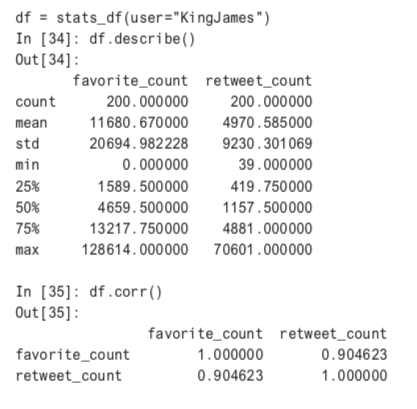
In the following code, the Twitter API is called with a slight sleep to avoid running into API throttling. Notice that the Twitter handles are being pulled from a CSV file. Basketball Reference also keeps a large selection of Twitter accounts. Another option would have been to find them manually.
def twitter_handles(sleep=.5,data="data/twitter_nba_combined.csv"):
    """yield handles"""

    nba = pd.read_csv(data)
    for handle in nba["twitter_handle"]:
        time.sleep(sleep) #Avoid throttling in twitter api
        try:
            df = stats_df(handle)
        except TwitterError as error: print("Error {handle} and error msg {error}".format(
            handle=handle,error=error))
    df = None
    yield df

def median_engagement(data="data/twitter_nba_combined.csv"):
    """Median engagement on twitter"""

    favorite_count = []
    retweet_count = []
    nba = pd.read_csv(data)
    for record in twitter_handles(data=data):
        print(record)
    #None records stored as Nan value
        if record is None:
            print("NO RECORD: {record}".format(record=record))
            favorite_count.append(np.nan)
            retweet_count.append(np.nan)
            continue
        try:
            favorite_count.append(record['favorite_count'].median())
            retweet_count.append(record["retweet_count"].median())
        except KeyError as error:
            print("No values found to append {error}".format(error=error))
            favorite_count.append(np.nan)
            retweet_count.append(np.nan)

    print("Creating DF")
    nba['twitter_favorite_count'] = favorite_count
    nba['twitter_retweet_count'] = retweet_count
    return nba
At the end of all of this, a new CSV file is created.
def create_twitter_csv(data="data/nba_2016_2017_wikipedia.csv"):
    nba = median_engagement(data)
nba.to_csv("data/nba_2016_2017_wikipedia_twitter.csv")To explore the athlete data, a new Jupyter Notebook will be created. This notebook is called nba_player_power_influence_performance. To begin, import a few libraries that are commonly used.
import pandas as pd
import numpy as np
import statsmodels.api as sm
import statsmodels.formula.api as smf
import matplotlib.pyplot as plt
import seaborn as sns
from sklearn.cluster import KMeans

color = sns.color_palette()
from IPython.core.display import display, HTML
display(HTML("<style>.container{width:100% !important; }</style>"))
%matplotlib inline
Next, load the data files in the project and rename the columns.
attendance_valuation_elo_df =pd.read_csv("../data/nba_2017_att_val_elo.csv")
salary_df = pd.read_csv("../data/nba_2017_salary.csv")
pie_df = pd.read_csv("../data/nba_2017_pie.csv")
plus_minus_df=pd.read_csv("../data/nba_2017_real_plus_minus.csv")
br_stats_df = pd.read_csv("../data/nba_2017_br.csv")

plus_minus_df.rename(
columns={"NAMES":"PLAYER", "WINS":"WINS_RPM"}, inplace=True)
    players = []
    for player in plus_minus_df['PLAYER']:
        plyr, _ = player.split(".")
        platers.append(plyr)
    plus_minus_df.drop(["PLAYER"], inplace=True, axis=1)
    plus_minus_df["PLAYER"] = players
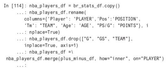
There are some duplicate sources, so these can also be dropped.
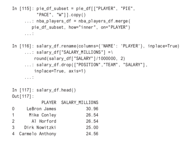
The salary information is missing for 111 NBA players, so these will be players we will drop as well when we do an analysis.
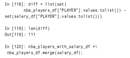
What’s left is a Pandas DataFrame with 38 columns.
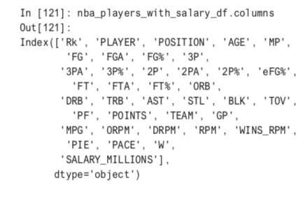

Next, the DataFrame can be merged with Wikipedia data. The data is collapsed into a median field so it can be represented as one row in a column.
wiki_df = pd.read_csv(
"../data/nba_2017_player_wikipedia.csv")
wiki_df.rename(columns={"names":"Players", "pageviews":"PAGEVIEWS"}, inplace=True)
median_wiki_df = wiki_df.groupby("PLAYER").median()
median_wiki_df_small = median_wiki_df[["PAGEVIEWS"]]
median_wiki_df_small.reset_index(
level=0, inplace=True)median_wiki_df_sm.head()PLAYER PAGEVIEWS
A.J. Hammons 1.0
Aaron Brooks 10.0
Aaron Gordon 666.0
Aaron Harrison 487.0
Adreian Payne 166.0The final columns to add are values from the Twitter data. There are total of 41 attributes to work with now.
twitter_df = pd.read_csv(
"../data/nba_2017_twitter_players.csv")
nba_players_with_salary_wiki_twitter_df=nba_players_with_salary_wiki_df.merge(twitter_df)
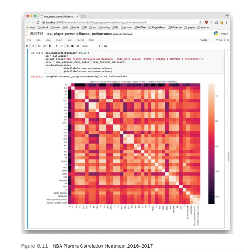
len(nba_players_with_salary_wiki_twitter_df.columns)41A logical next step in exploring the data is to create a correlation heatmap.
plt.subplot(figsize=(20,15))
ax = plt.axes()
ax.set_title("NBA Player Correlation Heatmap")
corr = nba_players_with_salary_wiki_twitter_df_corr()
sns.heatmap(corr,
           xticklabels=corr.columns.values,
           yticklabels=corr.columns.values)
Figure 6.11 shows some fascinating correlations. Twitter engagement and Wikipedia pageviews are highly correlated. Wins attributed to player, or WINS_RPM, is also correlated with Twitter and Wikipedia. Salary and points are highly correlated as well.
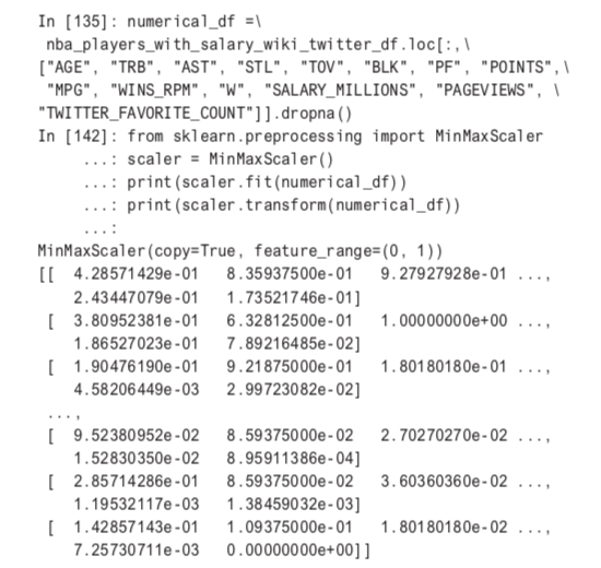
With a diverse data set and many useful attributes, performing unsupervised ML on NBA players could prove to be very informative. A first step is scale the data and select the attributes against which to cluster (dropping rows with any missing values).
Next, let’s cluster again and write out a CSV file to do faceted plotting in R.

First, import the CSV file and use the ggplot2 library.
> player_cluster <- read_csv(
+ "nba_2017_players_social_with_clusters.csv",
+                          col_types = cols(X1 = col_skip()))> library("ggplot2")
Next, give all four clusters meaningful names.
> #Name Clusters
> player_cluster$cluster_name[player_cluster$
+ cluster == 0] <- "Low Pay/Low" > player_cluster$cluster_name[player_cluster$
+ cluster == 1] <- "High Pay/Above Average Performance" > player_cluster$cluster_name[player_cluster$
+ cluster == 2] <- "Low Pay/Average Performance" > player_cluster$cluster_name[player_cluster$
+ cluster == 3] <- "High Pay/High Performance" > player_cluster$cluster_name[player_cluster$+ cluster == 4] <- "Medium Pay/Above Average Performance"
Create facets with the cluster names.
> #Create faceted plot
> p <- ggplot(data = player_cluster)
+      geom_point(mapping = aes(x = WINS_RPM,
                                y = POINTS,
                                color = SALARY_MILLIONS,
                                size = PAGEVIEWS))+
+       facet_wrap(~ cluster_name) +
+       ggtitle("NBA Players Faceted")
+       ylab("POINTS PER GAME")
+       xlab("WINS ATTRIBUTABLE TO PLAYER (WINS_RPM)")
+       geom_text(aes(x = WINS_RPM, y = POINTS,
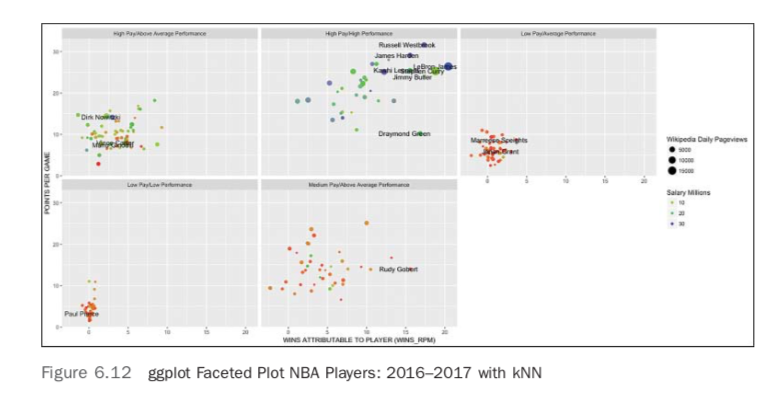
There is a bit of work to figure plot text in each facet, and this is accomplished by R and/or statements below. There is also the use of three colors in the salary, which allows for a much clearer view of the differences
label=ifelse(
+ PAGEVIEWS>10000|TOV>5|AGE>37|WINS_RPM>15|cluster
+ == 2 & WINS_RPM > 3,
+
as.character(PLAYER),'')),hjust=.8, check_overlap = FALSE)
>
> #Change legends
> p +
+    guides(color = guide_legend(title = "Salary Millions")) +
+    guides(size = guide_legend(
+ title = "Wikipedia Daily Pageviews" ))+
+    scale_color_gradientn(colours = rainbow(3))
>    geom_text(aes(x = ELO, y = VALUE_MILLIONS, label=ifelse(
VALUE_MILLIONS>1200,as.character(TEAM),'')),hjust=.35,vjust=1)
The final result is a nifty, faceted plot as shown in Figure 6.12. The main labels that have been discovered are the differences between popularity, salary, and performance. The cluster with LeBron James and Russell Westbrook has the “best of the best,” but they also command the highest salaries.
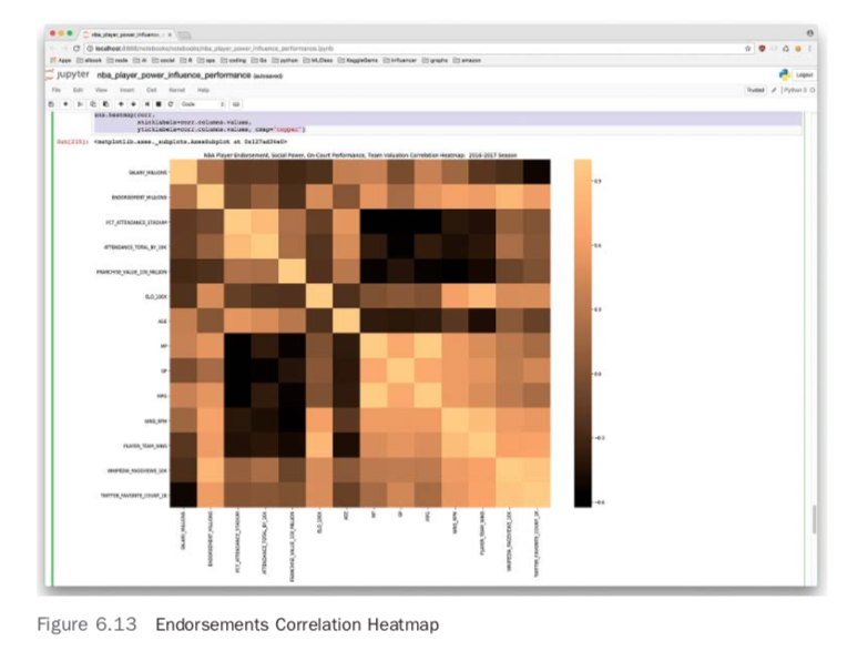
With all the data collected, there are some interesting new plots to test out. By combining the endorsement, team, and player data, it is possible to make a couple of fascinating plots. First, the endorsement data can be shown in a correlation heatmap in Figure 6.13. You can see the “copper” color adds an interesting twist to this plot.
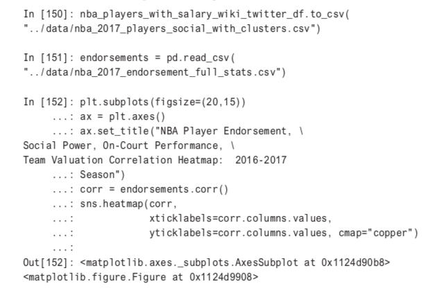
Next, in an accent plot, the totality of the work is showcased in Figure 6.14. The code for that is
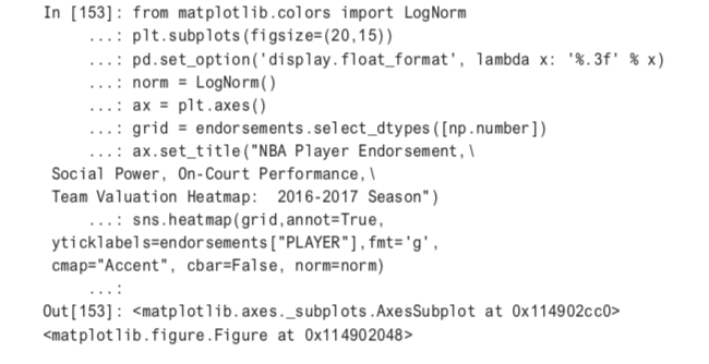
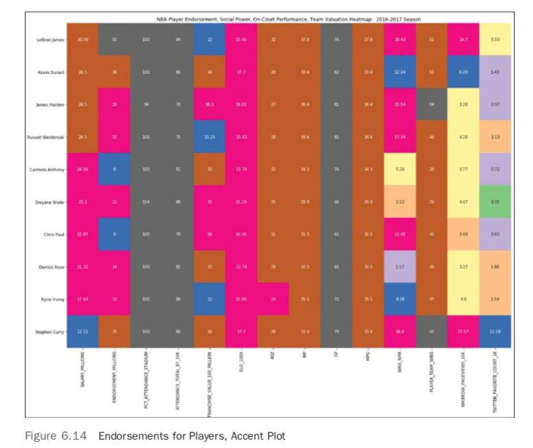
Note that a huge part of making the accent plot readable is converting the colors to LogNorm.This allows relative changes to be the catalyst for boundaries between cells.
One of the key reasons for this book to exist is to show how to create complete working solutions deployable to production. One way to get this solution out of a notebook would be to explore some of the solutions in other chapters that go over techniques to get projects shipped into production, for example, creating an NBA Team Valuation prediction API, or an API that showed the social power of NBA superstars. A Y combinator (YC) pitch deck might be just a few more lines of code away. In addition to that, a Kaggle notebook can be forked and that could be a starting point for even more exploration. [There is also a complementary Domino project.] Finally, a video and slides on this topic can be found on the Strata Data Conference 2018 San Jose schedule.
This chapter looked at a real-world ML problem, starting with questions and then moving into techniques on how to collect data from all over the internet. Many of the smaller data sets were cut and pasted from websites that may or may not have been friendly to their collection. The larger data sources Wikipedia and Twitter required a different approach—a more software engineering-centric approach. Next, the data was explored in both a statistical fashion and using unsupervised ML and data visualization. In the final section, several solutions were created using cloud providers, including a scalable API, a serverless application, and a data visualization framework (Shiny).

Domino Data Lab empowers the largest AI-driven enterprises to build and operate AI at scale. Domino’s Enterprise AI Platform provides an integrated experience encompassing model development, MLOps, collaboration, and governance. With Domino, global enterprises can develop better medicines, grow more productive crops, develop more competitive products, and more. Founded in 2013, Domino is backed by Sequoia Capital, Coatue Management, NVIDIA, Snowflake, and other leading investors.
Watch the 15 minute on-demand demo to get an overview of the Domino Enterprise AI Platform.
In this article
Watch the 15 minute on-demand demo to get an overview of the Domino Enterprise AI Platform.