The enterprise platform to build, deliver, and govern AI
Watch the 15 minute on-demand demo to get an overview of the Domino Enterprise AI Platform.
Many thanks to AWP Pearson for the permission to excerpt "Manual Feature Engineering: Manipulating Data for Fun and Profit" from the book, Machine Learning with Python for Everyone by Mark E. Fenner.
Many data scientists deliver value to their organizations by mapping, developing, and deploying an appropriate ML solution to address a business problem. Feature engineering is useful for data scientists when assessing tradeoff decisions regarding the impact of their ML models. It is a framework for approaching ML as well as providing techniques for extracting features from raw data that can be used within the models. As Domino seeks to help data scientists accelerate their work, we reached out to AWP Pearson for permission to excerpt the chapter “Manual Feature Engineering: Manipulating Data for Fun and Profit” from the book, Machine Learning with Python for Everyone by Mark E. Fenner. Many thanks to AWP Pearson for providing the permissions to excerpt the work.

# setupfrom mlwpy import *%matplotlib inline

iris = datasets.load_iris()
(iris_train, iris_test,
    iris_train_tgt, iris_test_tgt) = skms.train_test_split(iris.data,
        iris.target,
        test_size=.25)
        #remove units ' (cm)' from names
        iris.feature_names = [fn[:-5] for fn in iris.feature_names]
# dataframe for convenience
iris_df = pd.DataFrame(iris.data, columns=iris.feature_names)
iris_df['species'] = iris.target_names[iris.target]We are going to turn our attention away from expanding our catalog of models [as mentioned previously in the book] and instead take a closer look at the data. Feature engineering refers to manipulation—addition, deletion, combination, mutation—of the features. Remember that features are attribute-value pairs, so we could add or remove columns from our data table and modify values within columns. Feature engineering can be used in a broad sense and in a narrow sense.
I’m going to use it in a broad, inclusive sense and point out some gotchas along the way. Here are some concrete examples:
sklearn comes to us pre-standardized, which is one form of scaling.Two drivers of feature engineering are (1) background knowledge from the domain of the task and (2) inspection of the data values. The first case includes a doctor’s knowledge of important blood pressure thresholds or an accountant’s knowledge of tax bracket levels. Another example is the use of body mass index (BMI) by medical providers and insurance companies. While it has limitations, BMI is quickly calculated from body weight and height and serves as a surrogate for a characteristic that is very hard to accurately measure: the proportion of lean body mass. Inspecting the values of a feature means looking at a histogram of its distribution. For distribution-based feature engineering, we might see multimodal distributions—histograms with multiple humps—and decide to break the humps into bins.
A major distinction we can make in feature engineering is when it occurs. Our primary question here is whether the feature engineering is performed inside the cross-validation loop or not. Feature engineering that is done during the modeling process will typically be done within a cross-validation loop. Cross-validation can protect us from overfitting.
We can also modify the features before we start the modeling process. Often, these modifications are part of exporting data from a storage system like a database. My readers that work with databases will be familiar with an extract-transform-load (ETL) paradigm. Feature engineering can also be part of data cleaning as an intermediate step between exporting/importing data and learning. If we manipulate the data before building a model, we need to be very careful that we don’t peek at the relationship between the predictive features and the target. We also need to be careful so we don’t unintentionally introduce a relationship that isn’t there in the raw data. There are many, many ways we can slip up and fail.
So, if we are going to perform pre-modeling feature engineering, we should be very careful to squirrel away a hold-out test set before we start playing with the data. The test set will allow us to evaluate the results of both our pre-modeling feature engineering and the direct modeling steps. We can use the hold-out test set to protect us from dangerous feature engineering outside of a cross-validation loop. We proceed as usual and see what happens with our training and testing errors. If our training errors are good but we see our testing errors aren’t improving—or are even getting worse—then we can assume that we are overfitting. In that case, we probably want to move some of our feature engineering into the cross-validation loop to detect the overfitting earlier.
Now, we have two competing concerns. If your feature engineering needs to be in the cross-validation loop, the easiest programming hooks mean you’ll probably want to perform it with sklearn. But if your feature engineering is complicated and not already implemented in sklearn, you probably don’t want to use sklearn—you probably want to use pandas or other custom Python tools. Now for the real kicker: if you have complicated feature engineering that needs to be in the CV loop, my best wishes are with you. Meeting these two needs at once is difficult. In seriousness, you might want to factor out some of the most complicated portions as preprocessing. Still, you may be able to write helper code that can be placed in the CV loop. In Section 9.3.1 [in the book], we defined a custom learner. You can also define a custom transformer and we’ll see that shortly.
A practical take on the whens of feature engineering gives us an overall timeline:
DataFrame and do any additional pre-modeling data wrangling. Data wrangling is a common term for feature engineering done before the learning steps.sklearn.pandas to sklearn and press Go.Another breakdown is how the feature engineering occurs. Our focus in this chapter is on feature engineering that is explicitly defined and manually applied. An example of an explicitly defined feature engineering task is creating the ratio between heights and weights that creates a BMI value. If we are literally responsible for calculating that value and adding a column to our dataset, I call that manually applied feature engineering—in this case, manual feature construction. If we set up a pipeline (as in the next chapter) that constructs all possible ratios between pairs of features, I’ll call that automatically applied.
There are learning methods that incorporate feature engineering as part of their operation. Some of these methods—like Support Vector Machines (Section 13.2.4)[in the book]—use the re-engineered features behind the scenes without our intervention. Others—like principal components analysis (Section 13.3) [in the book]—require us to make use of their outputs as inputs to another learning step. In both cases, we perform steps similar to the learning algorithms we’ve seen so for: we fit a model to training data and then we transform the testing data.
One of the most blunt tools we have in feature engineering is removing data. We might remove data because of redundancy, irrelevance, or overload. (A quick side note: I’m discussing this from the perspective of removing features from our dataset. We could equally well consider removing examples—that is, rows instead of columns—from our dataset.)
There are practical and technical reasons that redundancy is a problem. We will see some technical reasons later in this chapter. From a practical perspective, if two columns represent the same concept—or, worse, the same literal values—we are pushing around and storing more numbers then we need to. The information is available to the learning system in more than one form. Some learning systems can’t handle this effectively.
Irrelevant features are even worse. Not only do they take up space, they also lead us down training paths that won’t do well when we turn to testing. Imagine several columns of random data. We can probably put enough random columns into our dataset to uniquely identify each example. Then, we can memorize a lookup table from these pseudo-identifiers to correct targets. But then, what do we do with a new example? If we just fill in several random values, the target will be equally random. It won’t have any relationship between the useful features—the nonrandom ones—and the target. We discussed this difficulty in the context of decision trees in Section 8.2 [in the book].
By overload, I mean simply that in a very large dataset—with many, many features—we may have no choice but to reduce the number of features we consider due to processing time and memory constraints. So, if we need to dump some data, how do we do it? There are three major strategies: manual techniques based on our knowledge of the problem and the data, random sampling techniques that use coin flipping to keep or discard data, and model-based techniques that attempt to keep features that interact well with our learning model. Sometimes these methods are combined: we can use random feature selection to build models and then combine the resulting models. We’ll discuss that in Chapter 12 [in the book].
Manual and randomized feature selection is conceptually simple. Drop a column from a table—either based on a principled argument (we know the two columns are measuring the same thing) or based on randomness. Done. I don’t have a but here. Selecting or discarding data based on learning models makes up for the simplicity of the other two options. There are forests worth of books and articles written on the topic. We can only scratch the surface. However, here are some examples.
Some feature selection strategies are internal components of learning techniques. For example, decision trees have to pick a feature to split on at each node. One type of decision tree uses a measure called information gain to decide on a good feature. We can extend that idea to rank features of a larger dataset. We can also use the results of modeling to evaluate features. For example, we can look at features with low linear regression coefficients and declare that they are relatively unimportant to the overall model. This doesn’t necessarily save us work in the first model-building process, but it might save substantial time in future models. We can also build many models and ask what the commonalities among those models are. Features that show up in many models may be more likely to be important to the relationship with the target.
One of our regularized forms of linear regression—L1-regularized regression or the lasso—has a tendency to push the learned coefficients to zero. The result is that models built using the lasso might drop out some features. So, we say that the lasso method is performing feature selection as an implicit part of its operation. We can use the lasso as our final model or we can use it as a feature selection phase before using other models.
We are going to discuss two ways to rescale and recenter features that don’t consider any relationships with other features or the target. Rescaling means that we translate the values so that the extremes are different and the intermediate values are moved in some consistent way. Recentering the data means that we translate the values so that the extremes are different and the intermediate values are moved in some consistent way. Often, rescaling will also result in re-centered data. The two major ways of rescaling are either by changing on a fixed scale or changing the values with respect to some statistic computed from the data. Whoa, did Mark just go off the deep end? It’s OK. We’ll bring it back in.
Here’s an example of fixed rescaling. If you convert between Fahrenheit and Celsius temperatures, you would take 220°F to 100°C and 32°F to 0°C. Temperatures in the middle—say, 104°F converting to 40°C—follow a fixed rule.
At least this is a bit more concrete, but what is the fixed value we are using to convert these? Well, that comes from the formula for converting temperatures:
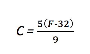
A little algebra turns that into
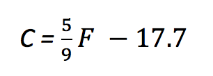
which is our friendly old y = mx + b in a different form. If you never noticed, converting values with a linear formula simply stretches and shifts the values; m is responsible for the stretching and b is responsible for the shift.
fig, ax = plt.subplots(1,1,figsize=(4,3))
f_temps = np.linspace(0, 212, 100)
c_temps = (5/9) * (f_temps - 32)
plt.plot(f_temps, f_temps, 'r', # F -> F
    f_temps, c_temps, 'b'); # F -> C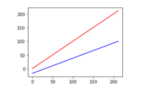
Notice how the upper red line is compressed vertically from 0 to 212 to around −18 to 100 on the lower blue line. The central value also moves from 106 to 59. Outside of unit conversions—Celsius to Fahrenheit or meters to feet—the most common fixed scalings are mapping {min, max} values to {0, 1} or to {−1, 1} and spreading the other values out evenly between them.
Standardization, a statistical rescaling, is a bit trickier. Instead of stretching out from the source to the target based on a fixed, prior value (like 5/9 to convert Fahrenheit to Celsius), it compresses values based on the spread—measured by the variance or standard deviation—of the source values. The difference is probably best explained with a graphic. Here we use sklearn’s StandardScaler to do the heavy lifting. fit_transform evaluates the training data and modifies it in one go. It is similar to our usual model.fit().predict() except it does not use a separate target in the fit() step. It simply learns—in this case, a mean and a standard deviation—and then applies itself to them. After being fit, it can also transform testing data. I’ve colored bins of data points so you can see how the points move around due to the transformation.
fig, ax = plt.subplots(1,1,figsize=(4,3))
original = np.random.uniform(-5, 5, 100)
scaled = skpre.StandardScaler().fit_transform(original.reshape(-1,1))[:,0]
bins = np.floor(original).astype(np.uint8) + 5
df = pd.DataFrame({'original':original,
    'scaled':scaled,
    'hue':bins})
df = pd.melt(df, id_vars='hue', var_name='scale')
sns.swarmplot(x='scale', y='value', hue='hue', data=df).legend_.remove()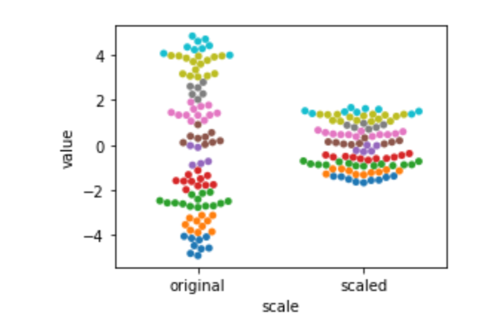
Here, the unit of measurement isn’t Fahrenheit or Celsius: it’s units of the standard deviation. The standard deviation tells us about the spread of our data. The more spread-out our data is, the bigger the standard deviation is. We are still on a linear scale after we standardize. That might be surprising. Here’s the formula:

There’s a y = mx + b hidden in there. The new center of our data is zero.
In a curious twist of events, standardization doesn’t change the overall shape of the data—it may not look the same at first sight, but here’s another take. In our example, we had data from a uniform or flat-ish distribution. When we standardize it, it is still uniform. Visually, the shape has relatively flat sides. It just happens to be more compressed. As another example—try it yourself—if the data looks like a two-humped camel and we standardize it, it would still have two humps. Basically, we can evenly stretch or squeeze the graph of the data, but we can’t distort it more than that.
Let’s look into the how of scaling. Here are simple examples of MinMaxScaler and StandardScaler. To follow the example points as they move around, I’m going to color them by their percentile bin. I’m using Pandas cut method to do this. I don’t want to get hung up on that, but just know that it is similar to the encoding technique we used when we made our piecewise constant regression model in Section 9.3 [in the book]. Here, we make use of Pandas categorical capabilities to create a coloring value:
iris_df = pd.DataFrame(iris.data, columns=iris.feature_names)
bins = pd.cut(iris_df['sepal width'],
np.percentile(iris_df['sepal width'],
    [25, 50, 75, 100])).cat.codes
df = pd.DataFrame({'orig':iris_df['sepal width'],
    'hue':bins})
scalers = [('std', skpre.StandardScaler()),
    ('01' , skpre.MinMaxScaler()),
    ('-1,1', skpre.MinMaxScaler((-1,1)))]
for name, scaler in scalers:
    # ugly: [[]] to keep 2D for sklearn
    # reshape(-1) to go back to 1D for seaborn :(
    df[name] = scaler.fit_transform(df[['orig']]).reshape(-1)
df = pd.melt(df, id_vars='hue', var_name='scale')sns.swarmplot(x='scale', y='value', hue='hue', data=df).legend_.remove()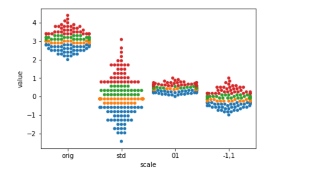
The most common motivation for rescaling is that we don’t want arbitrary measurement scales to influence our outcomes. For example, if we measure someone’s height in meters, instead of nanometers, the values will be much smaller—one meter is an awful lot of nano-whatevers. But that shouldn’t really affect the fundamental information in the measurements. The easiest way to keep things fair between values measured on very different scales is to rescale them to an approximately common scale. Another example occurs when different types of measurements are in the same model. For example, household income is often tens of thousands of dollars—but cars per household is typically measured in single digits. Numerically, these values have a very different weight. We offset that by placing them on a common scale. Some of the benefits of rescaling become more prominent when we move beyond predictive modeling and start making statistical or causal claims.
We’ve already seen discretization—the process of sorting a range of continuous values into some finite, or discrete, buckets of values—when we implemented piecewise constant regression. There, we had to pick an output value—a line segment—based on the input value’s bucket. Discretization also shows up as part of decision tree value splits: height > 5’7” is either true or false. There are a number of automated methods for discretizing data; some of them look at the relationship between a feature’s values, the ideal split points to break those features at, and the value of those breaks to good classification. It is crucial that these methods be used inside of cross-validation to prevent overfitting on the training data. You can think of sufficiently advanced discretization strategies as micro-learners of their own—imagine if they could discretize right into the correct classification buckets! For now, let’s consider some manual approaches to discretization with the iris data.
iris_df = pd.DataFrame(iris.data, columns=iris.feature_names)
iris_df['species'] = iris.target_names[iris.target]
display(iris_df.iloc[[0,50,100]])
If we look at a smoothed plot of the sepal lengths, we see it is a pretty well-behaved bump.
plt.subplots(1,1,figsize=(4,3))
ax = sns.distplot(iris_df['sepal length'], hist=False, rug=True)
ax.set_ylabel("Approximate %");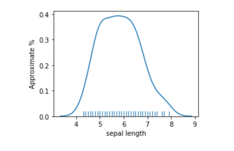
A simple way to discretize is to break the values into low and high at the mean or median.
# apply binary threshold to numeric with sklearn is tricky
column = iris_df[['sepal length']] # keep 2Dness because sk complains
col_mean = column.mean().values # and sk fails with Series/DF
both = column.copy()
both['> Mean'] = skpre.binarize(column, col_mean).astype(np.bool)
print('Column Mean:', col_mean)
display(both.iloc[[0,50,100]])Column Mean: [5.8433]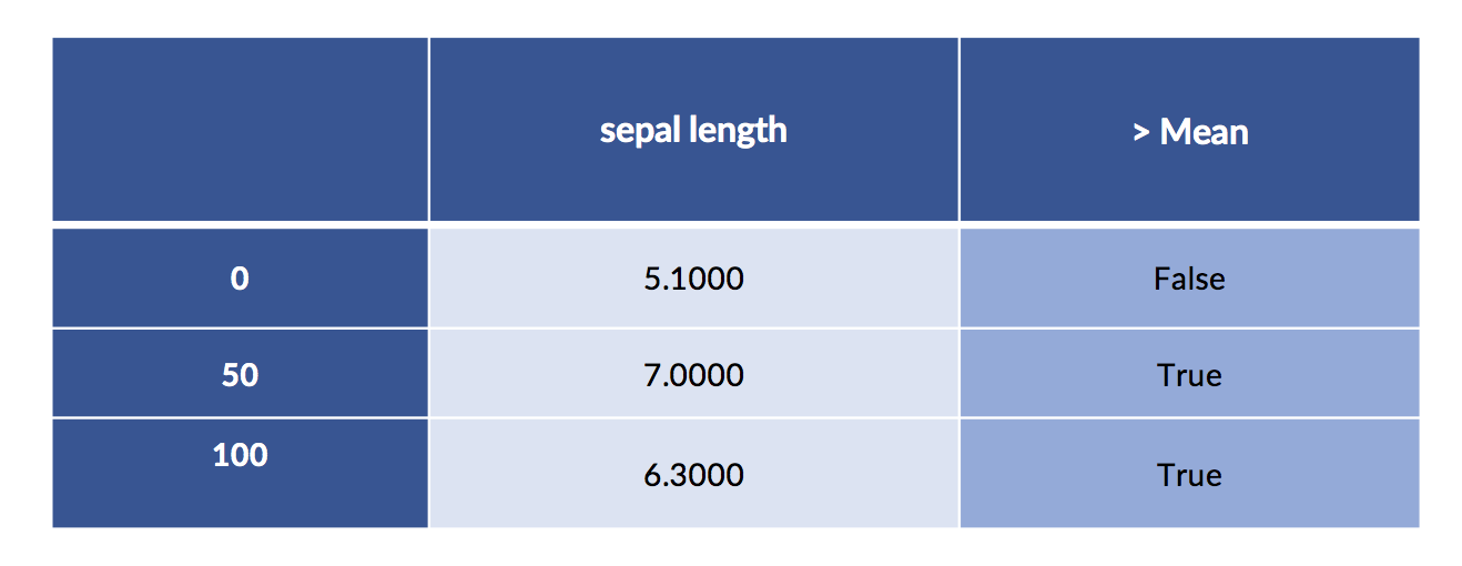
We can also do the same discretization using the pd.cut function we showed off a minute or two ago.
sep_len_series = iris_df['sepal length']
breaks = [sep_len_series.mean(),
    sep_len_series.max()]
# ugly to extract
print(pd.cut(sep_len_series, breaks).cat.codes[[0, 50, 100]])0 -1
50 0
100 0
dtype: int8
But, frankly, going to raw np results in a fairly readable solution that involves minimal behind-the-scenes magic.
# an easy button:
np.where(column > column.mean(), True, False)[[0,50,100]]array([[False],
[ True],
[ True]])Even though we pushed that computation through, does it make sense to break such well-behaved data right in the middle? Two very similar sepal length values—mean plus a little and mean minus a little—are forced into different buckets. The big hump also means most of the values are in that region around the mean. Do we want them together or split apart? Only our prediction problem can tell us for sure. But, personally, I’d be more comfortable keeping the middle together and partitioning the particularly long and short into their own buckets. So, we’d have short, medium, and long with most of the examples falling into the medium bucket.
If we have domain knowledge, we might have other reasons to pick certain split points. For example, an accountant might introduce split points at tax bracket thresholds. Here, there is strong information available and we likely don’t need to worry about overfitting. We can always cross-validate and compare. If we have no source of expert information, we might try a range of split point possibilities and cross-validate them to make sure we don’t overfit.
Let’s get practical for a moment. Which technique should you use? Now, I’m going to get up to my old tricks. The answer is it depends. You may not be a NumPy ninja, so the last option may not make sense to you. But if you have more complex numerical data, you might get some other wins by using NumPy. There’s a bit more of a tradeoff with the Pandas and sklearn options. The Pandas option isn’t going to be super convenient to place inside of a cross-validation loop. The sklearn method will plug directly into cross-validation using pipelines. However, if you need to do data exploration and processing to come up with the split points, stick with Pandas.
So far, we’ve been using the iris dataset in the exact form it was given to us: we predict the species from numerical measurements of the flowers. But we can rearrange the data and do other learning tasks. For example, imagine we want to predict petal length from the other features, including the species. Now, we take the species as a known input feature and the petal length as an unknown target. Here’s what the data looks like:
# close your eyes Francis, this is about to get ugly
# this pandas voodoo is simply to produce a labeled dataframe
# so you can *see* the learning problem I am describing in the text
new_iris_df = pd.DataFrame(iris_df, columns=['petal length',
    'petal width',
    'species'])
new_iris_df.columns = pd.MultiIndex([['input ftrs', 'target ftr'],
    new_iris_df.columns],
    [[1, 0, 0], [0,1,2]])
new_iris_df.sort_index(axis='columns', inplace=True)
display(new_iris_df.iloc[[0,50,100]])
Species does not have a direct numerical interpretation. There isn’t a defined ordering that we can use to say setosa = 1 < versicolor = 2. We could use numbers to represent categories—think class 0, class 1, class 2. However, if we pass this column to linear regression, what would it mean for a species coefficient to be multiplied by these different values? We’d be treating the categories as numerical values when they are really just class identifiers. We don’t want a numerical difference of 1 to be interpreted as adding or subtracting anything from a predicted petal length.
Our general technique for encoding discrete data is called coding categorical variables. We’ll examine it in a broader context in a few minutes. For now, let’s start with a useful technique that gives old-school statisticians fits: one-hot coding. It translates a single column with multiple values into multiple columns with one, and only one, on value. The on value for an example is usually a binary 1 (or True) with the other column values being 0 (or False). Here are the iris species in a one-hot encoding:
# start with category numbers
print("Numerical categories:",
    iris.target[[0, 50, 100]], sep='\n')
# produces sparse representation
sparse = skpre.OneHotEncoder().fit_transform(iris.target.reshape(-1,1))
# densify it
print("One-hot coding:",
sparse[[0,50,100]].todense(), sep="\n")Numerical categories:
[0 1 2]
One-hot coding:
[[1. 0. 0.]
[0. 1. 0.]
[0. 0. 1.]]
Several technical points are worth mentioning here. OneHotEncoder requires numerical inputs. It isn’t happy with strings. It also requires a 2D input—hence the call to reshape. Finally, if we go one-hot, there are many, many zeros in the result. Remember, only one value per example is turned on over all the expanded columns. A source column with even just a few legal values leads to lots of zeros—all but one of the options aren’t used for every example. So, sklearn is clever and stores the data in a compressed format that deals well with sparsity—a technical term for data with lots of zeros. Instead of recording values everywhere, it records just the nonzero entries and assumes everything else is zero.
There are some learning methods that can work efficiently with sparse data; they know that many values are zero and are smart about not doing extra work. If we want to see the data in its usual, complete form, we have to ask to make it dense. You can imagine that when we fill out the sparse form, we have a table that is a bit like Swiss cheese: it has lots of holes in it. We have to fill those holes—values that were assumed to be zero—in with actual zeros. Then we have a solid—dense—table with entries everywhere. We do that with the .todense() call in the last line.
We can also perform one-hot encoding with pandas. One benefit is that we can ask it to give nice labels to the one-hot columns.
# can use drop_first to get treatment coding
# can request sparse storage
encoded = pd.get_dummies(iris_df, prefix="is")
encoded.iloc[[0,50,100]]
We can merge the one-hot species with the original data for fun and profit. We may want to visualize the relationship between the encoding and the original species values. Here goes:
# splicing dataframes together by merging
# recall `iris.target` is in terms of 0, 1, 2, not symbolic (setosa, etc).
encoded_species = pd.get_dummies(iris.target)
encoded_df = pd.merge(iris_df, encoded_species,
    right_index=True, left_index=True)
encoded_df.iloc[[0,50,100]]
Here’s one other way to achieve the one-hot coding. In the statistical world, the one-hot coding goes by the names of treatment or dummy coding. There are details I’m going to tap-dance around, but I’ll leave a few more notes at the end of the chapter. patsy is a nice system that allows us to specify a number of feature engineering and modeling ideas in a convenient way. Here’s a long-hand version we’ll use in a minute:
import patsy.contrasts as pc
levels = iris.target_names
coding = (pc.Treatment(reference=0)
    .code_with_intercept(list(levels)))
print(coding)ContrastMatrix(array([[1., 0., 0.],
[0., 1., 0.]
[0., 0., 1.]]),
['[setosa]', '[versicolor]', '[virginica]'])
My reason for bringing yet another option up is not to overwhelm you with alternatives. In reality, I want to segue into talking about a few useful feature engineering tasks we can do with patsy and also deepen your understanding of the implications of categorical encodings. Now, I claimed it was a nice system for doing things like one-hot encoding. But, for crying out loud, that previous cell is hideous. Let’s press the easy button.
encoded = patsy.dmatrix('species-1',
    iris_df,
    return_type='dataframe')
display(encoded.iloc[[0,50,100]])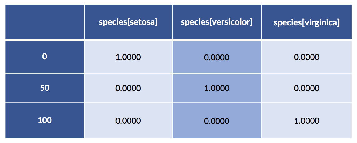
What’s happening with that -1 in 'species-1'? Let’s see what happens when we leave it out.
encoded = patsy.dmatrix('species',
    iris_df,
    return_type='dataframe')
display(encoded.iloc[[0,50,100]])
We get two of the features coded explicitly and we get a column of all ones under the name Intercept. By the way, patsy is literally performing the +1 trick for us and giving it the name Intercept. So, why do we have to do the -1 to get the simple result? Why does the dmatrix for species give us a column of ones and—seemingly!—ignore one of the species (there’s no column for setosa)? We’ll come back to this in moment.
Let’s point a flashlight at what just happened. We were building design matrices—dmatrix critters—with two main elements: (1) some specification of a modeling idea and (2) the data we want to run through that model. A design matrix tells us how we get from raw data to the form of the data we want to run through the underlying number-crunching of a modeling process. It’s definitely example time.
We might specify that we want to predict petal length from petal width and species—our regression twist on the iris data. If our column names had underscores (petal_length) instead of spaces (petal length), that specification would be written as (petal_length - petal_width + C(species. Treatment)'. This specification says to run a linear regression with the left-hand side of the tilde ~ as the target and the right-hand side terms as the input features. The C() indicates that we want to encode the species before running the linear regression. Having spaces in the names complicates matters slightly, but we’ll fix that in a moment.
Here’s a quick reference of basic things we can do with patsy formulas:
tgt ~ ftr_1 + ftr_2 + ftr_3: model tgt from the right-hand side featurestgt ~ Q('ftr 1') + Q('ftr 2') + Q('ftr 3'): Quote funky namestgt ~ ftr_1 + C(cat_ftr, Some_Coding): model tgt on ftr_1 and the Categorically encoded cat_ftr.tgt ~ ftr_1 - 1: model on ftr_1 without an intercept. By default, the formulas include an intercept: we have to remove it by hand. We can also remove features from the RHS: tgt ~ ftr_1 + ftr_2 - ftr_1M\ is equivalent to M tgt ~ ftr_2. There are useful cases for feature removal.Now, I want to investigate what happens with including—or not—certain variable codings. To do so, we need some trivial data we can process in our heads. Here we go:
pet_data = pd.DataFrame({'pet' :['cat', 'cat', 'dog'],
    'cost':[20.0, 25.0, 40.0]})
pet_df = pd.get_dummies(pet_data)
display(pet_df)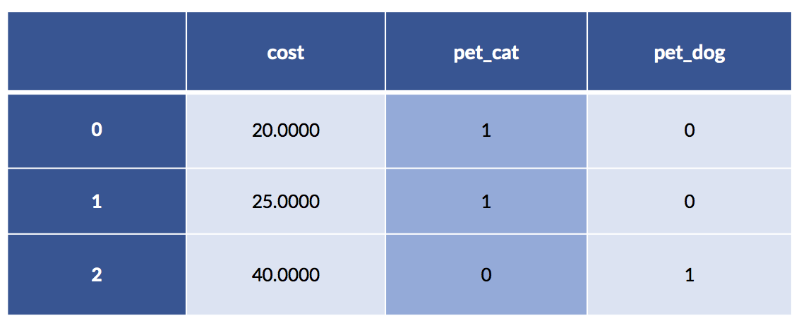
In this example, the cat costs are 20 and 25. The single dog example has a cost of 40. Make a quick mental note that the average cat cost is 22.50.
We’ve almost never taken a concrete look at the knob values that are set on our factory machine. Let’s do that here. After we fit, linear regression will have chosen particular knob values, the ws or m, b. Below, you might notice that I snuck a fit_intercept=False into the linear regression constructor. There’s a very good reason for it, and I’ll get back to it in a few minutes. It is intimately tied to the default dmatrix having a column of all ones and not coding all three species explicitly. Just keep in mind that we didn’t explicitly fit a b term (the constant or intercept).
def pretty_coeffs(sk_lr_model, ftr_names):
    ' helper to display sklearn results in a nice dataframe '
    lr_coeffs = pd.DataFrame(sk_lr_model.coef_,
        columns=ftr_names,
        index=['Coeff'])
    lr_coeffs['intercept'] = sk_lr_model.intercept_
    return lr_coeffs
Let’s do a bit of data massaging to make our modeling step happy:
# massage
sk_tgt = pet_df['cost'].values.reshape(-1,1)
sk_ftrs = pet_df.drop('cost', axis='columns')
# build model
sk_model = (linear_model.LinearRegression(fit_intercept=False)
    .fit(sk_ftrs, sk_tgt))
display(pretty_coeffs(sk_model, sk_ftrs.columns))
We didn’t fit an intercept—that equivalent to fixing its value at zero. A quick comment on interpreting the pet entries. One, and only one, of the two feature values (for pet_cat and pet_dog) is not zero. Basically, we pick one of those columns and the result chooses our cost. You might also notice that the cat value is the average of the two cat cases; the dog value is the single dog value. For both, we’ve turned the dummy coding of zeros and ones into a switchable weight—only one of which is turned on—to add to our pet-care cost model.
Back to my main story. Here’s another way to generate the same model and knob settings.
import statsmodels as sm
import statsmodels.formula.api as smf# patsy formula that explicitly removes an intercept
formula = 'cost ~ pet - 1'
sm_model = smf.ols(formula, data=pet_data).fit()
display(pd.DataFrame(sm_model.params).T)
These two methods work out to the same coefficients—we’re pretty happy about that. Let’s go back to the question of the missing intercept. I left it out with fit_intercept=False in the sklearn example. If you start playing around with these patsy formulas, you’ll find out that it is very difficult to get an explicit three-column dummy coding for the species and a column of all ones for the intercept. I’ll finally answer:
Let’s recreate the sklearn model, this time with an intercept:
sk_tgt = pet_df['cost'].values.reshape(-1,1)
sk_ftrs = pet_df.drop('cost', axis='columns')
sk_model = (linear_model.LinearRegression() # fit_intercept=True by default!
.fit(sk_ftrs, sk_tgt))
display(pretty_coeffs(sk_model, sk_ftrs.columns))
Now, let’s do the same model building with patsy and statsmodels. We have to do some trickery to convince statsmodels to (1) use the fully explicit, one-hot coding for the pets and (2) also use a column of all ones. We’ll do that by: (1) pet - 1 to code the pets with both cats and dogs and (2) we’ll use an artificial column of ones to force an intercept.
pet[cat] pet[dog] ones
10.5 Categorical Coding 339
pet_data_p1 = pet_data.copy() # don't muck the original data
pet_data_p1['ones'] = 1.0 # manual +1 trick
# remove coding intercept ..... add manual ones == add manual intercept
formula = 'cost ~ (pet - 1) + ones'
sm_model = smf.ols(formula, data=pet_data_p1).fit()
display(pd.DataFrame(sm_model.params).T)
Something seems to be wrong, Major Tom. The coefficients are different. Let’s take a quick look at the predictions from both models:
# row-slicing is annoying, but have to get to single-D things
# and .flat gives a warning in the DF constructor
df = pd.DataFrame({'predicted_sk' : sk_model.predict(sk_ftrs)[:,0],display(df)
    'predicted_sm' : sm_model.predict(pet_data_p1),
    'actual' : sk_tgt[:,0]})
display(df)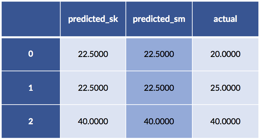
Yet the predictions are the same. What on Earth is going on?
Let’s look under the hood at what happens when we specify a pet formula without an intercept. Here’s our data including the column of ones:
display(pet_data_p1)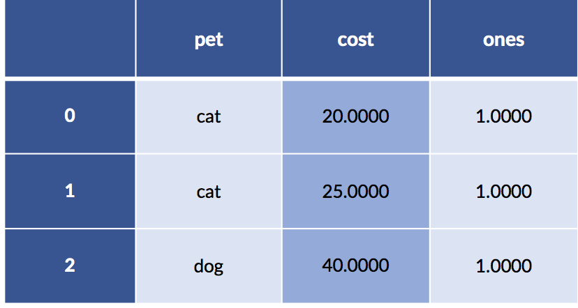
The encoding for that data—without an intercept from the categorical coding—gives us.
print('pet - 1 coding')
print(patsy.dmatrix('pet - 1', data=pet_data_p1)) pet - 1 coding
[[1. 0.]
[1. 0.]
[0. 1.]]
If we add up across, example-wise, all the coding-created columns, we can verify we only have one “on” value for each example:
# what happens when we add up the coding columns
print("column sum:")
full_coding = patsy.dmatrix('pet - 1',
    data=pet_data_p1,
    return_type='dataframe')
display(pd.DataFrame(full_coding.sum(axis='columns')))column sum: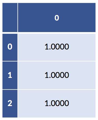
If we add up the columns of the fully explicit coding that has columns for both pets, we get a column of all ones. In addition, both of our models—the sklearn has fit_intercept=True by default and our statsmodels has the explicit column of ones—already have a column of ones in them. So, we have a redundant column of ones buried in our data. This redundancy is precisely why there are two different but predictively equivalent answers to the regression models with intercepts. When we remove the intercept but keep the full coding, we still have an intercept-like term from the sum of the coding columns.
There are some rules about what constitutes redundancy for a linear model. If a linear combination of some columns is equal to a linear combination of other columns, there is redundancy. Then, we can’t accurately get one and only one answer for our linear regression coefficients: there are many—an infinite number of them—equally correct answers. We can add a little bit to one coefficient and subtract a little bit from another and they will balance out. You’ll notice that this did not seem to be much of a problem for us in terms of predictions. In the bigger picture, the redundancy issue is called collinearity and it is more of a concern when you move above the level of prediction and start entering the realms of statistical and causal reasoning. As I’ve mentioned, we are sweeping those issues under the carpet in this book. However, those issues are precisely why statsmodels makes you go far out of your way to include both full coding and an explicit intercept.
Feature construction is very powerful. In fact, it is so powerful, it can actually replace the steps we normally perform in model building. Suitably constructed features can mimic the targets we produce when we predict with a model. Here are two examples:
Many complicated learning methods can be implemented as either (1) a complicated method or (2) feature construction plus a basic method. Often, the later is less labor- intensive. If we separate out the feature engineering, we need to be sure to assess the combined method in the same way we would assess a stand-alone method—usually with cross-validation.
I’ve made the claim that feature engineering can be very strong in the sense that it can remove the need to learn. Sufficiently powerful discretization and feature construction methods can essentially solve learning problems for us. Let’s cut out the handwaving and make that idea more explicit. Here’s a classic troublesome learning example. I’m going to create a very simple table of examples for the xor function. xor is a Boolean function that is true only when one or the other, but not both, of its inputs is true. Here’s the data:
xor_data = [[0,0,0],
    [0,1,1],
    [1,0,1],
    [1,1,0]]
xor_df = pd.DataFrame(xor_data,
    columns=['x1','x2','tgt'])
display(xor_df)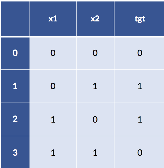
If we try to model xor with a simple linear classifier, things don’t work out so well. We’re getting problems predicting in-sample on the training set—we haven’t even seen any novel testing data yet.
model = linear_model.LogisticRegression().fit(xor_df[['x1', 'x2']],
    xor_df['tgt'])
model.predict(xor_df[['x1', 'x2']])array([0, 0, 0, 0])How can we be so bad? Well, let’s look at a graph of the data values colored by their output.
fig, ax = plt.subplots(1,1,figsize=(2,2))
ax.scatter('x1', 'x2', data=xor_df, c='tgt')
ax.set_xlim(-1, 2)
ax.set_ylim(-1, 2);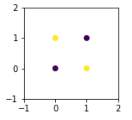
It is fundamentally impossible to use a single line to separate these points and keep them with their like classes only. At a minimum, we need two lines to fence off points on one diagonal from points on the other diagonal. But what if we can create a clever feature?
xor_df['new'] = (-1)**xor_df['x1'] * (-1)**xor_df['x2']
print(xor_df)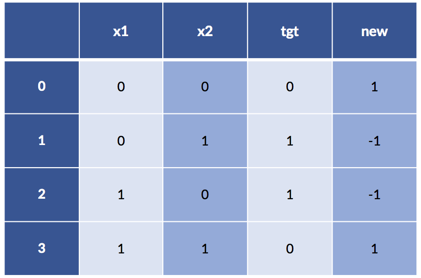
Now things are looking pretty nice: even a super simple rule, xor_df['new'] < 0 == True, will give us our target. Here’s what happens:
model = linear_model.LogisticRegression().fit(xor_df[['new']],
    xor_df['tgt'])
model.predict(xor_df[['new']])array([0, 1, 1, 0])Sometimes, we need to invent a new vocabulary—constructed columns like new—to enable our learning systems to learn.
One specific type of constructed feature is an interaction between existing features. There are two major ways that features interact: (1) by working together like a key in a dictionary that selects a class or target value and (2) by acting together based on their product (multiplication) instead of their sum (addition). The second is a really complex way of saying that when we multiply two features together we are considering the way in which they interact. Multiple degrees of interaction can include more and more features.
Here we consider two-way interactions between numerical features—all pairs of numerical features—with sklearn:
# parameters:
# degree: degree of terms
# interaction_only: no x**2, only x*y (and x,y)
# include_bias: constant term
quad_inters = skpre.PolynomialFeatures(degree=2, # degree of terms
interaction_only=True, # no x**2, only x*y
    include_bias=False) # constant term
subset = iris_df.loc[[0, 50, 100], ['sepal length', 'sepal width']]
new_terms = pd.DataFrame(quad_inters.fit_transform(subset),
    index=[0, 50, 100])
new_terms.set_axis(['sep length', 'sep width', 'sep area'],
    axis=1, inplace=True)
# note: creating the interaction *also*
# includes the base terms in the interaction
display(new_terms)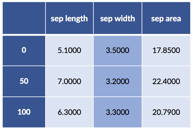
This representation may be good enough, particularly if we want to make these steps part of an sklearn pipeline. However, we can get much finer grained control using patsy.
Now we can get a big win from using patsy formulas. Patsy lets us specify interactions with either : or *. The difference is that : only includes the interaction—sepal_width * sepal_length—between the two, like interaction_only=True in skpre.PolynomialFeatures.
design_df = patsy.dmatrix("Q('sepal length'):Q('sepal width') - 1",
    data=iris_df.iloc[[0, 50, 100]],
    return_type='dataframe')
design_df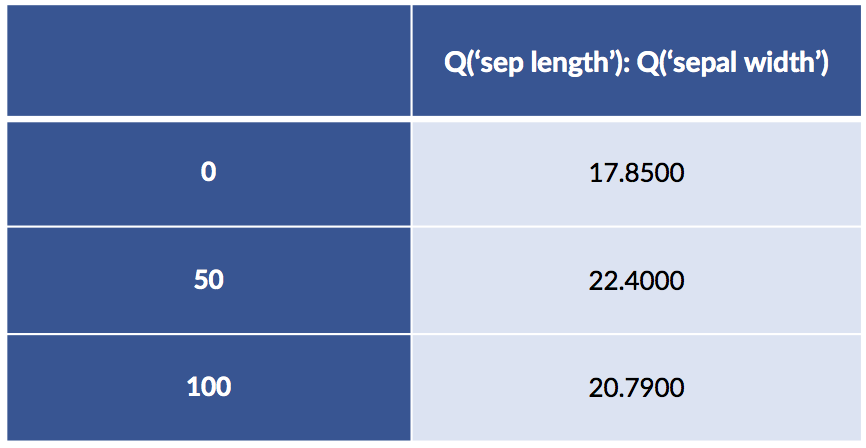
If we use the patsy * to join two features, ftr_1 & ftr_2 , we will get three columns: ftr_1, ftr_2, and the product ftr_1 x ftr_2. Between two categorical features, a patsy * means we take the Cartesian product—all possible combinations of each value. Let’s construct a scenario where we might use this.
After we’ve been talking about sepal length and width for a while, you might start thinking that we could, as an approximation, multiply the two together to get a sepal area. Effectively, we are talking about creating a new feature sepal area = sepal width × sepal length. We might justify this by appealing to the area of a rectangle or an approximate area of an ellipse when calculated from its major and minor axes. We’d be happy to tie the two primitive concepts of width and length to a more expressive idea. We might be even happier if we talked to a botanist who said that in her expert opinion, yes, the approximation is valid enough and the area is more useful in determining the species. This approach is driven by background knowledge—so we probably don’t need to go to great lengths to cross-validate it. However, we would want a hold-out test set to ensure that we don’t mislead ourselves as to the value of areas. Unlike medieval scholastic philosophers who were content to argue and argue without evidence, we insist on demonstrating our claims with data and evaluation.
Let’s also combine this idea of flower areas with discretization to find the big areas. Finally, we’ll create combinations of smaller and larger petals and sepals.
# create some areas
sepal_area = iris_df['sepal length'] * iris_df['sepal width']
petal_area = iris_df['petal length'] * iris_df['petal width']
# discretize
iris_df['big_sepal'] = sepal_area &gt; sepal_area.median()
iris_df['big_petal'] = petal_area &gt; petal_area.median()
display(iris_df.iloc[[0,50,100]])
design_df = patsy.dmatrix("big_sepal:big_petal - 1",
    data=iris_df.iloc[[0, 50, 100]],
    return_type='dataframe')
# breaking up the long column names
display(design_df.iloc[:, :2])
display(design_df.iloc[:,2: ])

Examples 50 and 100 both have big sepals and petals. Example 0 has a big sepal and a small petal.
When we create an interaction between a categorical and a numerical features, we effectively get one weight for the numerical feature for each of the categories we consider:
# we (Q)uote sepal length because it has a space in the name
design_df = patsy.dmatrix("C(species,Treatment):Q('sepal length') - 1",
data=iris_df.iloc[[0, 50, 100]],
   return_type='dataframe')
# breaking up the long column names
display(design_df.iloc[:,[0]])
display(design_df.iloc[:,[1]])
display(design_df.iloc[:,[2]])![display(design_df.iloc[:,[0]])](https://cdn.sanity.io/images/kuana2sp/production-main/9ccd8a073d7968384e9711576c9e8d5f64a7b7c9-922x440.png?w=1920&fit=max&auto=format)
![display(design_df.iloc[:,[1]])](https://cdn.sanity.io/images/kuana2sp/production-main/36defcf5d5922d32a1096df774263ad264b4ef7d-902x432.png?w=1920&fit=max&auto=format)
![display(design_df.iloc[:,[2]])](https://cdn.sanity.io/images/kuana2sp/production-main/141add52dd03b75bcf5812d5bfe8c1463b29baa4-896x428.png?w=1920&fit=max&auto=format)
If we dive back into the data, we see where those values are coming from—the column value is precisely the selected out value of sepal length when it is in that category. It is an elementwise multiplication of (1) the one-hot encoding of the species times (2) the sepal length.
print(iris_df.iloc[[0, 50, 100]]['sepal length']0 5.1000
50 7.0000
100 6.3000
Name: sepal length, dtype: float64
We can also look at a quick example of connecting patsy formulas and sklearn models. Essentially, we build a design matrix—that’s the mapping between raw features and the data that we use to learn parameters—by hand, apply it by hand, and then run the model.
import statsmodels as smimport statsmodels.formula.api as smf

# we can build a design matrix and send it to sklearn
design = "C(species,Treatment):petal_area"
design_matrix = patsy.dmatrix(design, data=iris_df)

# intercept is already in design matrix
lr = linear_model.LinearRegression(fit_intercept=False)
mod = lr.fit(design_matrix, iris_df['sepal width'])
print(mod.coef_)[ 2.8378 1.402 -0.0034 0.0146]# hey, we get the same results!
formula = "Q('sepal width') ~ C(species,Treatment):petal_area"
res1 = smf.ols(formula=formula, data=iris_df).fit()
print(res1.params)Intercept 2.8378
C(species, Treatment)[setosa]:petal_area 1.4020
C(species, Treatment)[versicolor]:petal_area -0.0034
C(species, Treatment)[virginica]:petal_area 0.0146
dtype: float64Fortunately, we get the same results—there’s some rounding in there—whether we do some manual hacking to feed data to sklearn or use a self-contained statsmodels approach.
If we want tighter integration with sklearn, we can define feature transformations using either FunctionTransformer for freestanding functions or inherit from TransformerMixin for classes. If we don’t need to remember or learn anything from a training set to a test set—if the transformation is completely self-contained, like taking the logarithm of the absolute value of the data—then we don’t need to add the complexity of a class-based method. We’ll start by recreating the initial area features in a clean DataFrame.
iris_df = pd.DataFrame(iris.data, columns=iris.feature_names)
iris_df['species'] = iris.target_names[iris.target]
area_df = pd.DataFrame({"sepal_area" : iris_df['sepal length'] *
    iris_df['sepal width'],
    "petal_area" : iris_df['petal length'] *
    iris_df['petal width']})
Now, if we simply want comparisons with the median values over the whole dataset—not training and testing differences—we can make a transformer as quickly as:
def median_big_small(d):
return d &gt; np.median(d)
transformer = skpre.FunctionTransformer(median_big_small)
res = transformer.fit_transform(area_df)
print("Large areas as compared to median?")
print(res[[0, 50, 100]])Large areas as compared to median?
[[ True False]
[ True False]
[ True True]]
If we want to learn the medians on the training data and then apply our discretization based on the learned medians to the testing data, we need a little more support. We have to compute the medians on the training data and then apply those medians as a threshold to either the training or testing data.
from sklearn.base import TransformerMixin
class Median_Big_Small(TransformerMixin):
def __init__(self):
pass
def fit(self, ftrs, tgt=None):
self.medians = np.median(ftrs)
return self
def transform(self, ftrs, tgt=None):
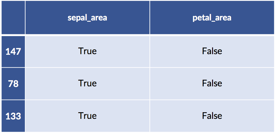
return ftrs &gt; self.mediansThe usage pattern is the same as for a built-in transformer and it is quite similar to a standard learning model. Since we use a train_test_split, we get randomly selected examples here.
# training-testing split
training, testing = skms.train_test_split(area_df)
# create and run the transformer
transformer = Median_Big_Small()
train_xform = transformer.fit_transform(training)
test_xform = transformer.transform(testing)
# the dataframes survived!
print('train:')
display(train_xform[:3])
print('test:')
display(test_xform[ :3])train: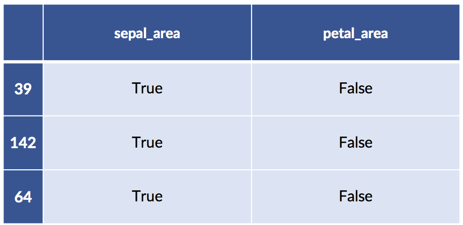
test:
In the context of linear regression models, you may hear the following advice:
I’ll add a few comments. Correcting for nonlinearity means that the fundamental relationship between features and target is not linear. Linear regression models are looking specifically for a best line. Going beyond the constraints of a good line means addressing the bias of linear regression.
Problems with unaccounted-for differences are characteristics of the errors between our predictions and reality. These are the residuals of Section 7.3.2 [in the book]. The two patterns we may see are (1) systematic behavior, such as bigger errors with bigger input x values, and (2) being distributed in a non-normal way. Non-normality means the errors may be unbalanced above and below the prediction line or the errors don’t taper off quickly.
We can go out on a limb and translate these to give general rules of thumb for dealing with modeling problems.
Let’s make these ideas more concrete by seeing how the first rule—correcting for a nonlinear relationship or, more generally, bias—plays out.
x = np.linspace(1,10,50)
n1 = np.random.normal(size=x.shape)
comparison = pd.DataFrame({"x" : x,
    "d1" : 2*x+5 + n1,
    "d2" : 2*x**2+5 + n1})
comparison['x'] = x
melted = pd.melt(comparison, id_vars=['x'])
One of the two data columns is not like the other:
sns.lmplot(x='x', y='value',
    data=melted, col='variable', ci=None,
    size=3);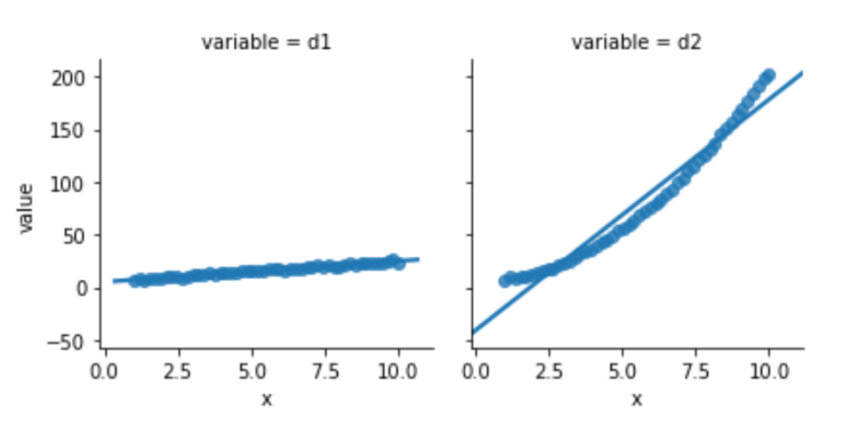
Looking below, the model built to relate d1 and x is well behaved. Its residuals seem somewhat normal-like—although we are only using 50 data points, so we aren’t going to see a super smooth normal shape. The residuals from the d2 model simply have no obvious relationship to a normal curve.
fig, axes = plt.subplots(1,2,figsize=(8,3))
for ax, variable in zip(axes, ['d1', 'd2']):
    predicted = (smf.ols("{} ~ x".format(variable), data=comparison)
        .fit()
        .predict())
    actual = comparison[variable]
    sns.distplot(predicted - actual, norm_hist=True, rug=True, ax=ax)
    ax.set_xlabel(variable)
    ax.set_ylabel('residual')
fig.tight_layout();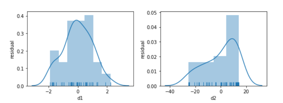
Before we panic, let’s see what happens when we try to relate a slightly different version of x, x2, to d2. We’ll look at the residuals, as well.
magic = pd.DataFrame({"d2" : 2*x**2+5+n1,
    "x_sq" : x**2})
melted = pd.melt(magic, id_vars=['x_sq'])
fig, (ax1, ax2) = plt.subplots(1,2,figsize=(8,3))
sns.regplot(x='x_sq', y='value',
    data=melted, ci=None, ax=ax1)
predicted = (smf.ols("d2 ~ x_sq", data=magic)
    .fit()
    .predict())
actual = comparison['d2']
sns.distplot(predicted - actual, rug=True,
    norm_hist = True, ax=ax2)
    ax2.set_title('histogram')
    ax2.set_xlim(-3,3)
    ax2.set_ylim(0,.45)
    ax2.set_ylabel('residual');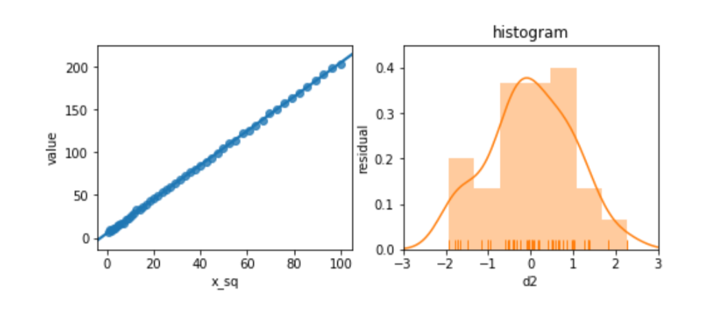
The residuals look great. Et voilà! Or, as the British say, “Bob’s your uncle.” By manipulating the features, we can adjust for unusual—nonlinear—relationships between features and target.
We can do a similar exercise that makes it clear when we should try to manipulate the target. Here, we will inject distinctly different types of noise into our relationship:
x = np.linspace(1,10,50)
n1 = np.random.normal(size=x.shape)
n2 = .5*x*np.random.normal(size=x.shape)
comparison = pd.DataFrame({"x" : x,
    "d1" : 2*x+5+n1,
    "d2" : 2*x+5+n2})
comparison['x'] = x
melted = pd.melt(comparison, id_vars=['x'])
Again, one of this is not like the other:
sns.lmplot(x='x', y='value',
    data=melted, col='variable', ci=None,
    size=3);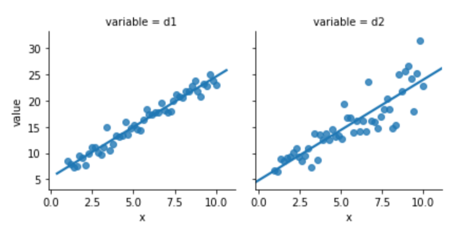
Something seems to be distinctly off with the right graph of d2. I didn’t comment on how we generated the data—but let’s focus on what we see. The errors—the vertical distance from the points to the line—are increasing in magnitude as x increases. Here is a histogram of the residuals for d1 and d2:
fig, axes = plt.subplots(1,2,figsize=(8,3))
for ax, variable in zip(axes, ['d1', 'd2']):
    predicted = (smf.ols("{} ~ x".format(variable), data=comparison)
        .fit()
        .predict())
actual = comparison[variable]
sns.distplot(predicted - actual, norm_hist=True, rug=True, ax=ax)
ax.set_xlabel(variable)
ax.set_ylabel('residual')
fig.tight_layout();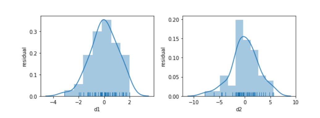
Again, we’ll try not to panic. Instead, let’s try to perform a bit of magic by taking the logarithm of the target:
magic = pd.DataFrame({"log_d2" : np.log(comparison['d2']),
    "x" : x})
melted = pd.melt(magic, id_vars=['x'])
fig, (ax1, ax2) = plt.subplots(1,2,figsize=(8,3))
sns.regplot(x='x', y='value', data=melted, ci=None, ax=ax1)
predicted = (smf.ols("log_d2 ~ x", data=magic)
    .fit()
    .predict())
actual = magic['log_d2']
sns.distplot(predicted - actual, rug=True, ax=ax2)
ax2.set_title('histogram')
ax2.set_xlim(-.7, .7)
ax2.set_ylim(0,3)
ax2.set_ylabel('residual');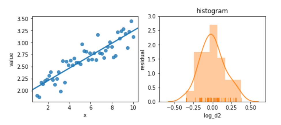
The residuals are pretty well behaved now. These examples are somewhat contrived; you won’t always see this sort of improvement from simple transformations. But they are easy to try—and you might get some improvement from them.
We’ve added to our toolbox in a very different way. We can now address issues with the data itself. These methods are widely useful: regardless of the learning method we apply, these feature engineering steps may be necessary. However, these methods are also limited. They require manual intervention, we need to be careful of overfitting with them, and they only haphazardly account for relationships between targets and features. These methods also need to be supplemented when we start dealing with data that is distinctly nontabular, like images and text.
sklearn has a normalization function whose purpose is to make rows sum to one. That’s different from what we’ve been doing: we’ve been talking about normalization over columns.
We briefly discussed sparse data storage. Some learning methods can be written so as to take advantage of sparsity: they’ll know that unfilled values are zeros and avoid doing unnecessary mathematics with those entries. I haven’t found a convenient list of sparse-aware methods in sklearn. You’ll have to find the breadcrumbs in the documentation.
We’ve discussed one-hot—also known as dummy or treatment—coding. There are other methods of encoding categorical variables that avoid the intercept problems. These methods are called contrast coding schemes. Instead of relying on one-against-one, they take one value as baseline and compare the others against it. By taking an implicit baseline, they don’t have the collinearity problem we discussed above.
A quick search with Google will get you docs for patsy and statsmodels:
You’ll find a lot of information on data transformation—feature engineering—in the statistical literature. It is often restricted to discussing linear regression. Here are a few examples:
mystery_df (below), graph x against each of the other features. Now, experiment with taking the log (np.log) of x, the other variable, or both and then graphing those values. You should be able to visually assess whether a linear regression would do well with these graphs. When would a linear regression be successful?x = np.linspace(1,8,100)
n1 = np.random.normal(size=x.shape)
n2 = x * np.random.normal(size=x.shape)
mystery = {'m1':5 + n1,
'm2':5 + n2,
'm3':x + n1,
'm4':x + n2,
'm5':np.log2(x) + n1,
'm6':np.log2(x) + n2,
'm7':np.exp2(x + n1),
'm8':np.exp2(x + n2)}
mystery_df = pd.DataFrame(mystery)
mystery_df['x'] = x
is the Product Marketing Director for Data Science, AI, and ML at Domino Data Lab, where she drives go-to-market strategy and technical content for the platform. Over six years at Domino, she has worked across training, sales engineering, product, and customer success, building a deep understanding of what it actually takes to deploy AI in regulated industries. Before entering tech, she was a neuroscientist turned data scientist.
Watch the 15 minute on-demand demo to get an overview of the Domino Enterprise AI Platform.
In this article
Watch the 15 minute on-demand demo to get an overview of the Domino Enterprise AI Platform.