The enterprise platform to build, deliver, and govern AI
Watch the 15 minute on-demand demo to get an overview of the Domino Enterprise AI Platform.
This article delves into methods for analyzing multivariate and univariate time series data.
Conducting exploratory analysis and extracting meaningful insights from data are core components of research and data science work. Time series data is commonly encountered. We see it when working with log data, financial data, transactional data, and when measuring anything in a real engineering system. Yet, because the last event affects the current event and ordering of events matter, we are obligated to use more specialized tools as compared to plain regression or classification machine learning algorithms. To support data scientists extract insights and accelerate their work, Domino reached out to Addison-Wesley Professional (AWP) for appropriate permissions to excerpt “Time Series and Autocorrelation” chapter from the book R for Everyone: Advanced Analytics and Graphics, Second Edition.
A big part of statistics, particularly for financial and econometric data, is analyzing time series, data that are autocorrelated over time. That is, one observation depends on previous observations and the order matters. Special care needs to be taken to account for this dependency. R has a number of built-in functions and packages to make working with time series easier.
One of the most common ways of fitting time series models is to use either autoregressive (AR), moving average (MA) or both (ARMA). These models are well represented in R and are fairly easy to work with. The formula for an ARMA(p, q) is where

(24.1)

(24.2)
is white noise, which is essentially random data.
AR models can be thought of as linear regressions of the current value of the time series against previous values. MA models are, similarly, linear regressions of the current value of the time series against current and previous residuals.
For an illustration, we will make use of the World Bank API to download gross domestic product (GDP) for a number of countries from 1960 through 2011.
# load the World Bank API package
> library(WDI)
> # pull the data
> gdp <- WDI(country=c("US", "CA", "GB", "DE", "CN", "JP", "SG", "IL"), indicator=c("NY.GDP.PCAP.CD", "NY.GDP.MKTP.CD"), start=1960, end=2011) >
# give it good names
> names(gdp) <- c("iso2c", "Country", "Year", "PerCapGDP", "GDP")
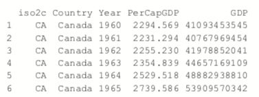
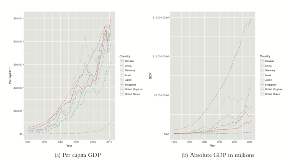
After downloading, we can inspect the data, which are stored in long country-year format with a plot of per capita GDP shown in Figure 24.1a. Figure 24.1b shows absolute GDP, illustrating that while China’s GDP has jumped significantly in the past ten years, its per capita GDP has only marginally increased.
> head(gdp)
> library(ggplot2)
library(scales)
> # per capita GDP
> ggplot(gdp, aes(Year, GDP, color=Country, linetype=Country))
+      geom_line() + scale_y_continuous(label=dollar)
>
> library(useful)
> # absolute GDP
> ggplot(gdp, aes(Year, GDP, color=Country, linetype=Country)) +
+     geom_line() +   scale_y_continuous(label=multiple_format(extra=dollar,
+                                                              multiple="M"))
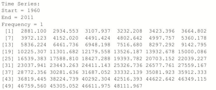
First we will only look at only one time series, so we extract the data for the United States.
> # get US data
> us <- gdp$PerCapGDP[gdp$Country == "United States"] > # convert it to a time series
> us <- ts(us, start=min(gdp$Year), end=max(gdp$Year)) > us
> plot(us, ylab="Per Capita GDP", xlab="Year")
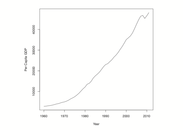
Figure 24.2 Time series plot of US per capita GDP.
Another way to assess a time series is to view its autocovariance function (ACF) and partial autocovariance function (PACF). In R this is done with the appropriately named acf and pacf functions.
The ACF shows the correlation of a time series with lags of itself. That is, how much the time series is correlated with itself at one lag, at two lags, at three lags and so on.
The PACF is a little more complicated. The autocorrelation at lag one can have lingering effects on the autocorrelation at lag two and onward. The partial autocorrelation is the amount of correlation between a time series and lags of itself that is not explained by a previous lag. So, the partial autocorrelation at lag two is the correlation between the time series and its second lag that is not explained by the first lag.
The ACF and PACF for the US per capita GDP data are shown in Figure 24.3. Vertical lines that extend beyond the horizontal line indicate autocorrelations and partial autocorrelations that are significant at those lags.
> acf(us)
> pacf(us)
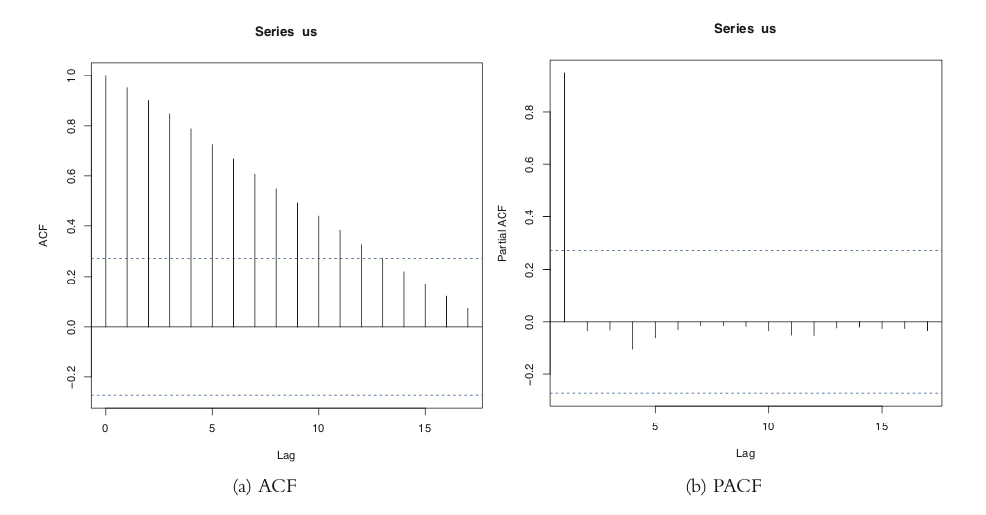
Figure 24.3 ACF and PACF of US per capita GDP. These plots are indicative of a time series that is not stationary.
This time series needs a number of transformations before it can be properly modeled. Its upward trend shows that it is not stationary1 (the data are in current US dollars, so inflation is not the cause). [Note: Being stationary requires that the mean and variance of a time series are constant for the whole series.] That can be fixed by diffing the series or applying some other transformation. Diffing is the process of subtracting one observation from another and can be done on any number of observations. For instance, we start with a series

Diffing it yields
![x(1) = [3 4 -6 4 0 -1 -2]](https://cdn.sanity.io/images/kuana2sp/production-main/a2437f321a2d75d7203a0c449e68386cb3062b7b-420x142.png?w=1920&fit=max&auto=format)
which is the difference between successive elements. Diffing twice iteratively diffs the diffs, so
![x(1) = 3 4 -6 4 0 -1 -2]](https://cdn.sanity.io/images/kuana2sp/production-main/4bc26be9ec1292947b084ec21729bdd514e686f4-402x100.png?w=1920&fit=max&auto=format)
Observe that for each level of diffing the there is one less element in the series. Doing this in R involves the diff function. The differences argument controls how many diffs are iteratively calculated. The lag determines which elements get subtracted from each other. A lag of 1 subtracts successive elements, while a lag of 2 subtracts elements that are two indices away from each other.
> x <- c(1 , 4 , 8 , 2 , 6 , 6 , 5, 3) >
# one diff

> diff(x, differences=1)[1] 3 4-6 4 0-1-2> # two iterative diffs
> diff(x, differences=2)[1] 1 -10 10 -4 -1 -1> # equivalent to one diff
> diff(x, lag=1)[1] 3 4-6 4 0-1-2> # diff elements that are two indices apart
> diff(x, lag=2)[1] 7-2-2 4-1-3Figuring out the correct number of diffs can be a tiresome process. Fortunately, the forecast package has a number of functions to make working with time series data easier, including determining the optimal number of diffs. The result is shown in Figure 24.4.
> library(forecast)
> ndiffs(x=us)[1] 2> plot(diff(us, 2))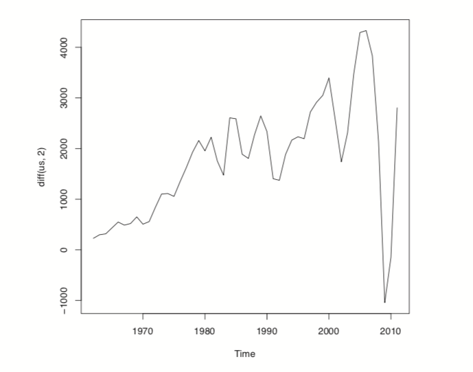
Figure 24.4 Plot of the US per capita GDP diffed twice.
While R offers individual ar and ma functions, a better option is the arima function, which can fit both AR and MA models and the combined ARMA model. It is even more robust in that it can diff the series and fit seasonal effects. Traditionally, the right order of each component of the model is determined by analyzing the ACF and PACF. This can be highly subjective, so fortunately forecast contains auto.arima, which will figure out the best specification.
> usBest <- auto.arima(x=us)
> usBestSeries:
ARIMA(2,2,1)Coefficients:
ar1 ar2 ma1
0.4181 -0.2567 -0.8102
s.e. 0.1632 0.1486 0.1111sigma^2 estimated as 286942: log likelihood=-384.05
AIC=776.1 AICc=776.99 BIC=783.75The function determined that an ARMA(2,1) (an AR(2) component and an MA(1) component) with two diffs is the optimal model based on minimum AICC (that is, AIC that is “corrected” to give a greater penalty to model complexity). The two diffs actually make this an ARIMA model rather than an ARMA model where the I stands for integrated. If this model is a good fit, then the residuals should resemble white noise.
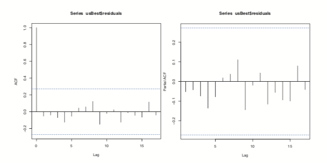
Figure 24.5 ACF and PACF plots for the residuals of ideal model chosen by auto.arima.
Figure 24.5 shows the ACF and PACF of the residuals for the ideal model. They resemble the pattern for white noise, confirming our model selection.
> acf(usBest$residuals)
> pacf(usBest$residuals)
The coefficients for an ARIMA model are the AR and MA components.
> coef(usBest)
       ar1        ar2        ma1
 0.4181109 -0.2567494 -0.8102419
Making predictions based on an ARIMA model is much the same as with any other model type, using the predict<c/ode> function.
> # predict 5 years into the future and include the standard error
> predict(usBest, n.ahead=5, se.fit=TRUE)$pred
Time Series:
Start = 2012
End = 2016
Frequency = 1
[1] 49292.41 50289.69 51292.41 52344.45 53415.70$se
Time Series:
Start = 2012
End = 2016
Frequency = 1
[1] 535.6701 1014.2773 1397.6158 1731.1312 2063.2010Visualizing this is easy enough but using the forecast function makes it even easier, as seen in Figure 24.6.
> # make a prediction for 5 years out

> theForecast
<- forecast(object=usBest, h=5) >
# plot it
> plot(theForecast)
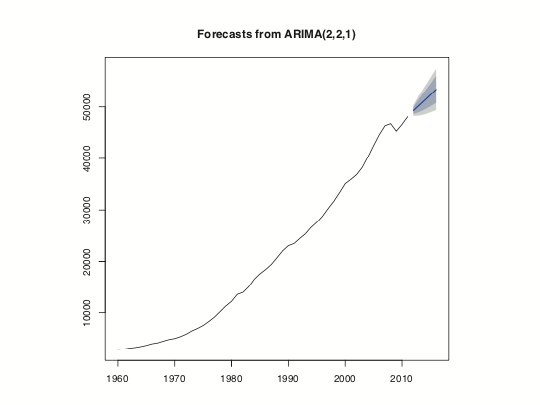
Figure 24.6 Five year prediction of US GDP. The think line is the point estimate and the shaded regions represent the confidence intervals.
When dealing with multiple time series where each depends on its own past, others’ pasts and others’ presents, things get more complicated. The first thing we will do is convert all of the GDP data into a multivariate time series. To do this we first cast the data.frame to wide format and then call ts to convert it. The result is shown in Figure 24.7.
> # load reshape2
> library(reshape2)
> # cast the data.frame to wide format
> gdpCast <- dcast(Year ~ Country,
                   data=gdp[, c("Country", "Year", "PerCapGDP")],
                   value.var="PerCapGDP")> head(gdpCast)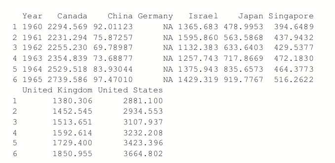
> # remove first 10 rows since Germany did not have

>

> # convert to time series

> gdpTS <- ts(data=gdpCast[, -1], start=min(gdpCast$Year),
+                   end=max(gdpCast$Year))
>

> # build a plot and legend using base graphics
>  plot(gdpTS, plot.type="single", col=1:8)
> legend("topleft", legend=colnames(gdpTS), ncol=2, lty=1,
+         col=1:8, cex=.9)
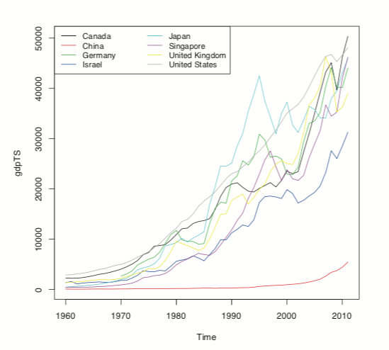
Figure 24.7 Time series plot of GDP data for all countries in the data. This is the same information as in Figure 24.1a, but this was built using base graphics.
Before proceeding we have to deal with the NAs for Germany. For some reason the World Bank does not have data on Germany’s GDP before 1970. There are other resources, such as the St. Louis Federal Reserve Economic Data (FRED), but their data do not agree well with the World Bank data, so we remove Germany from our data.
> gdpTS <- gdpTS[, which(colnames(gdpTS) != "Germany")]
The most common way of fitting a model to multiple time series is to use a vector autoregressive (VAR) model. The equation for a VAR is

(24.3)
where

(24.4)
is white noise.
While ar can compute a VAR, it often has problems with singular matrices when the AR order is high, so it is better to use VAR from the vars package. To check whether the data should be diffed, we use the ndiffs function on gdpTS and then apply that number of diffs. The diffed data is shown in Figure 24.8, which exhibits greater stationarity than Figure 24.7.
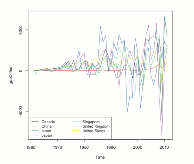
Figure 24.8 Differenced GDP data.
> numDiffs <- ndiffs(gdpTS) > numDiffs[1] 1> gdpDiffed <- diff(gdpTS, differences=numDiffs) > plot(gdpDiffed, plot.type="single", col=1:7)> legend("bottomleft", legend=colnames(gdpDiffed), ncol=2, lty=1,+ col=1:7, cex=.9) Now that the data is prepared, we can fit a VAR using VAR. This essentially fits a separate regression using lm of each time series on the lags of itself and the other series. This is evidenced in the coefficient plot for the Canada and Japan models, shown in Figure 24.9.
> library(vars)> # fit the model
> gdpVar <- VAR(gdpDiffed, lag.max=12) > # chosen order
> gdpVar$pAIC(n) 6> # names of each of the models > names(gdpVar$varresult)[1] "Canada" "China" "Israel"[4] "Japan" "Singapore" "United.Kingdom"[7] "United.States"> # each model is actually an lm object > class(gdpVar$varresult$Canada)[1] "lm"
> class(gdpVar$varresult$Japan)[1] "lm"> # each model has its own coefficients > head(coef(gdpVar$varresult$Canada))
> head(coef(gdpVar$varresult$Japan))

> library(coefplot)
> coefplot(gdpVar$varresult$Canada)
> coefplot(gdpVar$varresult$Japan)
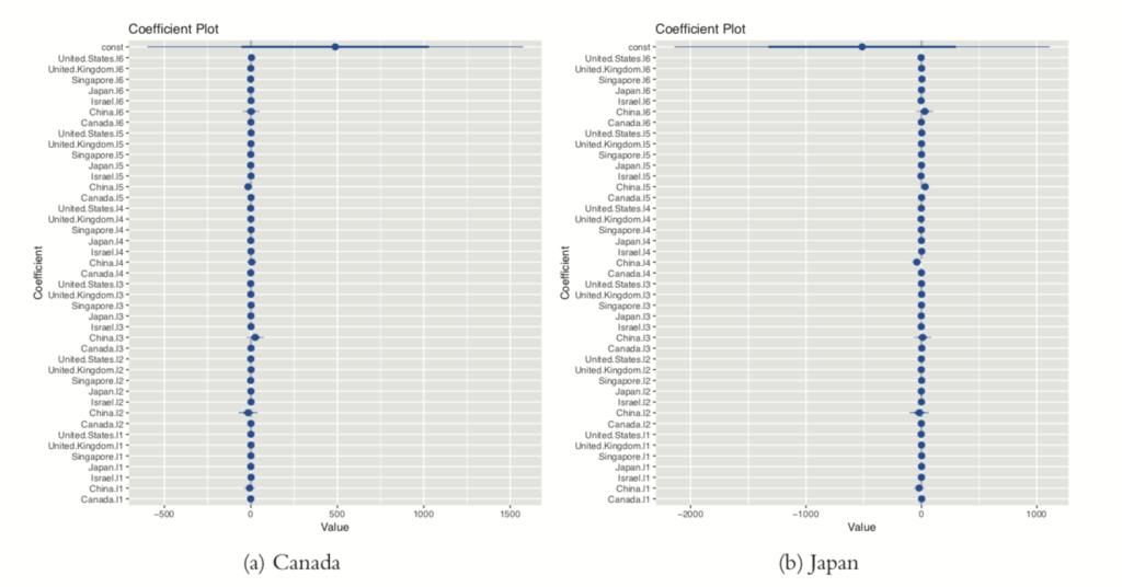
Figure 24.9 Coefficient plots for VAR model of GDP data for Canada and Japan.
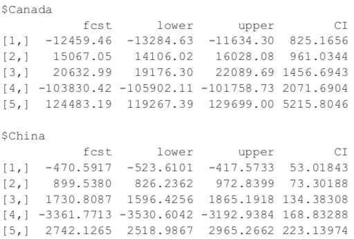
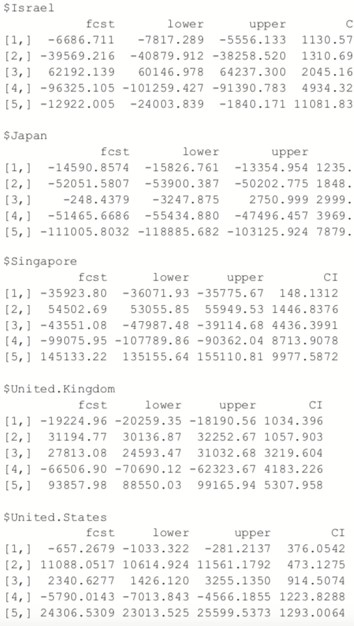
Predictions for this model are done just like with any other model, using the
predict function.
> predict(gdpVar, n.ahead=5)
A problem with ARMA models is that they do not handle extreme events or high volatility well. To overcome this, a good tool to use is generalized autoregressive conditional heteroskedasticity or the GARCH family of models, which in addition to modelling the mean of the process also model the variance.
The model for the variance in a GARCH(m, s) is

(24.5)
where

(24.6)
and

(24.7)
is generalized white noise.
For this example we download AT&T ticker data using the quantmod package.
> library(quantmod)

> load("data/att.rdata")
> library(quantmod)

> att <- getSymbols("T", auto.assign=FALSE)
This loads the data into an xts object from the xts package, which is a more robust time series object that, among many other improvements, can handle irregularly spaced events. These objects even have improved plotting over ts, as seen in Figure 24.10.
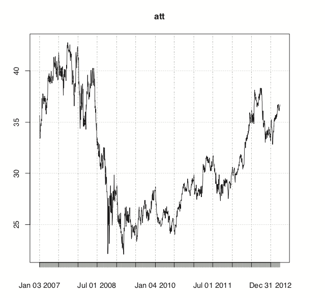
Figure 24.10 Time series plot of AT&T ticker data.
>library(xts)
> # show data
> head(att)

> plot(att)
For those used to financial terminal charts, the chartSeries function should be
comforting. It created the chart shown in Figure 24.11.
> chartSeries(att)

> addBBands()

> addMACD(32, 50, 12)
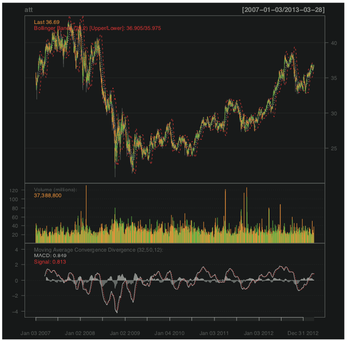
Figure 24.11 Series chart for AT&T.
We are only interested in the closing price, so we create a variable holding just that.
> attClose <- att$T.Close
> class(attClose)[1] "xts" "zoo"> head(attClose)           T.Close
2007-01-03   34.95
2007-01-04   34.50
2007-01-05   33.96
2007-01-08   33.81
2007-01-09   33.94
2007-01-10   34.03
The package most widely considered to be the best for fitting GARCH models is rugarch. There are other packages for fitting GARCH models, such as tseries, fGarch and bayesGARCH, but we will focus on rugarch.
Generally, a GARCH(1,1) will be sufficient so we will fit that model to the data. The first step is setting up the model specification using ugarchspec. We specify the volatility to be modeled as a GARCH(1, 1) and the mean to be modeled as an ARMA(1, 1). We also specify that the innovation distribution should be the t distribution.
> library(rugarch)
attSpec
<- ugarchspec(variance.model=list(model="sGARCH",
+                                    garchOrder=c(1, 1)),
+                mean.model=list(armaOrder=c(1, 1)),
+                distribution.model="std")
The next step is to fit the model using ugarchfit.
attGarch <- ugarchfit(spec=attSpec, data=attClose)
Printing the model spits out a lot of information, including the coefficients, standard errors, AIC and BIC. Most of this, such as the statistics on residuals, tests, AIC and BIC are diagnostic measures on the quality of the fit. The optimal parameters, seen near the top, are the crux of the model.
> attGarch


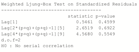
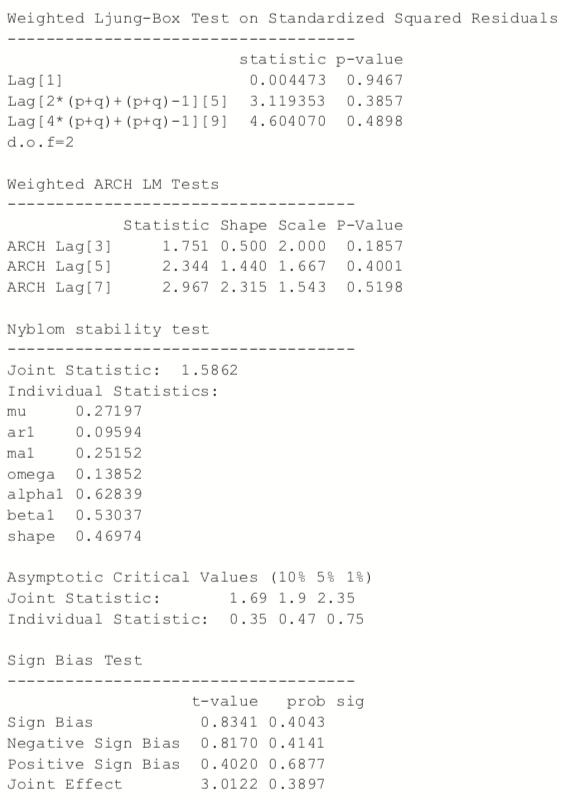
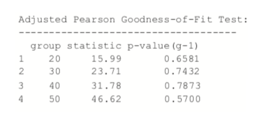
Figure 24.12 shows a time series plot and the ACF of the residuals from the model.
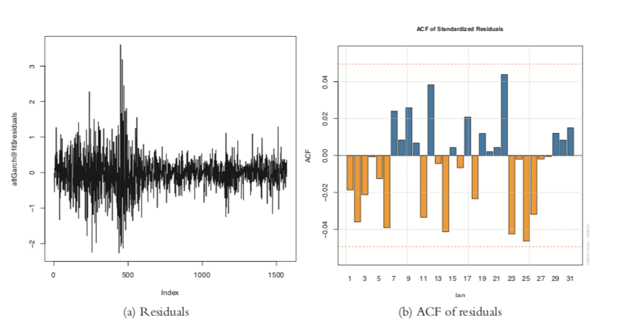
Figure 24.12 Residual plots from GARCH model on AT&T data.
To judge the quality of this model, we build a few models with different mean specifications—all GARCH(1, 1)—and compare their AICs.
> # ARMA(1,1)attSpec1 <- ugarchspec(variance.model=list(model="sGARCH", garchOrder=c(1, 1)),+ mean.model=list(armaOrder=c(1, 1)), + distribution.model="std")> # ARMA(0,0)> attSpec2 <- ugarchspec(variance.model=list(model="sGARCH", garchOrder=c(1, 1)), mean.model=list(armaOrder=c(0, 0)), distribution.model="std") > # ARMA(0,2)attSpec3 <- ugarchspec(variance.model=list(model="sGARCH", garchOrder=c(1, 1)), mean.model=list(armaOrder=c(0, 2)), distribution.model="std")> # ARMA(1,2)attSpec4 <- ugarchspec(variance.model=list(model="sGARCH", + garchOrder=c(1, 1)),+ mean.model=list(armaOrder=c(1, 2)), + distribution.model="std")> attGarch1 <- ugarchfit(spec=attSpec1, data=attClose) > attGarch2 <- ugarchfit(spec=attSpec2, data=attClose) > attGarch3 <- ugarchfit(spec=attSpec3, >data=attClose) > attGarch4 <- ugarchfit(spec=attSpec4, data=attClose) >> infocriteria(attGarch1) 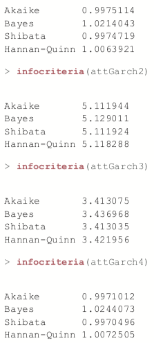
This shows that the first and fourth models were the best, according to AIC and BIC and the other criteria.
Predicting with objects from rugarch is done through the ugarchboot function, which can then be plotted as seen in Figure 24.13.
> attPred <- ugarchboot(attGarch, n.ahead=50,

+                             method=c("Partial", "Full")[1])
> plot(attPred, which=2)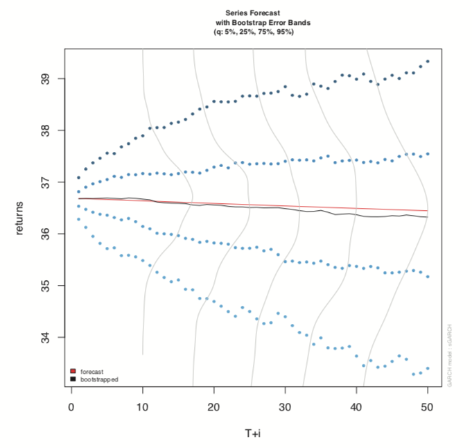
Figure 24.13 Predictions for GARCH model on AT&T data.
Because this is stock data, it is worth computing the model on the log returns instead of the actual closing prices.
> # diff the logs, drop the first one which is now NA
> attLog <- diff(log(attClose))[-1]

> # build the specification
> attLogSpec <- ugarchspec(variance.model=list(model="sGARCH",
+                                               garchOrder=c(1, 1)),
+                           mean.model=list(armaOrder=c(1, 1)),
+                           distribution.model="std")
> # fit the model
>  attLogGarch <- ugarchfit(spec=attLogSpec, data=attLog)

> infocriteria(attLogGarch)Akaike -5.869386
Bayes -5.845481
Shibata -5.869426
Hannan-Quinn -5.860500This led to a significant drop in AIC.
It is important to remember that the purpose of GARCH models is not to fit the signal better but to capture the volatility better.
Time series play a crucial role in many fields, particularly finance and some physical sciences. The basic building block in R for time series is the ts object, which has been greatly extended by the xts object. The most common types of models are ARMA, VAR and GARCH, which are fitted by the arima,VAR and ugarchfit functions, respectively.

Domino Data Lab empowers the largest AI-driven enterprises to build and operate AI at scale. Domino’s Enterprise AI Platform provides an integrated experience encompassing model development, MLOps, collaboration, and governance. With Domino, global enterprises can develop better medicines, grow more productive crops, develop more competitive products, and more. Founded in 2013, Domino is backed by Sequoia Capital, Coatue Management, NVIDIA, Snowflake, and other leading investors.
Watch the 15 minute on-demand demo to get an overview of the Domino Enterprise AI Platform.
Watch the 15 minute on-demand demo to get an overview of the Domino Enterprise AI Platform.