The enterprise platform to build, deliver, and govern AI
Watch the 15 minute on-demand demo to get an overview of the Domino Enterprise AI Platform.
R Markdown is one of those indispensable tools in a data scientist’s toolbox that provides speed and flexibility with the last-mile problem of getting your work into production. Speed comes from how easy it is to host and schedule R Markdown reports. Flexibility comes from the wide array of options for production output. Whether it is prototyping an intermediate result or producing quality output that will put your work in its best light, R Markdown has a lot to offer.
In this post we offer motivation for having a variety of deployment options on-hand when it comes time to deploy a model and build a MLOps pipeline. We make an argument for prototyping models before a project gets too far along. We encourage the use of R Markdown in both of these situations. Finally, we walk through the code needed to build a COVID-19 report using R Markdown that is scheduled to run on a regular basis and automatically emails stakeholders upon report completion.
Consider the following hypothetical scenario. You meet with your business stakeholders. You hear them explain how incredibly important it is to have particular insights about their customers. You know better than to take their word for it so you push them to quantify “incredibly important”. After verifying assumptions and crunching numbers it turns out they are right. There is a lot of ROI on the table if you can produce the right model. You go off and create a beautiful model providing insights that squarely fit the bill. This is where things start to unravel. First, you hand that model off to central IT, and a month later they’ve built a model API that can integrate into any application. Then the business stakeholders take another month to agree on the best way to integrate the API so it is useful to their decision-makers. Finally, the business unit’s IT, who owns the end-user application, gets involved with all sorts of red tape about integrating a new API into their application. Ugh! Months have passed, enthusiasm has waned, and all that ROI is still comfortably seated on the table. What went wrong?
There are two things. The first is obvious. The second, perhaps not so much. The obvious mistake was to neglect a detailed scoping of the deliverable before starting project work. That should be part of every data scientist’s pre-flight checklist. During this scoping process, a knowledge of what is possible with R Markdown will be important as it expands your options for model delivery form factors. If R Markdown meets the needs at play, it can ease the burden on IT and avoid having to build a soup-to-nuts application. If heavy IT involvement is needed, the scoping exercise will add clarity and precision to IT’s SOW.
The second mistake was a missed opportunity to get mid-project check-ins with users/model customers. Early prototyping is a great way to verify assumptions before moving to the next phase of work. Experienced data scientists will often use web apps, lightweight mocks, and R Markdown publications to prototype the delivery of their models. In our hypothetical example, the lead data scientists could have created an R Markdown parameterized HTML page which takes input from the user and returns the prediction on the HTML page. R Markdown is useful in prototyping as it allows for detailed commentary and background information that will help frame what a user is seeing in the prototype.
Let’s turn away from hypothetical to something more concrete and walk through a coding example to demonstrate the speed and flexibility of R Markdown. In this example, we want to create a simple COVID-19 HTML report comparing death rates in the US pre and post-pandemic. We will use R for all our work. The steps we will cover are:
The National Center for Health Statistics (NCHS) in the United States collects and disseminates the nation’s official vital statistics. NCHS collects death certificate data from state vital statistics offices for virtually all deaths occurring in the United States. This data can be downloaded in an R script using the cdcfluview library.
install.packages('cdcfluview')library(cdcfluview)

mypath = './data/'

mortality <- pi_mortality()
write.csv(mortality, paste(mypath,"mortality.csv", sep=''), row.names = FALSE)After reading the downloaded csv file into a dataframe, the dates will need to be formatted into the R Date format.
library(dplyr)

# Bring in CDC US mortality data
df <- read.csv('./data/mortality.csv', header = TRUE, stringsAsFactors = FALSE)
df <- df[c('total_pni','all_deaths','week_start', 'week_end')]
df$week_end <- as.Date(df$week_end, format = "%Y-%m-%d")
df$week_start <- as.Date(df$week_start, format = "%Y-%m-%d")
df <- df %>% arrange(desc(week_end))
head(df)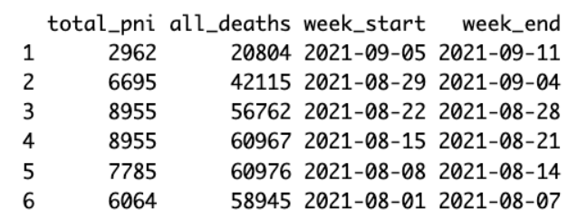
As it takes the NCHS some time to compile all the death certificates, it is advisable to remove the three most recent weeks of data, if you need a complete tally.
exc_date <- df$week_start[3]
df <- subset(df, week_start < exc_date)
head(df)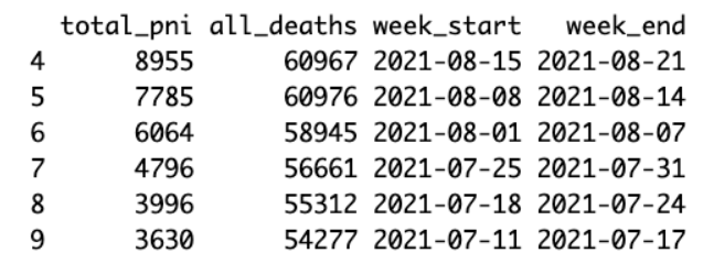
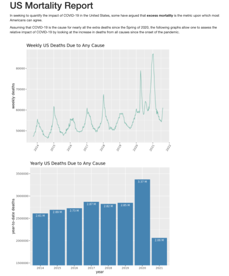
In seeking to quantify the impact of COVID-19 in the United States, some have argued that excess mortality is the metric upon which most Americans can agree.
Assuming that COVID-19 is the cause for nearly all the extra deaths since the Spring of 2020, the following graphs allow one to assess the relative impact of COVID-19 by looking at the increase in deaths from all causes since the onset of the pandemic.
# trend line
library(ggplot2)
p <- ggplot(df, aes(x=week_start, y=all_deaths)) +
scale_x_date(date_breaks = "1 year", date_labels = "%Y") +
geom_line(color="#69b3a2") +
xlab("") + ylab("weekly deaths") +
theme(axis.text.x=element_text(angle=60, hjust=1)) +
ggtitle("Weekly US Deaths Due to Any Cause")
p

# bar plot

# sum by year first
df$year <- format(as.Date(df$week_start, format="%d/%m/%Y"),"%Y")
df_year <- df %>%
group_by(year) %>%
summarise(deaths = sum(all_deaths)) %>%
as.data.frame()
df_year$deaths_label <- paste(round(df_year$deaths / 1000000,2), "M")
df_year <- df_year[df_year$year != 2013,]
head(df_year)

# calculate y axis limits
y_min <- round(min(df_year$deaths)*0.75,0)
y_max <- round(max(df_year$deaths)*1.05,0)

# plot
b <- ggplot(df_year, aes(x=year, y=deaths)) +
geom_bar(stat="identity", fill="steelblue") +
coord_cartesian(ylim = c(y_min, y_max)) +
geom_text(aes(label=deaths_label), vjust=1.6, color="white",
position = position_dodge(0.9), size=3.0) +
gtitle("Yearly US Deaths Due to Any Cause")
b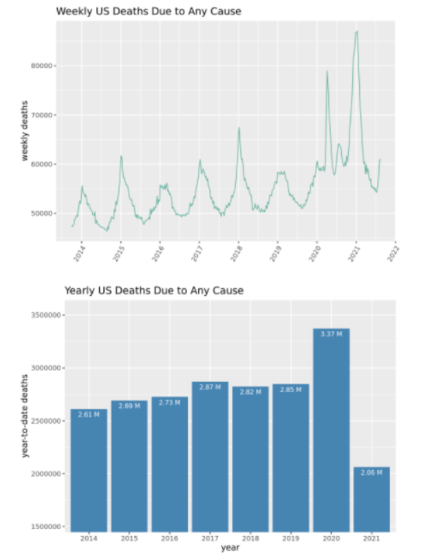
Create a title and specify the type of output. Add some descriptive text and a few break lines. Use {r, include=FALSE} to run the data processing code and {r, echo=FALSE} to display the graphs.
---
title: "US Mortality Report"
output:
html_document
---

In seeking to quantify the impact of COVID-19 in the United States, some have argued that
**excess mortality** is the metric upon which most Americans can agree.

Assuming that COVID-19 is the cause for nearly all the extra deaths since the Spring of 2020,
the following graphs allow one to assess the relative impact of COVID-19 by looking at the
increase in deaths from all causes since the onset of the pandemic.
<br>
<br>

```{r setup, include=FALSE}
# knitr::opts_chunk$set(echo = TRUE)
library(dplyr)
library(ggplot2)
tinytex::install_tinytex()

Bring in CDC US mortality data
df <- read.csv('../data/mortality.csv', header = TRUE, stringsAsFactors = FALSE)
df <- df[c('total_pni','all_deaths','week_start', 'week_end')]
df$week_end <- as.Date(df$week_end, format = "%Y-%m-%d")
df$week_start <- as.Date(df$week_start, format = "%Y-%m-%d")
df <- df %>% arrange(desc(week_end))

# Exclue the most recent rows as it seems to take the CDC several weeks to update
# total death numbers
exc_date <- df$week_start[3]
exc_date
df <- subset(df, week_start < exc_date)
```


```{r, echo=FALSE}
# plot US deaths due to any cause - trend line
p <- ggplot(df, aes(x=week_start, y=all_deaths)) +
scale_x_date(date_breaks = "1 year", date_labels = "%Y") +
geom_line(color="#69b3a2") +
xlab("") +
ylab("weekly deaths") +
theme(axis.text.x=element_text(angle=60, hjust=1)) +
ggtitle("Weekly US Deaths Due to Any Cause")
print(p)
```


```{r, include=FALSE}
# plot US deaths due to any cause - bar plot
df$year <- format(as.Date(df$week_start, format="%d/%m/%Y"),"%Y")
df_year <- df %>%
group_by(year) %>%
summarise(deaths = sum(all_deaths)) %>%
as.data.frame()
df_year$deaths_label <- paste(round(df_year$deaths / 1000000,2), "M")
df_year <- df_year[df_year$year != 2013,]
head(df_year)

y_min <- round(min(df_year$deaths)*0.75,0)
y_max <- round(max(df_year$deaths)*1.05,0)
```

```{r, echo=FALSE}
b <- ggplot(df_year, aes(x=year, y=deaths)) +
geom_bar(stat="identity", fill="steelblue") +
coord_cartesian(ylim = c(y_min, y_max)) +
geom_text(aes(label=deaths_label), vjust=1.6, color="white",
position = position_dodge(0.9), size=3.0) +
ylab("year-to-date deaths") +
ggtitle("Yearly US Deaths Due to Any Cause")
print(b)
```Rendering R Markdown is simple in the RStudio IDE. Click the Knit button when an .Rmd file is in the active editing window.
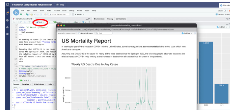
It only takes one line to render a R Markdown report programmatically in an R script. All the data processing code in the .Rmd file will be executed when this script is called. In the next step we will schedule this script to run monthly.
rmarkdown::render("./code/mortality_report.Rmd")Here’s the final report as viewed in a web browser.
There are several tools we could use to schedule the data collection. In this blog I will use the Enterprise MLOps Platform from Domino Data Lab. You can access a free trial of Domino to schedule your own jobs.
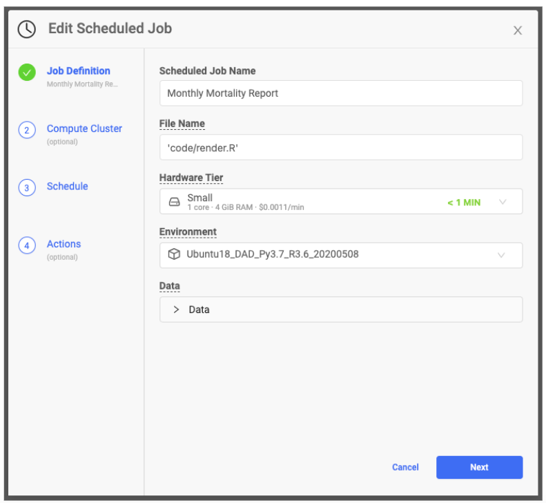
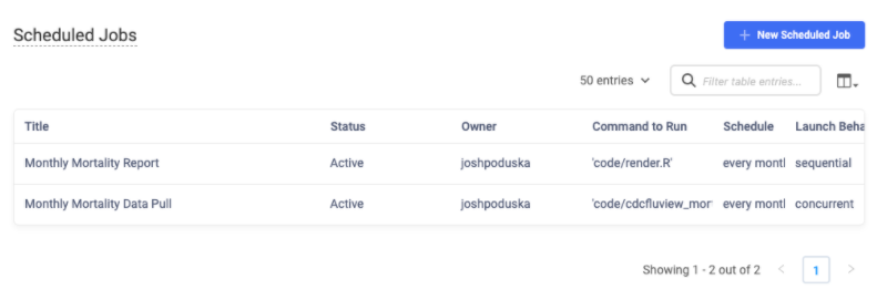
In a project that contains your files, select Scheduled Jobs in the left navigation window. Create two scheduled jobs; one to run a script that downloads the latest CDC mortality data and the other to run the one-line script that renders the R Markdown document. The data download script should start first with the rendering script running second. Domino manages the software environment so you can be sure your production pipeline uses the same docker image with the same library combinations and versions that you used in your development work.
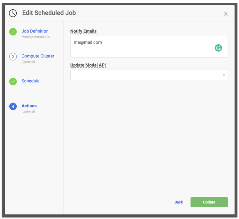
The mailR library has the ability to send emails via an R script. However, getting the library to work for all situations is not easy. Sending an email from your company email server can be tricky to set up and may require help from your IT department. Email recipients' experiences may vary depending on the type of email client they have. Sending in-body HTML documents can be fraught as CSS errors are common. An alternative is to use MLOps platforms to make emailing more seamless. For example, in Domino, you can easily include a list of email addresses in the same Scheduled Job wizard. Upon completion of the job, the recipients listed will receive an email with a link to the R Markdown report.
When going on a week-long backpacking trip, anyone would prefer a Swiss Army Knife to a standard pocket knife. It’s better to have options. The same is true when putting models into production. We never know what we will encounter with our customers and with IT as we scope out our data science deliverables. R Markdown is an important tool to help you to meet the variety of needs that can arise. Additionally, we have discussed the power that R Markdown has in prototyping model output before we get too far along in a project. This post shared code examples for building a simple HTML report and rendering it using R Markdown. Scheduling the data capture, data processing, and rendering pipeline was done with Domino, as was automatic emailing of the report to stakeholders upon completion. If you’re interested in learning more about other flexible model deployment options, you might like the Best Practices for Getting Data Science Web Apps in Production webinar.

Josh Poduska is the Chief Field Data Scientist at Domino Data Lab and has 20+ years of experience in analytics. Josh has built data science solutions across domains including manufacturing, public sector, and retail. Josh has also managed teams and led data science strategy at multiple companies, and he currently manages Domino’s Field Data Science team. Josh has a Masters in Applied Statistics from Cornell University. You can connect with Josh at https://www.linkedin.com/in/joshpoduska/
Watch the 15 minute on-demand demo to get an overview of the Domino Enterprise AI Platform.
Watch the 15 minute on-demand demo to get an overview of the Domino Enterprise AI Platform.