The enterprise platform to build, deliver, and govern AI
Watch the 15 minute on-demand demo to get an overview of the Domino Enterprise AI Platform.
Have you ever crunched some numbers on data that involved spatial locations? If the answer is no, then boy are you missing out! So much spatial data to analyze and so little time.
Since your time is precious, you know that attempting to create spatial plots in languages like Matlab or applications like Excel can be a tedious, long process. Thankfully there are a number of new R libraries being created to make spatial data visualization a more enjoyable endeavor. Of these new options, one useful package is ggmap:
install.packages("ggmap")library(ggmap)That’s it.
The fastest way to get going is with the qmap class, which stands for "quick map plot". Play around with the different types of parameter calls to render various plot types.
Some examples to start:
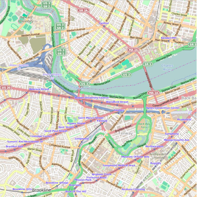
qmap(location = "boston university")qmap(location = "boston university", zoom = 14)qmap(location = "boston university", zoom = 14, source = "osm")
Here's how it works: qmap is a wrapper for get_map and ggmap. get_map is a smart wrapper that queries the map server of your choosing—Google Maps, OpenStreetMap, or Stamen Maps—and returns a map at a specified location. (Sorry, Apple and Bing Maps fans, there's no support yet for these APIs.)
As the above example shows, there's no need to add a specific latitude or longitude. ggmap accepts text search inputs with the "location" parameter when creating a map.
Spatial plotting capabilities are helpful for those running analytics in certain actuarial science industries like health or car insurance.
For example, let's visually investigate the number of motor vehicle collisions state by state. To start, I found an Excel file of fatal crashes in 2012 from the Fatality Analysis Reporting System (FARS) Encyclopedia.
After loading the ggmap library, we need to load and clean up the data. The following lines load a CSV file, convert the State column to character data type, and turns the Motor Vehicle collision amounts from integer to double. Lastly, we remove Hawaii and Alaska to get a tighter map view. (Sorry!)
mydata = read.csv("vehicle-accidents.csv")mydata$State <- as.character(mydata$State)mydata$MV.Number = as.numeric(mydata$MV.Number)mydata = mydata[mydata$State != "Alaska", ]mydata = mydata[mydata$State != "Hawaii", ]Next, we use geocode to find a latitude and longitude with the Google Maps API using only the character string in mydata$State.
The following is a simple for loop that runs over each state and returns lat/lon coordinates:
for (i in 1:nrow(mydata)) {latlon = geocode(mydata[i,1])mydata$lon[i] = as.numeric(latlon[1])mydata$lat[i] = as.numeric(latlon[2])}Since we aren’t looking at other aspects of the data such as nonmotorist or fixes object collisions, we can create a new data frame to simplify the dataset:
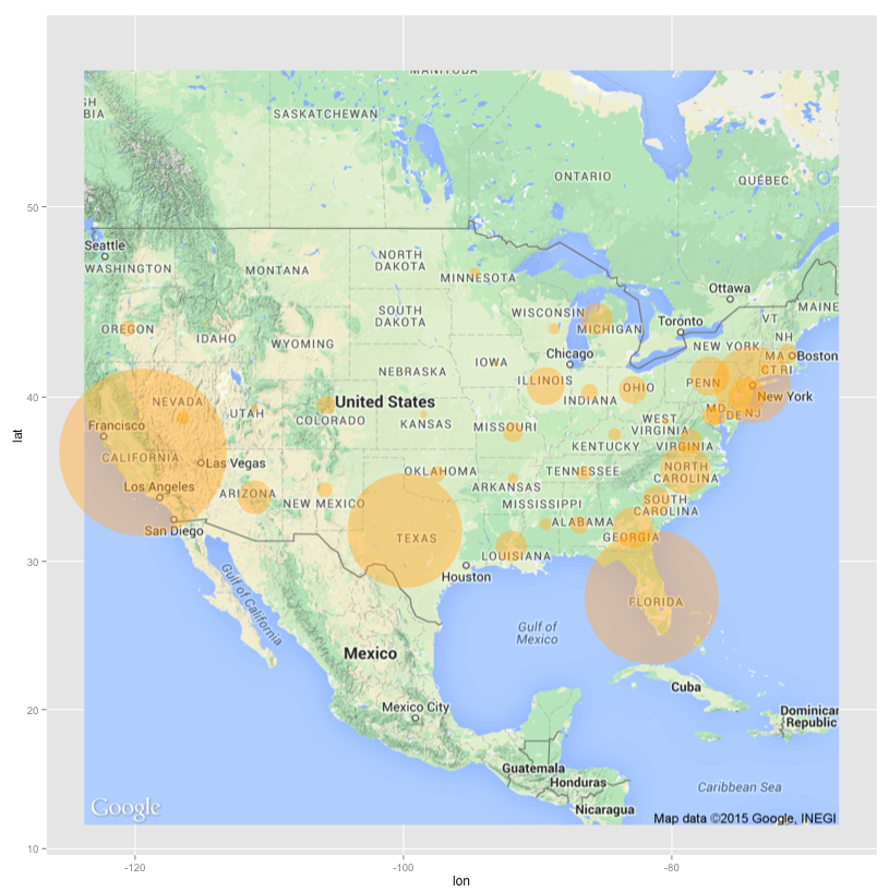
mv_num_collisions = data.frame(mydata$MV.Number, mydata$lon, mydata$lat)colnames(mv_num_collisions) = c('collisions','lon','lat')Now let's plot the number of collisions per state with varying sizes of circles to see the biggest motor vehicle collision offenders.
We get the geocode for the United States, then create a Google map that covers an area from coast to coast:
usa_center = as.numeric(geocode("United States"))USAMap = ggmap(get_googlemap(center=usa_center, scale=2, zoom=4), extent="normal")We use the + operator to add ggplot2 geometric objects and other styling options on top of the map.
The ability to combine ggmap and ggplot2 functionality is a huge advantage for visualizing data with heat maps, contour maps, or other spatial plot types. Most of this overlay capability stems from ggplot2’s geoms, or geometric objects, that determine the shape of the plot being created.
Next we add the geom_point geom to the map and generate aesthetic mappings with aes that describe how variables in the data are mapped to visual properties (aesthetics) of geoms.
Finally, the size and scale of each circle is based on the minimum and maximum value range of collision amounts per state.
USAMap +geom_point(aes(x=lon, y=lat), data=mv_num_collisions, col="orange", alpha=0.4, size=mv_num_collisions$collisions*circle_scale_amt) +scale_size_continuous(range=range(mv_num_collisions$collisions))Running the ggmap-demo-circles.R script in Domino results in a nice map of the biggest offenders: California, Florida, Texas and New York.

Shocking? No. Fun? Yes!
Let’s try one more plot type—the heat map. Continuing with the theme of data visualization for insurance insights, the next dataset looks at concentration of homes in a region and when those homes were built.
We can use get_map to download the base map, then draw a gg_map on top. Then we add:
geom_density2d: Perform a 2D kernel density estimation using kde2d and display the results with contours.stat_density2d: 2D density estimationscale_alpha: Sets alpha value for transparency.Watch the 15 minute on-demand demo to get an overview of the Domino Enterprise AI Platform.
In this article
Watch the 15 minute on-demand demo to get an overview of the Domino Enterprise AI Platform.