The enterprise platform to build, deliver, and govern AI
Watch the 15 minute on-demand demo to get an overview of the Domino Enterprise AI Platform.
Cluster Analysis is an important problem in data analysis. Data scientists use clustering to identify malfunctioning servers, group genes with similar expression patterns, and perform various other applications.
There are many families of data clustering algorithms, and you may be familiar with the most popular one: k-means. As a quick refresher, k-means determines k centroids in the data and clusters points by assigning them to the nearest centroid.
While k-means is easy to understand and implement in practice, the algorithm has no notion of outliers, so all points are assigned to a cluster even if they do not belong in any. In the domain of anomaly detection, this causes problems as anomalous points will be assigned to the same cluster as “normal” data points. The anomalous points pull the cluster centroid towards them, making it harder to classify them as anomalous points.
In this blog post, I will cover a family of techniques known as density-based clustering. Compared to centroid-based clustering like k-means, density-based clustering works by identifying “dense” clusters of points, allowing it to learn clusters of arbitrary shape and identify outliers in the data. In particular, I will:
Before we can discuss density-based clustering, we first need to cover a topic that you may have seen in a topology course: ɛ-neighborhoods.
The general idea behind ɛ-neighborhoods is given a data point, we want to be able to reason about the data points in the space around it. Formally, for some real-valued ɛ > 0 and some point p, the ɛ-neighborhood of p is defined as the set of points that are at most distance ɛ away from p.
If you think back to geometry, the shape in which all points are equidistant from the center is the circle. In 2D space, the ɛ-neighborhood of a point p is the set of points contained in a circle of radius ɛ, centered at p. In 3D space, the ɛ-neighborhood is a sphere of radius ɛ, centered at p, and in higher dimensional space, the ɛ-neighborhood is just the N-sphere of radius ɛ, centered at p.
Let’s consider an example to make this idea more concrete.
I have scattered 100 data points in the interval [1,3]X[2,4]. Let’s pick the point (3,2) to be our point p.
![100 data points in the interval [1,3]X[2,4]](https://cdn.sanity.io/images/kuana2sp/production-main/6c3dcbffa9bc6cf8a48bde38ff645cc81daca3b3-1442x1002.png?w=1920&fit=max&auto=format)
First, let’s consider the neighborhood of p with radius 0.5 (ɛ = 0.5), the set of points that are distance 0.5 away from p.
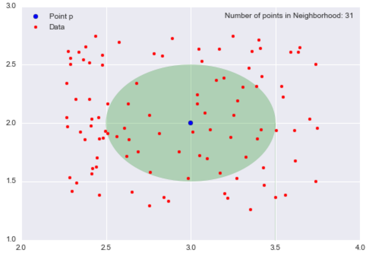
The opaque green oval represents our neighborhood, and there are 31 data points in this neighborhood. Since I scattered 100 data points and 31 are in the neighborhood, this means that a little under one-third of the data points are contained within the neighborhood of p with radius 0.5.
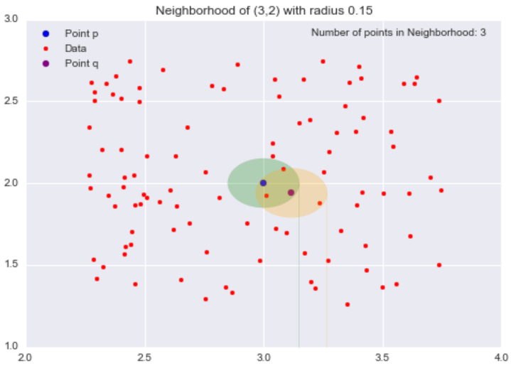
Now, let’s change our radius to 0.15 (ɛ = 0.15) and consider the resulting smaller neighborhood.
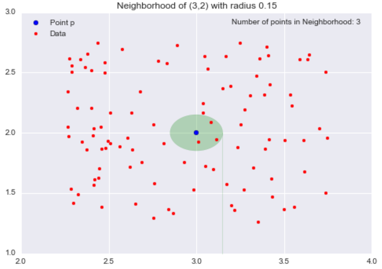
We have shrunk the neighborhood, so now only 3 data points are contained within it. By decreasing ɛ from 0.5 to 0.15 (a 70% reduction), we have decreased the number of points in our neighborhood from 31 to 3 (a 90% reduction).
Now that we have defined what we mean by a “neighborhood”, we’ll introduce the next important concept: the notion of a “density” for a neighborhood (we’re building up to describing “density-based clustering, after all).
In a grade-school science class, children are taught that density = mass/volume. Let’s use this idea of mass divided by volume to define density at some point p. If we consider some point p and its neighborhood of radius ɛ, we can define the mass of the neighborhood as the number of data points (or alternatively, the fraction of data points) contained within the neighborhood, and the volume of the neighborhood is volume of the resulting shape of the neighborhood. In the 2D case, the neighborhood is a circle, so the volume of the neighborhood is just the area of the resulting circle. In the 3D and higher dimensional case, the neighborhood is a sphere or n-sphere, so we can calculate the volume of this shape.
For example, let’s consider our neighborhood of p = (3,2) of radius 0.5 again.
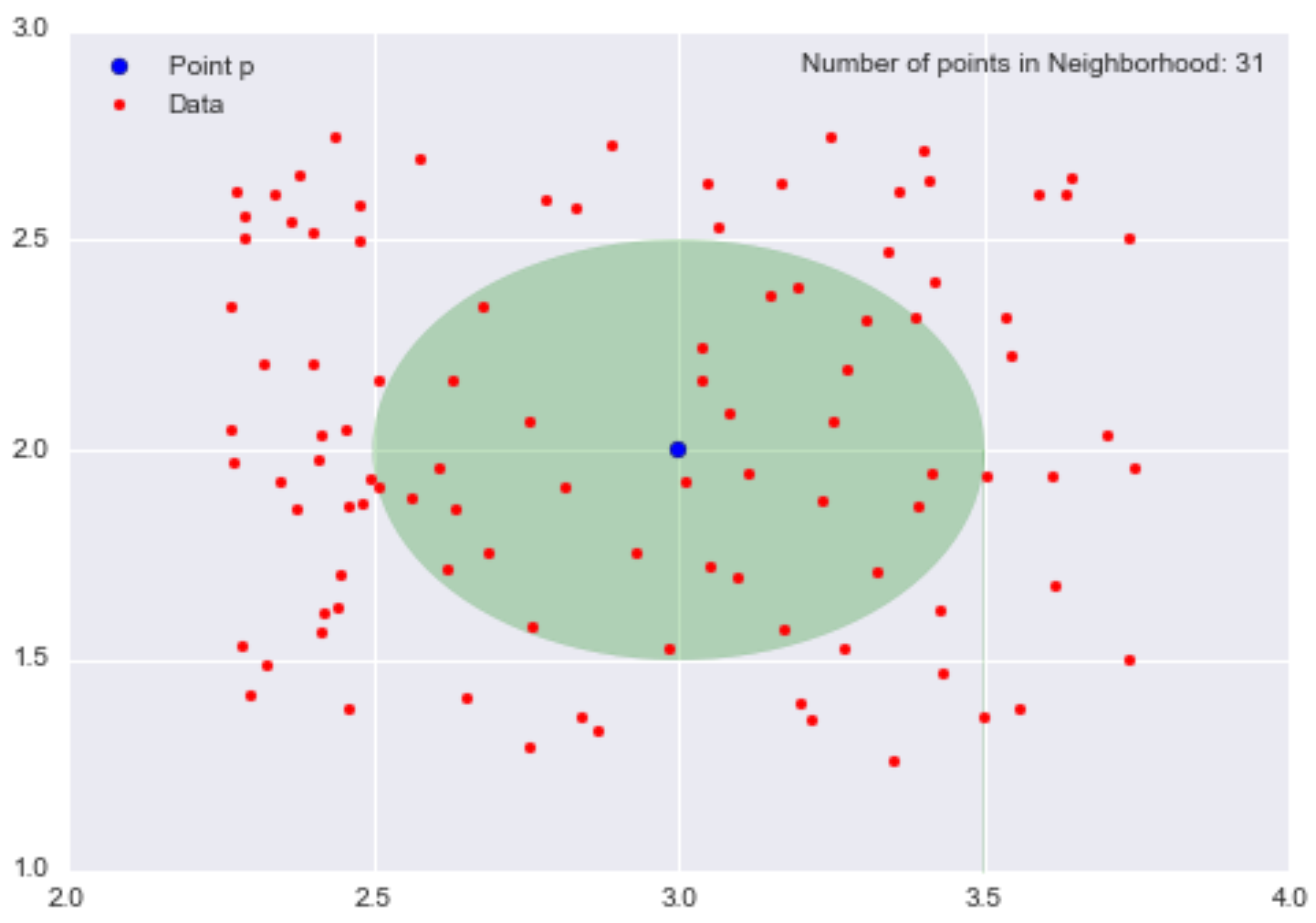
The mass is the number of data points in the neighborhood, so mass = 31. The volume is the area of the circle, so volume = π0.25 = π/4. Therefore, our local density approximation at *p = (3,2) is calculated as density = mass/volume = 31/(π/4) = 124/π ~= 39.5.
This value is meaningless by itself, but if we calculate the local density approximation for all points in our dataset, we could cluster our points by saying that points that are nearby (contained in the same neighborhood) and have similar local density approximations belong in the same cluster. If we decrease the value of ɛ, we can construct smaller neighborhoods (less volume) that would also contain fewer data points. Ideally, we want to identify highly dense neighborhoods where most of the data points are contained in these neighborhoods, but the volume of each of these neighborhoods is relatively small.
While this is not exactly what either DBSCAN or the Level Set Tree algorithm does, it forms the general intuition behind density-based clustering.
To recap, we discussed the ɛ-neighborhoods and how they allow us to reason about the space around a particular point. Then we defined a notion of density at a particular point for a particular neighborhood. In the next section, I’ll discuss the DBSCAN algorithm where the ɛ-ball is a fundamental tool for defining clusters.
DBSCAN (Density-Based Spatial Clustering of Applications with Noise) is the most well-known density-based clustering algorithm, first introduced in 1996 by Ester et. al. Due to its importance in both theory and applications, this algorithm is one of three algorithms awarded the Test of Time Award at the KDD conference in 2014.
Unlike k-means, DBSCAN does not require the number of clusters as a parameter. Rather it infers the number of clusters based on the data, and it can discover clusters of arbitrary shape (for comparison, k-means usually discovers spherical clusters). As I said earlier, the ɛ-neighborhood is fundamental to DBSCAN to approximate local density, so the algorithm has two parameters:
Using these two parameters, DBSCAN categories the data points into three categories:
These definitions may seem abstract, so let’s cover what each one means in more detail.
Core Points are the foundations for our clusters are based on the density approximation I discussed in the previous section. We use the same ɛ to compute the neighborhood for each point, so the volume of all the neighborhoods is the same. However, the number of other points in each neighborhood is what differs. Recall that I said we can think of the number of data points in the neighborhood as its mass. The volume of each neighborhood is constant, and the mass of neighborhood is variable, so by putting a threshold on the minimum amount of mass needed to be a core point, we are essentially setting a minimum density threshold. Therefore, core points are data points that satisfy a minimum density requirement. Our clusters are built around our core points (hence the core part), so by adjusting our minPts parameter, we can fine-tune how dense our clusters' cores must be.
Border Points are the points in our clusters that are not core points. In the definition above for border points, I used the term density-reachable. I have not defined this term yet, but the concept is simple. To explain this concept, let’s revisit our neighborhood example with epsilon = 0.15. Consider the point r (the black dot) that is outside of the point p‘s neighborhood.
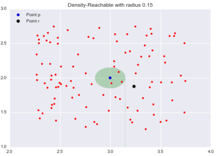
All the points inside the point p‘s neighborhood are said to be directly reachable from p. Now, let’s explore the neighborhood of point q, a point directly reachable from p. The yellow circle represents q‘s neighborhood.
Now while our target point r is not our starting point p‘s neighborhood, it is contained in the point q‘s neighborhood. This is the idea behind density-reachable: If I can get to the point r by jumping from neighborhood to neighborhood, starting at a point p, then the point r is density-reachable from the point p.
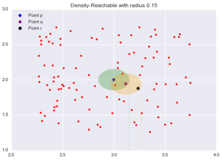
As an analogy, we can think of density-reachable points as being the “friends of a friend”. If the directly-reachable of a core point p are its “friends”, then the density-reachable points, points in the neighborhood of the “friends” of p, are the “friends of its friends”. One thing that may not be clear is density-reachable points are not limited to just two adjacent neighborhood jumps. As long as you can reach the point doing “neighborhood jumps”, starting at a core point p, that point is density-reachable from p, so “friends of a friend of a friend … of a friend” are included as well.
It is important to keep in mind that this idea of density-reachable is dependent on our value of ɛ. By picking larger values of ɛ, more points become density-reachable, and by choosing smaller values of ɛ, less points become density-reachable.
Finally, we get to our “other” class. Outliers are points that are neither core points nor are they close enough to a cluster to be density-reachable from a core point. Outliers are not assigned to any cluster and, depending on the context, may be considered anomalous points.
Now that I have covered all the preliminaries, we can finally talk about how the algorithm works in practice.
DBSCAN is implemented in the popular Python machine learning library Scikit-Learn, and because this implementation is scalable and well-tested, I will be using it to demonstrate how DBSCAN works in practice.
The steps to the DBSCAN algorithm are:
Thanks to Scikit-Learn’s easy-to-use API, we can implement DBSCAN in only a couple lines of code
from sklearn.cluster import DBSCANTo test out DBSCAN, I’m going to use a dataset consisting of annual customer data for a wholesale distributor.
The dataset consists of 440 customers and has 8 attributes for each of these customers. I will use the Pandas library to load the .csv file into a DataFrame object:
import pandas as pd
data = pd.read_csv("data/wholesale.csv")
#Drop non-continuous variables
data.drop(["Channel", "Region"], axis = 1, inplace = True)
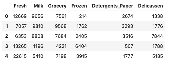
After dropping two fields that identify the customer, we can examine the first few rows of this dataset:
So we can visualize the data, I’m going to use only two of these attributes:
data = data[["Grocery", "Milk"]]
data = data.to_numpy().astype("float32", copy = False)
Because the values of the data are in the thousands, we are going to normalize each attribute by scaling it to 0 mean and unit variance.
stscaler = StandardScaler().fit(data)
data = stscaler.transform(data)
Now, let’s visualize the normalized dataset:
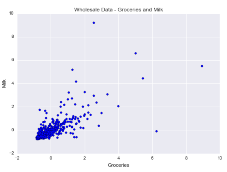
As you can see, there is positive correlation between grocery purchases and milk product purchases. There is a cluster centered about the mean milk purchase (milk = 0) and the mean groceries purchase (groceries = 0). In addition, there are a handful of outliers pertaining to customers who buy more groceries or milk products compared to other customers.
With DBSCAN, we want to identify this main cluster of customers, but we also want to flag customers with more unusual annual purchasing habits as outliers.
We will construct a DBSCAN object that requires a minimum of 15 data points in a neighborhood of radius 0.5 to be considered a core point.
dbsc = DBSCAN(eps = .5, min_samples = 15).fit(data)
Next, we can extract our cluster labels and outliers to plot our results.
labels = dbsc.labels_
core_samples = np.zeros_like(labels, dtype = bool)
core_samples[dbsc.core_sample_indices_] = True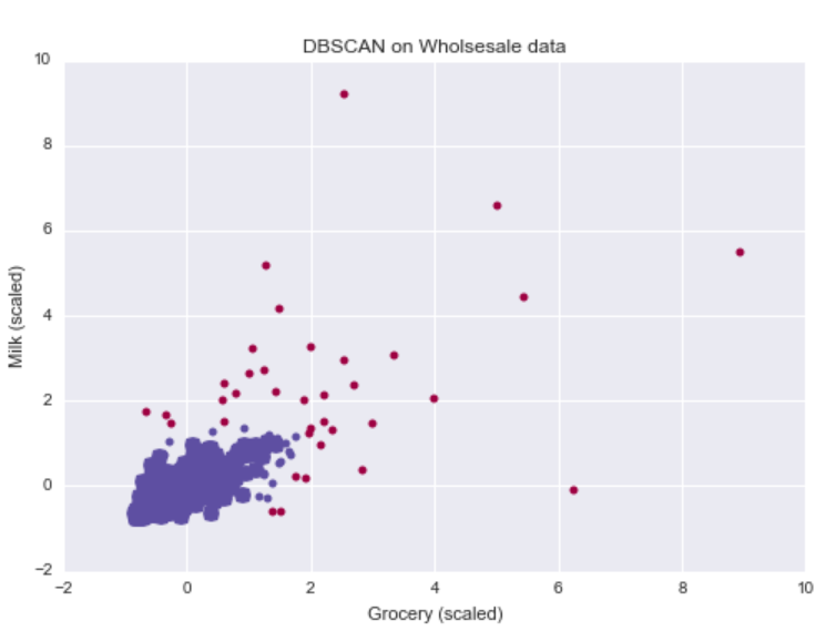
Lining up with our intuition, the DBSCAN algorithm was able to identify one cluster of customers who buy about the mean grocery and mean milk product purchases. In addition, it was able to flag customers whose annual purchasing behavior deviated too heavily from other customers.
Because the outliers corresponded to customers with more extreme purchasing behavior, the wholesale distributor could specifically target these customers with exclusive discounts to encourage larger purchases.
As a baseline, let’s run k-means with two clusters on this dataset. The big blue dot represents the centroid for the black cluster, and the big gold dot represents the centroid for the white cluster:
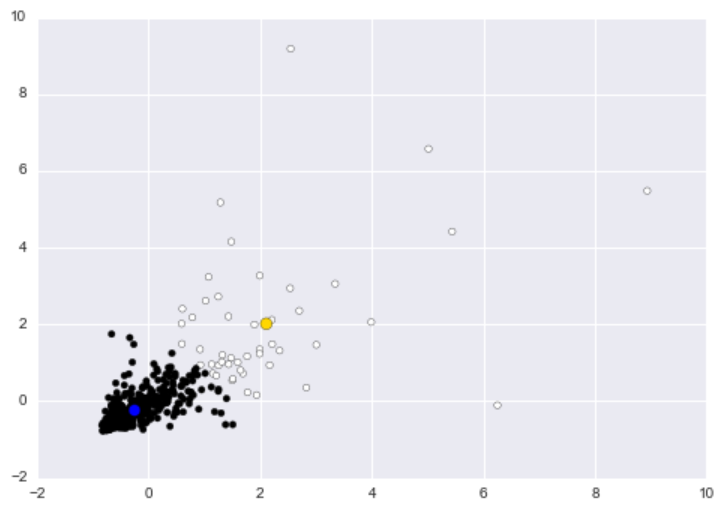
While the white clusters appear to capture most of the outliers, the cluster basically captures customers who purchase relatively more goods. If we designate the white cluster as the “anomalous” cluster, then we basically flag any customer who purchases a lot of milk or groceries. If you were the wholesale distributor, then you would be calling your better customers, the ones whom you make more money from, anomalies.
For a more contrived but impressive illustration of DBSCAN’s capabilities, let’s consider a toy example informally known as the “half-moons” dataset where each data point belongs to one of the two “half-moons”.
from sklearn.datasets import make_moons
#moons_X: Data, moon_y: Labels
moons_X, moon_y = make_moons(n_samples = 2000)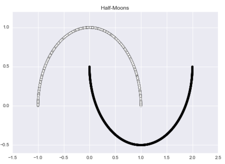
This dataset is aesthetically pleasing, but it has no outliers. To rectify this problem, I am going to add random noise to 1% of the data using the following code:
def add_noise(X,y, noise_level = 0.01):
    #The number of points we wish to make noisy
    amt_noise = int(noise_level*len(y))
    #Pick amt_noise points at random
    idx = np.random.choice(len(X), size = amt_noise)
    #Add random noise to these selected points
    noise = np.random.random((amt_noise, 2) ) -0.5
    X[idx,:] += noise
    return X
Now the dataset has noticeable outliers.
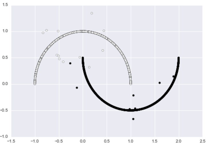
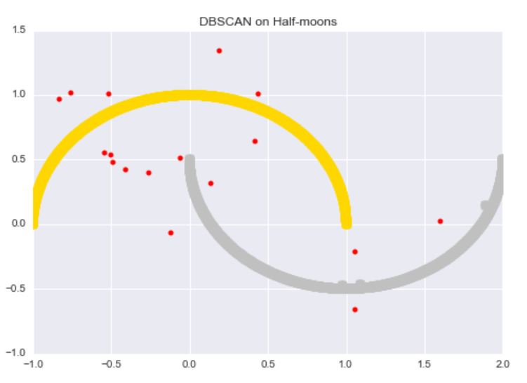
We can run DBSCAN on the data to get the following results. The algorithm successfully discovers both “half-moons” and identifies almost every noisy data point as an outlier.
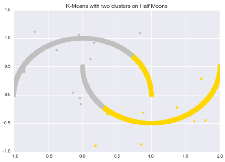
In contrast, k-Means performs poorly on this dataset. The algorithm can not successfully discover the “half-moon” structure, nor can it distinguish the noisy data points from the original data points.
The Level Set Tree clustering algorithm was developed in 2010 by Chaudhuri and Dasgupta, two computer scientist at UC San Diego. For this section, I will be using the denpro R package, developed by professor and author, Jussi Klemela. This library contains an efficient implementation of the Level Set Tree clustering algorithm.
While DBSCAN is built on ɛ-balls as its foundation, Level Set Tree clustering is built on, as the name suggests, level sets.
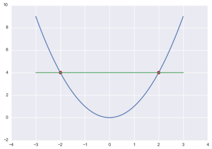
If we have some mathematical function f and some constant c, then the level set Lc is all the values of x such that f(x) = c. Formally, in mathematical set builder notation.
Lc(f) = { x in X| f(x) = c}
For example, if f(x) = x2 and c = 4, then Lc(f) = {-2, 2} because f(-2) = (-2)2 = 4 and f(2) = 22 = 4.
To build the Level Set Trees, we are going to use a special class of level sets called λ-upper level sets. For some constant λ and some function f, the λ-upper level set of f, Lλ(f), is defined as:
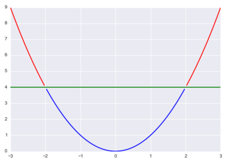
Lλ(f) = { x in X| f(x) >= λ}
Essentially, this is where a function is greater than or equal to some constant λ. Returning back to our previous example of f(x) = x2 and λ = 4, the λ-upper level set of f would be (-∞,-2]U[2,∞).
Now, I’m sure you are wondering how we can use this mathematical object to perform clustering. The basic idea is that we assume our data is generated according to some probability density function f, so if we pick λ to a constant in the interval [0,1], our λ-upper level sets correspond to regions of the data that are denser than our threshold λ.
Our goal is to use the threshold parameter λ to identify high-density clusters that correspond to connected regions of the data with similar densities.
Now, let’s talk about the Tree part of the algorithm. Let’s say we start with a high initial value of λ, say λ = 0.7, and compute the resulting λ-upper level set of f. We end up with a set of points such that f(x) >= 0.7 for each point in the upper level set. Now, let’s decrease the value of λ to 0.5 and compute the resulting λ-upper level set. Now by the transitive property, all the points in the λ = 0.7-upper level set are also members of the λ = 0.5-upper level set because if f(x) >= 0.7 and 0.7 >= 0.5, then f(x) >= 0.5.
Generalizing this pattern, if λ1 < λ2, then Lλ2 (f) is a subset of Lλ1 (f). Essentially, if we were to iterate through an increasing sequence of λ’s, we would create an λ-upper level set that is a subset of the previous upper level sets. This is the tree structure: The root represents λ = 0.0 (all the points), and each branch represents a higher value of λ and thus a subset of the points from the previous level.
Since we don’t know the true probability density function f that generates the data, we are going to need to estimate it. Previously, we used our ɛ-Balls to estimate density by computing the “mass” to “volume” ratio of our neighborhoods.
Here we use a similar method called k-Nearest Neighbor Density Estimation to estimate the underlying probability density function f. With the ɛ-Balls method, we first fixed the volume of the neighborhood and then counted the number of points within the neighborhood to determine the mass. With the k-Nearest Neighbor Density Estimation method, we’re going to do the opposite; first we fix the mass to be some number k, then we compute the volume necessary to get k points within our ball.
In machine learning, one of the most basic classification algorithms is k-Nearest Neighbors (k-NN) classification. A quick refresher on k-NN classification:
With k-NN density estimation, we are going to do something similar. Like I said above, we want k points in our neighborhood, so we are going to find the volume of the smallest neighborhood that contains exactly k points.
To estimate the density of a given point using k-NN density estimation, we are going to find the distance to the Kth nearest point, dk, and use this as the radius of our neighborhood. By doing this, we get a neighborhood around our point with exactly k other points in it.
The mathematical equation for the k-Nearest Neighbor estimator is included below:

In this equation, k is the number of points we want in our neighborhood, xi is our given point, n is the number of points in the dataset, vd is the volume of the d-dimensional Euclidean ball, and rk(xi) is the distance to the kth nearest point.
For 2-dimensional data, the volume of the 2-dimensional Euclidean ball is πR2 where R = 1, so vd = π, in this case.
The following code computes the k-NN density estimate for 2-dimensional data using the TDA R package:
## kernel density estimator
install.packages('TDA')
library(TDA)
k <- 500
KNN <- knnDE(crater_xy, crater_xy, k)
qplot(x, y, data = crater, size = KNN, colour = KNN, main = 'KNN Density Estimate on Crater Dataset') +
scale_colour_continuous(low = "black", high = "red")
To demonstrate how k-NN density estimation, let’s consider a toy dataset informally called the “crater” dataset. The dataset consists of a very dense core (“impact” of the crater) with a less dense ring surrounding the core.
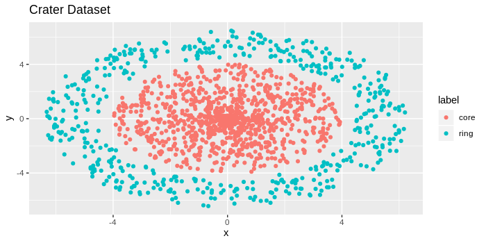
If you look at the image above, you’ll notice a tightly bundled set of data points in the center, and the points appear to get less bundled as we move away from the center. There are 2,000 red data points, and 1,000 blue data points, for reference.
The code I used to create this toy dataset is provided below:
makeCraters <- function(inner_rad = 4, outer_rad = 4.5,
donut_len = 2, inner_pts = 1000,
outer_pts = 500){
#Make the inner core
radius_core <- inner_rad*runif(inner_pts)
direction_core <- 2*pi*runif(inner_pts)
#Simulate inner core points
core_x <- radius_core*cos(direction_core)
core_y <- radius_core*sin(direction_core)
crater <- data.frame(x=core_x, y=core_y, label='core')
#Make the outer ring
radius_ring <- outer_rad + donut_len*runif(outer_pts)
direction_ring <- 2*pi*runif(outer_pts)
#Simulate ring points
ring_x <- radius_ring*cos(direction_ring)
ring_y <- radius_ring*sin(direction_ring)
crater_ring <- data.frame(x=ring_x, y=ring_y, label='ring')
crater <- rbind(crater, crater_ring)return(crater)}crater <- makeCraters()crater_xy <- crater[,c(1,2)]require(ggplot2)qplot(x, y, data = crater, colour = label, main = 'Crater Dataset')
From the above image, we should expect for the points near the center to have higher k-NN density estimates and the points in the outer ring to have lower k-NN density estimates.
We run the k-NN density estimate code I included above on this “crater” dataset and plot the points where larger and darker points correspond to higher density values.
## kernel density estimator
install.packages('TDA')
library(TDA)
k <- 500
KNN <- knnDE(crater_xy, crater_xy, k)
qplot(x, y, data = crater, size = KNN, colour = KNN) +
scale_colour_continuous(low = "black", high = "red")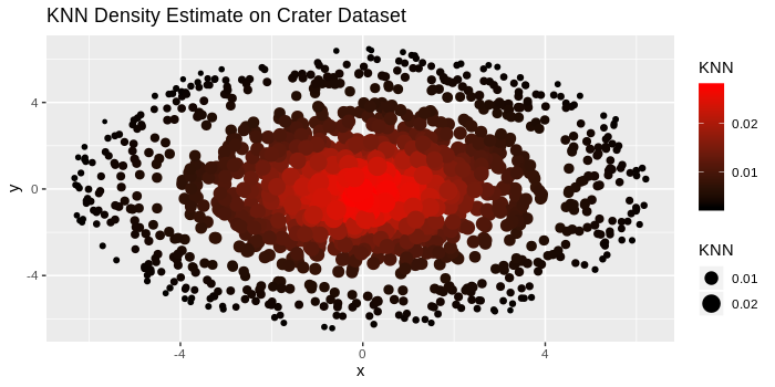
As expected, the larger and darker points are bundled in the center, and as we move farther away from the center, the points become lighter and smaller. By choosing appropriate values of λ, we can create an upper-level set consisting of only the darker points near the center, corresponding to a highly dense cluster.
The denpro library is available through CRAN, so we can install it with
install.packages('denpro')
library(denpro)
We will be applying the Level Set Tree algorithm to the “crater” dataset from the previous section. Rather than only trying to cluster the data into the core and the outer ring, the hierarchical nature of the Level Set Tree algorithm will find “denser” sub-clusters in the outer ring.
We start by running pcf.kern which computes a multivariate kernel estimate and gives the output as a piecewise constant function object. It takes inputs of h, the smoothing parameters, and N, the grid dimensions for the kernel estimate. It uses a standard Gaussian kernel by default.
pcf <- pcf.kern(crater_xy,h=0.5,N=c(32,32)) # kernel estimateNext, we build the level set tree and then prune it.
lst <- leafsfirst(pcf) # level set tree
td <- treedisc(lst,pcf,ngrid=60) # pruned level set tree
Now, we plot the tree, its volume graph, and its barycenter plot which is a location plot of a shape tree.
plottree(td, col='blue') # plot tree
plotvolu(td) # volume plot
plotbary(td) # location plot
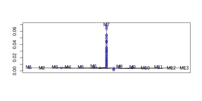


From the dendrogram, we see that the dataset was clustered into a main group followed by denser exterior clusters.
We can now plot the data with these cluster labels.
cd<-colors2data(crater_xy,pcf,lst)
plot(crater_xy,col=cd$datacolo)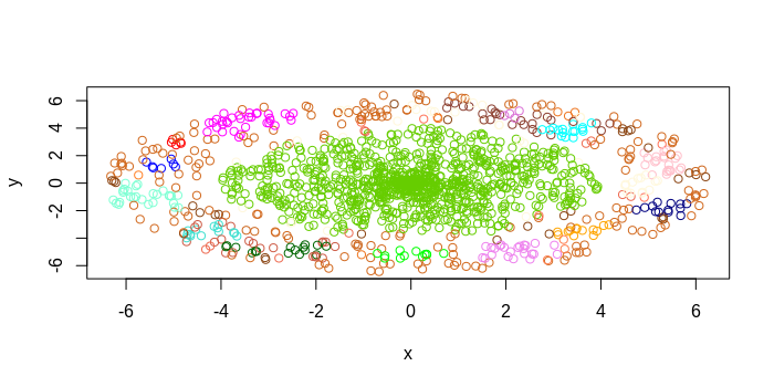
The Level Set Tree was able to successfully cluster most of the inner core as a single cluster and then identified “dense” sub-clusters in the outer ring.
With Level Set Trees, we can cluster in datasets where the data exhibits large differences in the density. Whereas DBSCAN just flags outliers, Level Set Trees attempt to discover some cluster-based substructure in these outliers. In market segmentation, this could be useful in detecting an emerging market. In data security, researchers could identify new malware in which the small sample of recently infected computers behave differently from the rest of the data, but similar to each other.
In the preliminary section about ɛ-neighborhoods, I said these neighborhoods exhibit circular or spherical shapes. When we use the standard Euclidean distance metric, sometimes called the l2 metric, our neighborhoods display this spherical shape. Why does this happen?
Let’s consider two points p1 = (x1, y1), p2 = (x2, y2) in 2D space. I am using points in 2D space for simplicity, but these distance metrics can be generalized to higher-dimensional spaces.
The Euclidean distance for these two points is d(p1,p2) = [(x1 – x2)2 + (y1 – y2)2]0.5.
If we fix the distance to be less than ɛ, then we get the following inequality:
d(p1, p2) = [(x1 – x2)2 + (y1 – y2)2]0.5 < ɛ
Squaring both sides yields:
(x1 – x2)2 + (y1 – y2)2 < ɛ2
The above inequality should look familiar to the general equation of a circle of radius r centered at the point (c1, c2): (x – c1)2 + (y- c2)2 = r2.
Thanks to the Euclidean distance metric, when we compute Nbhd(p, ɛ) , we end up with a spherical neighborhood centered at p with radius ɛ.
However, if we were to use a different distance metric, we would end up with neighborhoods of different shapes. For example, if we used the Manhattan distance, or l1 metric, where the distance between two points is d(p1, p2) = |x1 – x2| + |y1 – y2| (|.| is the absolute value), then neighborhoods will display a rectangular shape.
By changing the distance metric used, we can change the shape of neighborhoods. By changing the shape of neighborhoods, we can discover different sets of clusters. Depending on the problem, it may be beneficial to use a distance metric other than the Euclidean distance metric to discover different types of clusters.
Density-based clustering methods are great because they do not specify the number of clusters beforehand. Unlike other clustering methods, they incorporate a notion of outliers and are able to “filter” these out. Finally, these methods can learn clusters of arbitrary shape, and with the Level Set Tree algorithm, one can learn clusters in datasets that exhibit wide differences in density.
However, I should point out that these methods are somewhat harder to tune compared to parametric clustering methods like k-means. Things like the epsilon parameter for DBSCAN or the parameters for the Level Set Tree are less intuitive to reason about compared to the number of clusters parameter for k-means, so it’s more difficult to pick good initial parameter values for these algorithms.
Finally, for readers who are interested in general clustering methodology for different types of problems, this book on data clustering is a handy reference.

Manojit is a Senior Data Scientist at Microsoft Research where he developed the FairLearn and work to understand data scientist face when applying fairness techniques to their day-to-day work. Previously, Manojit was at JPMorgan Chase on the Global Technology Infrastructure Applied AI team where he worked on explainability for anomaly detection models. Manojit is interested in using my data science skills to solve problems with high societal impact.
Watch the 15 minute on-demand demo to get an overview of the Domino Enterprise AI Platform.
Watch the 15 minute on-demand demo to get an overview of the Domino Enterprise AI Platform.