The enterprise platform to build, deliver, and govern AI
Watch the 15 minute on-demand demo to get an overview of the Domino Enterprise AI Platform.
I get very excited about a nice map. But when it comes to creating maps in Python, I have struggled to find the right library in the ever changing jungle of Python libraries. After some research I discovered Folium, which makes it easy to create Leaflet maps in Python. This blog post outlines how I used Folium to visualize a data set about crime in San Francisco. I then describe a how to use Domino to turn this Python code into a self-service reporting tool.
Folium is a powerful Python library that helps you create several types of Leaflet maps. The fact that the Folium results are interactive makes this library very useful for dashboard building. To get an idea, just zoom/click around on the next map to get an impression. The Folium github contains many other examples.
By default, Folium creates a map in a separate HTML file. In case you use Jupyter (like myself), you might prefer to get inline maps.
For this example I needed some interesting data that contains locations. I decided to use SFPD incident data from SF OpenData. Use the Export function (select csv) to download the entire dataset.
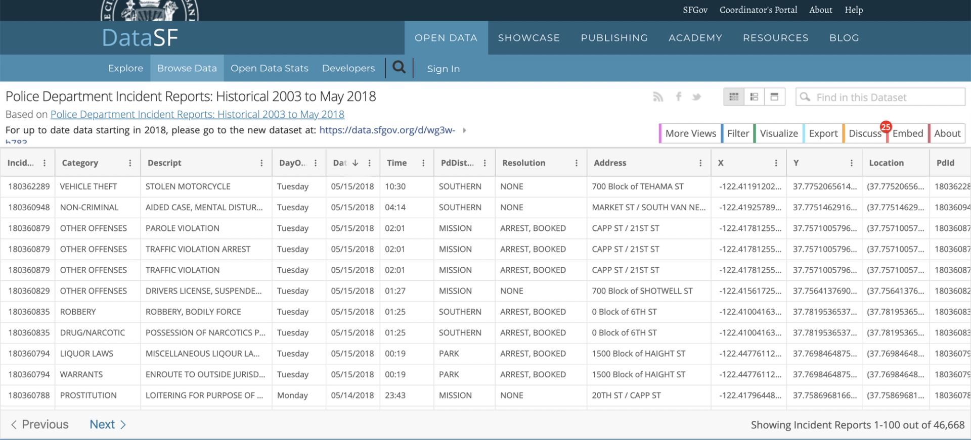
With the data installed, we can begin writing the script to visualize our data. To begin set up, you will want to install Folium by running pip install folium in your terminal.
import folium
import pandas as pd

SF_COORDINATES = (37.76, -122.45)
crimedata = pd.read_csv("SFPD_Incidents_2015.csv")

# for speed purposes
MAX_RECORDS = 1000

# create empty map zoomed in on San Francisco
_map = folium.Map(location=SF_COORDINATES, zoom_start=12)

# add a marker for every record in the filtered data, use a clustered view
for each in crimedata[0:MAX_RECORDS].iterrows():
    _map.simple_marker(
        location = [each[1]["Y"],each[1]["X"]],
        clustered_marker = True)

display(_map)
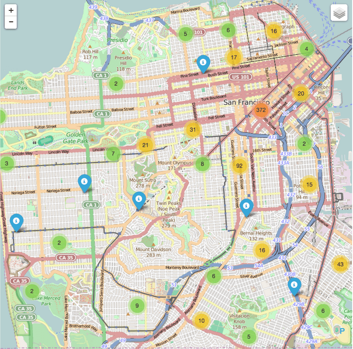
When running this, it creates a map with location markers that are clustered (clustered_marker = True) if close together. The tileset used in here is OpenStreetMap (which is default). Folium can be used with other tilesets like Mapbox or Cloudmade too.
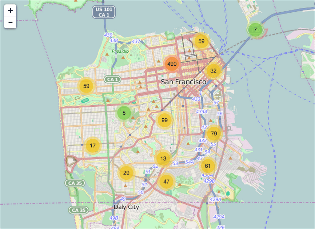
You save a map as an html file by using map.create_map(path='map.html') instead of display(map)
Well, that was fun! But this might not be an ideal visualization to compare maps with each other. Lucky for us, there is also a way to create a choropleth map thanks to Folium.
A choropleth map (from Greek χώρο ("area/region") + πλήθος ("multitude")) is a thematic map in which areas are shaded or patterned in proportion to the measurement of the statistical variable being displayed on the map, such as population density or per-capita income.
To create a choropleth, we need a geojson file to create the areas/boundaries that match the San Francisco police districts in the data file. With a Google search on "sfpd districts geojson" I found a government open data website with a Shapefile that almost matches my needs.
The next step is to convert the Shapefile into a geojson file. The easiest way is to use an ogr2ogr web client. Select the downloaded zip file and put crs:84 in the Target SRS field. Save the result as sfpddistricts.geojson and upload the file to your Domino project.
The additional Python code to create a choropleth is as follows. Note that I used the whole dataset instead of the 1000 records used earlier. Because the choropleth is based on the aggregated counts, the speed isn't suffering from large datasets.
# definition of the boundaries in the map
district_geo = r"sfpddistricts.geojson"

# calculating total number of incidents per district
crimedata2 = pd.DataFrame(crimedata["PdDistrict"].value_counts().astype(float))
crimedata2.to_json("crimeagg.json")
crimedata2 = crimedata2.reset_index()
crimedata2.columns = ["District", "Number"]

# creation of the choropleth map1 = folium.Map(location=SF_COORDINATES, zoom_start=12)
map1.geo_json(geo_path = district_geo,
data_out = "crimeagg.json",
data = crimedata2,
columns = ["District", "Number"],
key_on = "feature.properties.DISTRICT",
fill_color = "YlOrRd",
fill_opacity = 0.7,
line_opacity = 0.2,
legend_name = "Number of incidents per district"
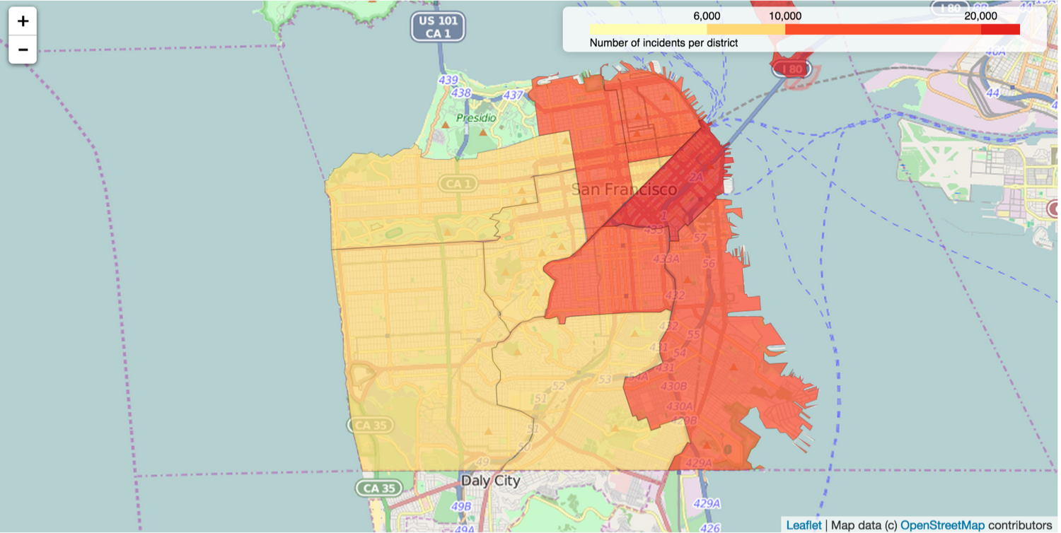
It creates a choropleth map like below with a legend in the upper right corner. Color Brewer color schemes are built-in and added like fill_color = 'YlOrRd'. The aggregated counts are stored in a separate json file (crimedata2.to_json('crimeagg.json')) which is later used as data source during the creation of the map.
The crime incident data is much richer than just locations and districts. It also contains variables like categories, dates and times. This creates the opportunity to, for instance, get better insights in specific sorts of incidents. To avoid making maps for all combinations of variables, I used Domino's "Launcher" feature to let others create their own maps based on their parameters.
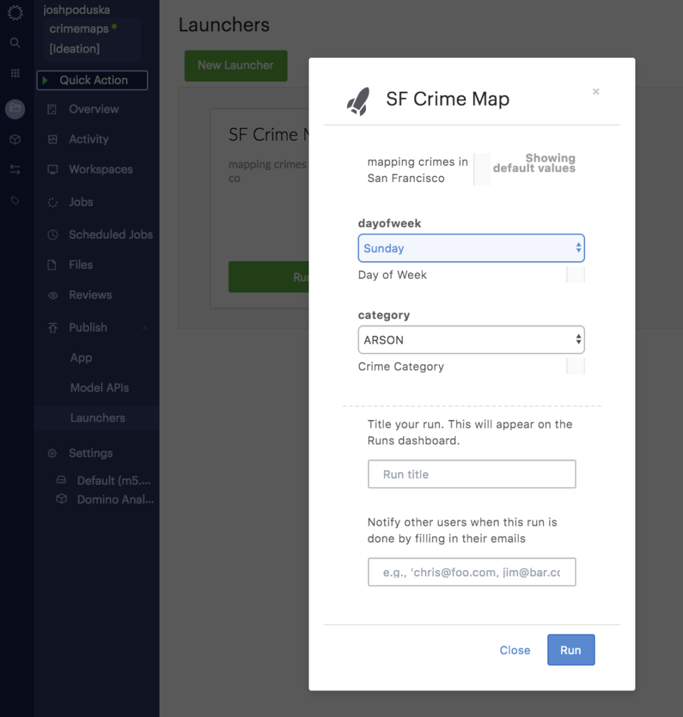
A Launcher in Domino is a self-service web form that lets non-technical users run your script. To create one, we just need to specify what parameters to expose through the web form.
My launcher will have two parameters:
1. "Dayofweek" is a multi-select list and contains all the days of the week.
2. "Category" is a select menu with all the incident categories that are in the data.
Out of laziness, I decide to create a little script to create the list of categories that occur in the data.
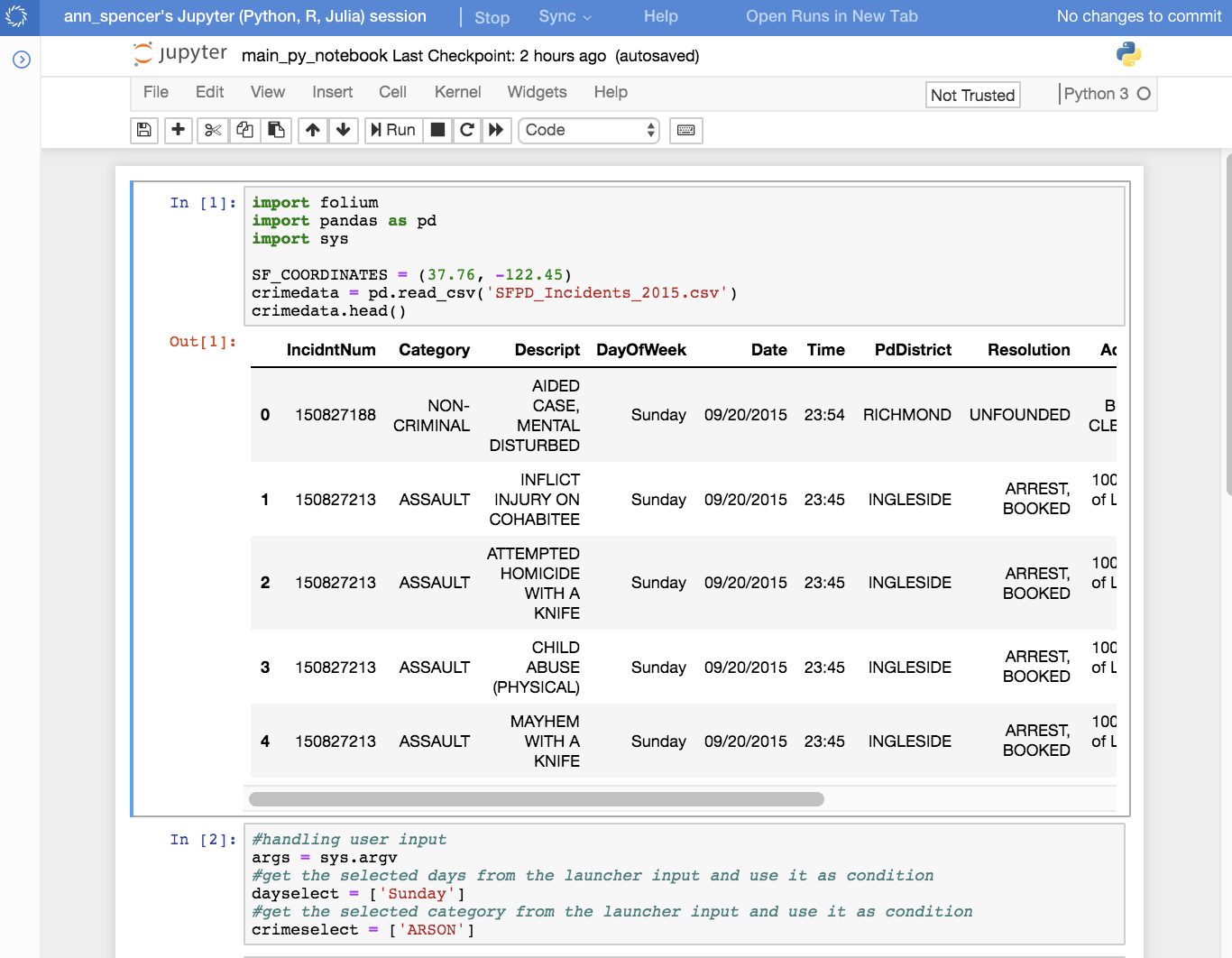
I copy paste the result of the second cell into the Allowed Values field in the newly created launcher.
The script that handles the launcher requests is main.py. This next bit of code handles the user input and uses it to filter the dataset:
args = sys.argv
dayselect = args[1].split(",")
crimeselect = args[2]

daycond = crimedata["DayOfWeek"].isin(dayselect)
crimecond = crimedata["Category"] == (crimeselect)

filtered_crimedata = crimedata[crimecond & daycond]
Now that we have category and description information, why not use it as a popup for the markers? Just add popup=each[1]['Category'] + ": " + each[1]['Descript'] to the parameters of the marker placement function. Main.py contains both the marker map code and the choropleth code.
Now we can create maps using the launcher. The following (static) map shows the drugs and narcotics related incidents in the weekends (Saturday & Sunday). Zooming in on the created map will make the clusters split. The blue markers refer to individual incidents. It is probably no surprise to see that most drug related incidents take place in and near the Tenderloin area.
It also creates a choropleth map like this one, telling a story similar to the map with markers.

Now that we have created the code and launcher like this, we can use the Domino comparison feature to put multiple maps side by side.
I had two separate runs from the launcher, one with burglaries in the weekend and one during weekdays. Both runs succeeded. The next step is to select both runs and hit compare at the top.
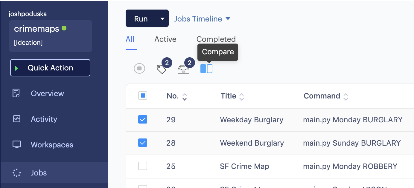
A page will open which contains a comparison of both runs. The nice part is that it will put the maps next to each other. This way we can easily see that, in case of our example, burglaries seem more evenly spread over San Francisco in weekends than during weekdays.

So there we have it, a pretty easy way to create and compare maps. I didn't find very shocking crime incident trends, yet. So feel free to share your most interesting finds in the comments.
Watch the 15 minute on-demand demo to get an overview of the Domino Enterprise AI Platform.
Watch the 15 minute on-demand demo to get an overview of the Domino Enterprise AI Platform.