The enterprise platform to build, deliver, and govern AI
Watch the 15 minute on-demand demo to get an overview of the Domino Enterprise AI Platform.
We all have heard how data is the new oil. I always say that if that is the case, we need to go through some refinement process before that raw oil is converted into useful products. For data, this refinement includes doing some cleaning and manipulations that provide a better understanding of the information that we are dealing with.
In a previous blog post, we have covered how Pandas Profiling can supercharge the data exploration required to bring our data into a predictive modelling phase. We covered the importance of Exploratory Analytics including observing the frequency of missing data and computing interactions of all features.
In this blog we will continue our discussion about data exploration with Pandas Profiler and include another tool that may come handy for those of us that may be more inclined to use visual clues, D-Tale.
Data exploration is a very important step before jumping onto the machine learning wagon. It enables us to build context around the data at hand and lets us develop appropriate models that then can be interpreted correctly. Furthermore, the initial exploration can also pave the road towards automating some of the transformations that may be needed to include in a machine learning pipeline.
It is also important to always take into account the information that the data owners can provide about the data. For example, are the numbers we are seeing actually referring to categories or are the dates provided in a specific format? The type of exploration may depend on the answers to some of those questions.
Some of the typical things we would like to achieve during the exploration phase of a project include:
We have covered Pandas Profiling in a previous post, and in this one we would like to emphasise some of the aspects that the tool enables us to do. We will then contrast the workflow with a second alternative: D-Tale.
First let us take a look at the data we are going to be playing with: The Mammographic Mass Data Set from the UCI Machine Learning Repository. Information about this dataset can be obtained here.
The dataset contains information about diagnostic mammograms used in the diagnostic of breast cancer. A mammogram is effectively an x-ray of the breast that is used to check or screen for cancer in people who may not have symptoms of the disease. In cases when an abnormality is detected, further mammograms may be needed to determine whether the abnormality is benign or not.
Let us load the data into pandas and start having a look first without Pandas Profiler and see what we can tell.
import numpy as np
import pandas as pd
import matplotlib.pyplot as plt
From the description provided by the UCI website we know that there are 6 attributes in total:
We can use this to provide useful names to the columns in our dataframe.
url = "http://archive.ics.uci.edu/ml/machine-learning-databases/mammographic-masses/mammographic_masses.data"
names = ['BI-RADS', 'Age', 'Shape', 'Margin', 'Density', 'Severity']
df = pd.read_csv(url, names=names)
masses = df.copy()
Notice that I have created a copy of my original dataset (df) and named it masses. In case some of the manipulations that we implement end up creating unintended changes in our dataset, we can always come back to the original one. In this case, we can always download the data from the UCI website, but in many cases this may not be possible.
OK, let us take a first look at our dataset:
masses.head()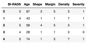
Furthermore, we can check that the data has the expected number of rows. According to the information we have there are 961 entries, with 516 benign and 445 malignant cases. With Severity being the column that tells us whether the mass is benign or malign we can sense check that the data is as expected:
masses.shape(961, 6)masses['Severity'].groupby(df['Severity']).size()Severity
0 516
1 445
Name: Severity, dtype: int64In this case, we have used the capabilities of pandas to group our data by the values in the column Severity and looked at the size of the groups. Lets continue looking at our data.
We can check the type of information that each column holds and we can do this with .dtypes:
masses.dtypesBI-RADS object
Age object
Shape object
Margin object
Density object
Severity int64
dtype: objectWe can see that apart from Severity all the columns have object type. This is a way of pandas telling us that the type is either a string or mixed numeric and non-numeric values. Severity is made out of integers.
Taking a closer look at the data you will notice that some columns have questions marks ?. For this dataset that is the way the data collection denotes missing data. We could have used this information when loading the dataset via read_csv with the na_values parameters. Let's look at some examples of the data in the dataset:
masses.iloc[[20, 456, 512],:]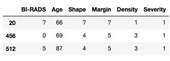
We can now use the replace function to transform the missing values for nan. At the same time, we can use this opportunity to convert our columns into numerical values instead of leaving them as object.
masses = masses.replace('?', np.NAN)
masses.loc[:,names[:-1]] = masses.loc[:,names[:-1]].apply(pd.to_numeric)
masses.dtypesBI-RADS float64
Age float64
Shape float64
Margin float64
Density float64
Severity int64
dtype: objectAs we can see the columns are now of type float. Please note that although the original data looks like integers, the fact that we have introduced nan values into the columns means that pandas requires the columns to be at least float. Let us take a look at some example rows where the missing values have been replaced:
masses[masses['BI-RADS'].isna()]
Excellent, let us look at the descriptive statistics for our dataset. We simply use the pandas.describe() function and we can see all the information in one go:
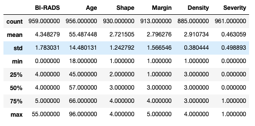
We can see that we have data for patients between 18 and 96 years of age with an average of 55 and a half years. But what do we make out the values for the rest of the columns. What does it mean to have a Shape of 2.72? And does it even make sense? This is when context makes all the difference.
We could also start looking into handling the missing data by replacing the missing values for the mean or the median, or even start using some fancy imputation such as using a -nearest neighbour algorithm. However, making transformations to the data without considering the meaning of the values considered is totally wrong.
We know that we can get hold of large amounts of data and indeed we can blindly take a dataset like the one above and throw it into a machine learning pipeline for say classification purposes. Nonetheless, doing so has the danger that we might miss the obvious and make decisions that are not fit for purpose. One way to deal with this is to stop and consider the context of the data.
In our working example, we may be able to assume safely that the Age variable is the age of the patients in years, but what can we tell about the other variables? According to the information in the UCI page the attributes are as follows:
BI-RADS assessment: 1 to 5 (ordinal)Age: patient's age in years (integer)Shape: mass shape: round=1 oval=2 lobular=3 irregular=4 (nominal)Margin: mass margin: circumscribed=1 microlobulated=2 obscured=3 ill-defined=4 spiculated=5 (nominal)Density: mass density high=1 iso=2 low=3 fat-containing=4 (ordinal)Severity: benign=0 or malignant=1 (binomial)Let us also consider what happens after mammography is obtained. We can expect that the results are examined by a qualified radiologist that is trained to look for abnormal masses in the tissue. Most cases may be benign, and for those that are not there are some tell-tale signs that may indicate cancer. After the radiologists looks at the case, they write a report that describes the findings of the abnormality in question. One way standard way that doctors use describe the results is the Breast Imaging Reporting and Data System or BI-RADS. It usually goes from 0 to 6, but according to the UCI page we can see that they consider they only have a range 1-5.
In addition to the BI-RADS score, doctors use other attributes such as the shape (round, oval, lobular or irregular), the amount of fat cells present in the mass as well as the number of suspicious cells, i.e. density, and the look of the edge of the mass, i.e. the margin. All of these attributes are effectively categorical and indeed some of them are ordinal. This means that taking the average or the standard deviation for these values does not really make sense.
Let us now use this information to carry out a better informed exploration of the data.
We can start by looking for outliers. For instance we do not expect to find any BI-RADS values outside the 1-5 range.
masses[(masses.loc[:,'BI-RADS']<1) | (masses.loc[:,'BI-RADS']>5)]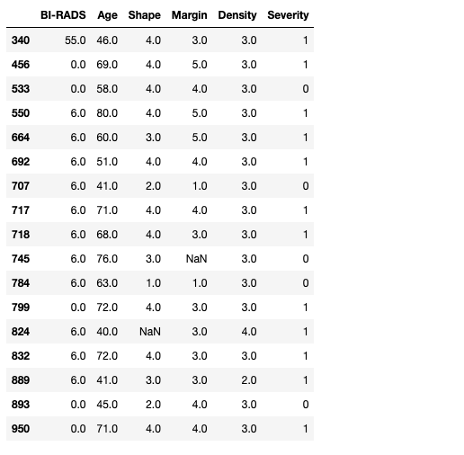
Uh-oh! It seems that we have some surprises. First there is a clear outlier in the data as row 340 has a BI-RADS of 55! We also have some rows with 0s and 6s. At this point we could go back to our radiologist team and verify that the outlier is (or not) a typo and the expected value is actually 5.
For the others we can try to corroborate that they are using the full BI-RADS categorisation that includes 0 for incomplete readings and 6 for known biopsies with proven malignancies.
In this case, since we obtained this data from the web, let us consider the following assumptions:
Please note that this may not be the actual intention of the original authors of the dataset. However, it provides us with some cleaning steps we can carry out for this exercise.
masses.loc[:,'BI-RADS'][masses.loc[:,'BI-RADS']==55] = 5
masses.loc[:,'BI-RADS'][masses.loc[:,'BI-RADS']==0] = 1
masses.loc[:,'BI-RADS'][masses.loc[:,'BI-RADS']==6] = 5
masses[(masses.loc[:,'BI-RADS']<1) | (masses.loc[:,'BI-RADS']>5)]
from pandas_profiling import ProfileReport
profile = ProfileReport(masses, title="Mammographic Mass Dataset Profiling Report")
profile.to_notebook_iframe()
The result is an interactive report that provides a very useful overview of the dataset, including some overall statistics. For instance we can see that the profiles considers that we have one numeric variable and 5 categorical ones. Furthermore is considers that the have 2.8% of missing cells.
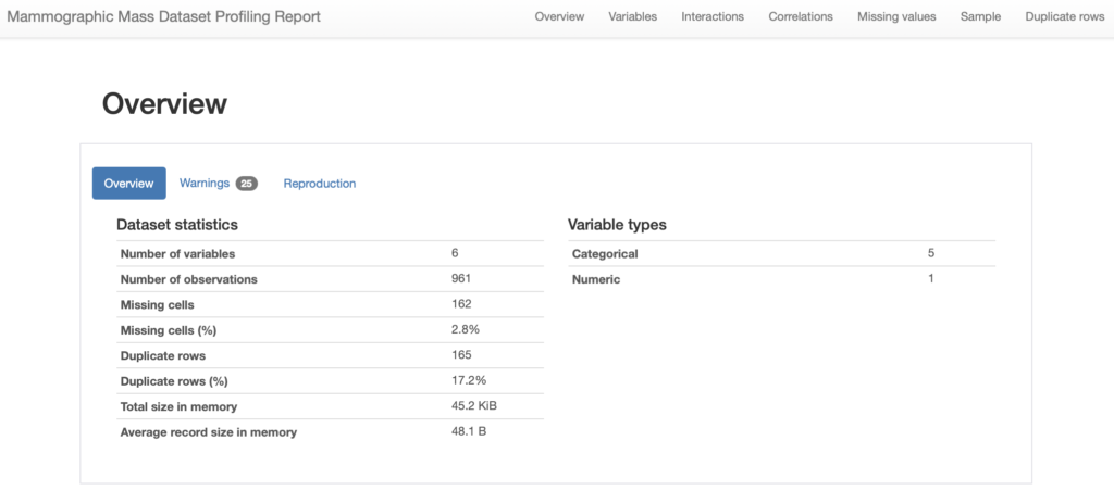
We can then look into each of the variables in our dataset, for instance lets us see the contents for our first two variables, namely BI-RADS and Age:
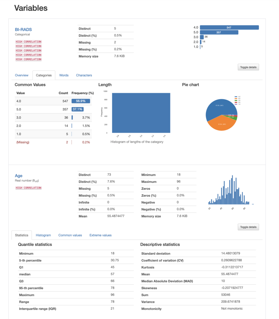
In the case of BI-RADS we can see that the most prevalent value is category 4 with over 56% of the data, whereas category 1 is only 0.5%. If we were to use this column in a model, we are now aware that we have an unbalanced dataset.
For Age, we are presented with a histogram that looks normal and we have a kurtosis of -0.31. Remember that Fisher's definition of kurtosis is used here, i.e. normal distributions have kurtosis zero. In both cases we have a lot of other informative stats that can guide our exploration.
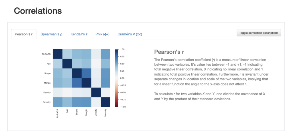
We can look at correlations between the variables and are able to choose between different correlation measures. We even get a description of the correlation measure chosen.
We also get information about missing values in different visualisation formats such as a nullity matrix as shown below:
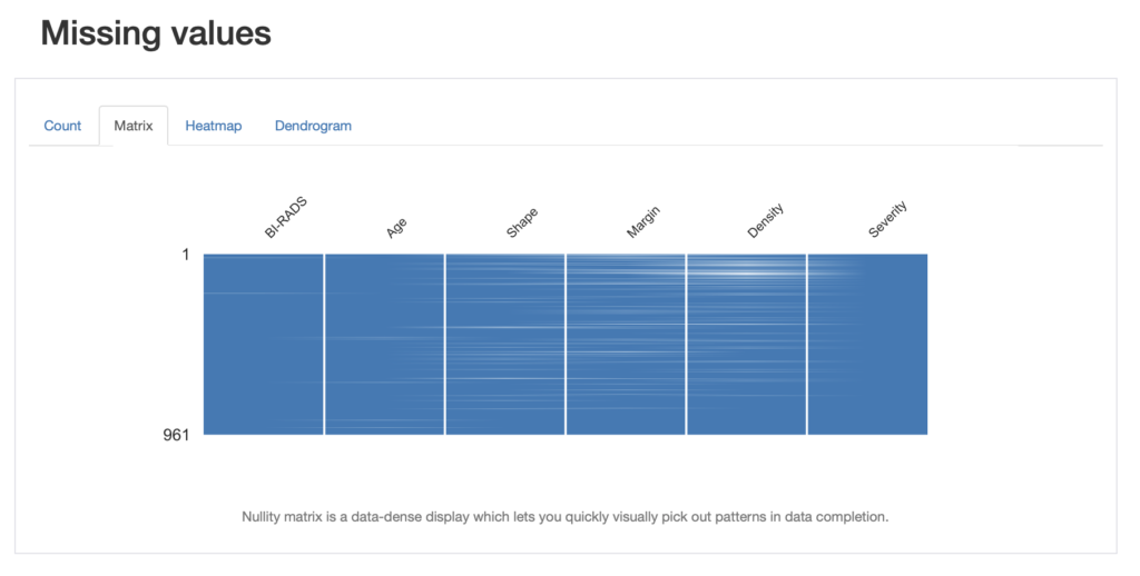
We can look at this from the point of view of pandas and look for the number of missing entries:
for name in names:
    missing = masses[masses[name].isna()].shape[0]
print('{0} missing: {1}'.format(name, missing))BI-RADS missing: 2
Age missing: 5
Shape missing: 31
Margin missing: 48
Density missing: 76
Severity missing: 0We can save the report to an HTML file for future reference:
profile.to_file("mammographic_mass_report.html")OK, that looks great! What about if you are even more of a visual person and would like to do your exploration that way? Well, D-Tale may be a great option for you. Let's take a look!
D-Tale is a module that can help us get detailed information about our dataset in a visual way. It supports code exports. This means that if there are parts of your analysis that you want to document, replicate or actually learn from you can get an export of the code created by the tool and go from there.
The module generates a report that covers an overview of the dataset, it lets you apply common and custom filters, run visualisations, highlight values and more.
Let us try to do some of the steps we did in the first part of this blog but now using D-Tale. Let us import the module and create a new copy of our original dataframe df.
import dtale
masses2 = df.copy()
We can now run a report in the notebook and we will look at performing the following steps:
NaNBI-RADSBI-RADS in the expected rangeReady?
dt = dtale.show(masses2, notebook=True)The report looks very much like a spreadsheet, and as you hover over the table, you can see some of the actions you can take.
Let us get convert the question marks into nan. For each column we select the "Replacements" menu and fill in the form to tell D-Tale to change '?' into 'nan'. Please note that you need to add the action by clicking on the plus sign. As you can see in the animation below the code generated by the tool is visible. I have done this for one single column, and we will need to apply the same changes to the other ones.
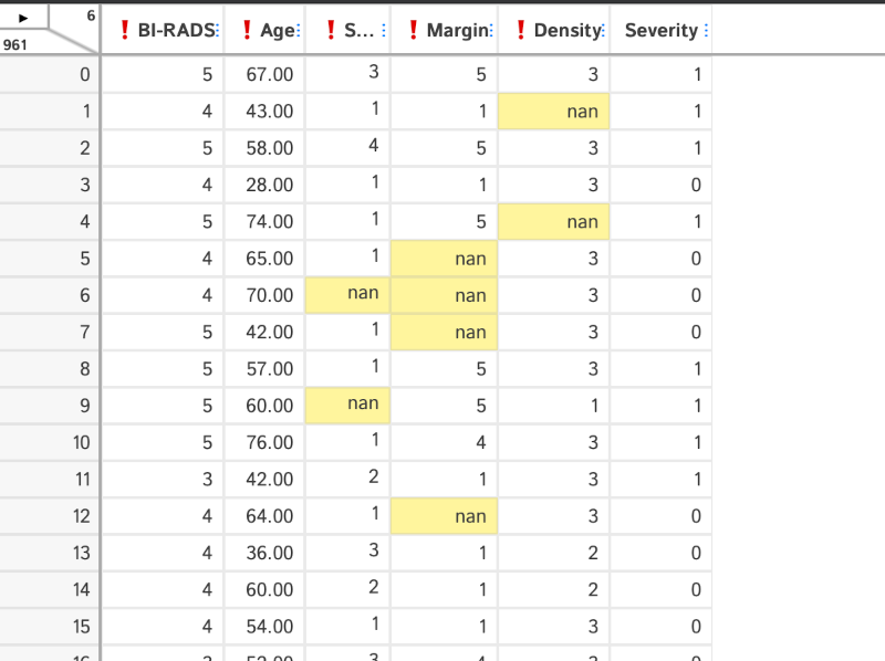
D-Tale lets us modify the values in the table directly, let us do that for the outlier in the BI-RADS column.
The other replacements for this column may be better applied with the replacement functionality. Note that you can add various steps into context menu as shown below:
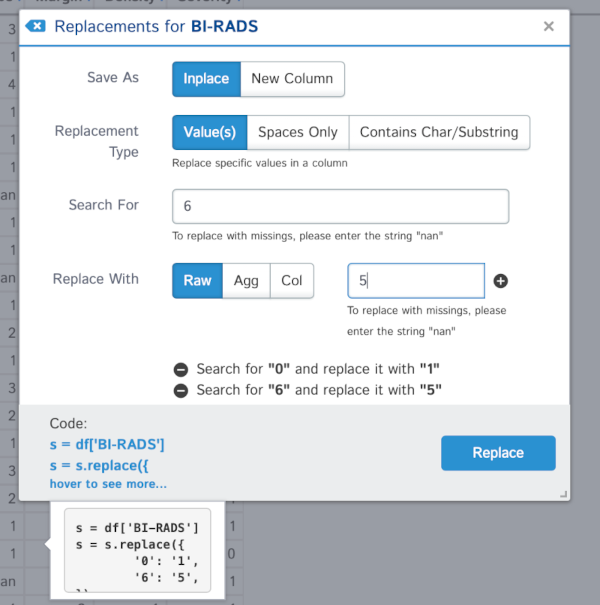
We can change the data types in our columns with the menus provided. For example, we can change the Severity column from int to categorical. In this case we need to tell D-Tale to change the values into strings first, and then to categories:
We can explore the missing data as before. In this case simply by selecting the "Missing Analysis" menu:
D-Tale lets us do many more things like looking at correlations, create charts or highlight values.
We can export the code generated by selecting "Code Export" from the menu:
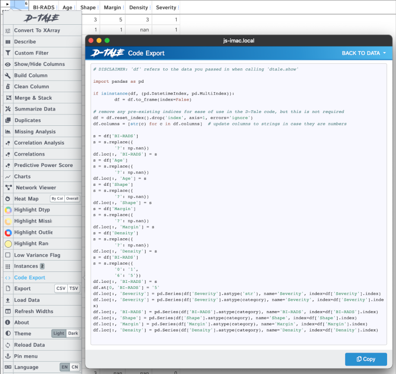
You can also see an "Export" menu that lets us save our data into a csv or tsv file.
In this post, we have covered the importance of data exploration and have seen how context can provide clues about where to go next. Not only are we able to create better and more suitable transformations, but also are able to interpret our variables better.
We saw how to do this with three tools: Pandas, Pandas Profiler and D-Tale. These tools can help us obtain information about our datasets in a few lines of code, and in the case of D-Tale with a few clicks of the mouse. The result of our explorations can be made repeatable and used further down the line in building machine learning models that are fit for purpose.

Dr Jesus Rogel-Salazar is a Research Associate in the Photonics Group in the Department of Physics at Imperial College London. He obtained his PhD in quantum atom optics at Imperial College in the group of Professor Geoff New and in collaboration with the Bose-Einstein Condensation Group in Oxford with Professor Keith Burnett. After completion of his doctorate in 2003, he took a postdoc in the Centre for Cold Matter at Imperial and moved on to the Department of Mathematics in the Applied Analysis and Computation Group with Professor Jeff Cash.
Watch the 15 minute on-demand demo to get an overview of the Domino Enterprise AI Platform.
Watch the 15 minute on-demand demo to get an overview of the Domino Enterprise AI Platform.