The enterprise platform to build, deliver, and govern AI
Watch the 15 minute on-demand demo to get an overview of the Domino Enterprise AI Platform.
I love Jupyter notebooks! They're great for experimenting with new ideas or data sets, and although my notebook "playgrounds" start out as a mess, I use them to crystallize a clear idea for building my final projects.
Jupyter Notebook is so great for interactive exploratory analysis that it's easy to overlook some of its other powerful features and use cases. I wanted to write a blog post on some of the lesser known ways of using Jupyter — but there are so many that I broke the post into two parts.
In Part 1, today, I describe how to use Jupyter to create pipelines and reports. In the next post, I will describe how to use Jupyter to create interactive dashboards.
You probably know that you can start notebooks with different kernels (e.g., R, Julia) — not just Python. What you might not know is that even within a notebook, you can run different types of code in different cells. With "magics", it is possible to use different languages. The magics that are available vary per notebook kernel, however.
By running % lsmagic in a cell you get a list of all the available magics. You can use % to start a single-line expression to run with the magics command. Or you can use a double %% to run a multi-line expression.
Some of my favorites are:
% env to list your environment variables.!: to run a shell command. E.g., ! pip freeze | grep pandas to see what version of pandas is installed.% matplotlib inline to show matplotlib plots inline the notebook.% pastebin 'file.py' to upload code to pastebin and get the url returned.% bash to run cell with bash in a subprocess.
%time will time whatever you evaluate%%latex to render cell contents as LaTeX
%timeit will time whatever you evaluate multiple times and give you the best, and the average times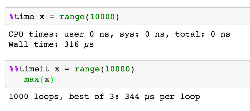
%prun, %lprun, %mprun can give you line-by-line breakdown of time and memory usage in a function or script.%% HTML: to render the cell as HTML. So you can even embed an image or other media in your notebook:
You can even use magics to mix languages in a single notebook. For example, rmagics lets you run R code — including plotting — in a Python notebook. Note that you first need to load the rmagics extension.
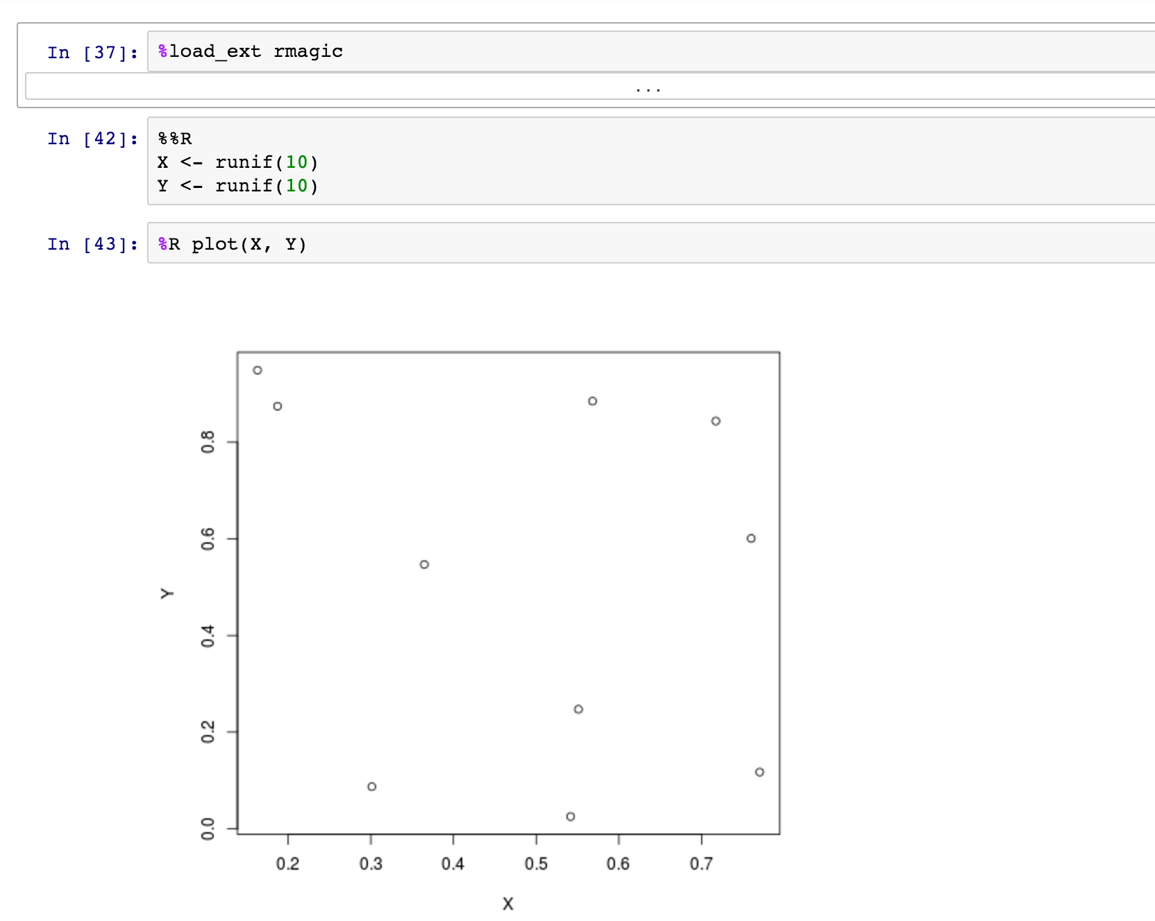
As described in the rmagics documentation, you can use %Rpush and %Rpull to move values back and forth between R and Python:

You can find other examples of language-magics online, including SQL magics and cython magics. You can read about more common magics here. Seriously, you could spend an entire day learning about these!
Magics are handy on their own, but they really shine when you combine them. These functions can help you create pipelines in one visual flow by combining steps in different languages. Getting familiar with magics gives you the power to use the most efficient solution per subtask and bind them together for your project.
When used this way, Jupyter notebooks became "visual shell scripts" tailored for data science work. Each cell can be a step in a pipeline that can use a high-level language directly (e.g., R, Python), or a lower-level shell command. At the same time, your "script" can also contain nicely formatted documentation and visual output from the steps in the process. It can even document its own performance, automatically recording CPU and memory utilization in its output.
Like any other Python script it is possible to also run your notebook in batch mode. By using nbconvert, you can calculate an entire notebook non-interactively, saving it in place or to a variety of other formats.
This capability makes notebooks a powerful tool for ETL and for reporting. For a report, just schedule your notebooks to run on a recurring basis automatically and update its contents or email its results to colleagues. Or using the magics techniques described above, a notebook can implement a data pipeline or ETL task to run on an automatic schedule, as well.
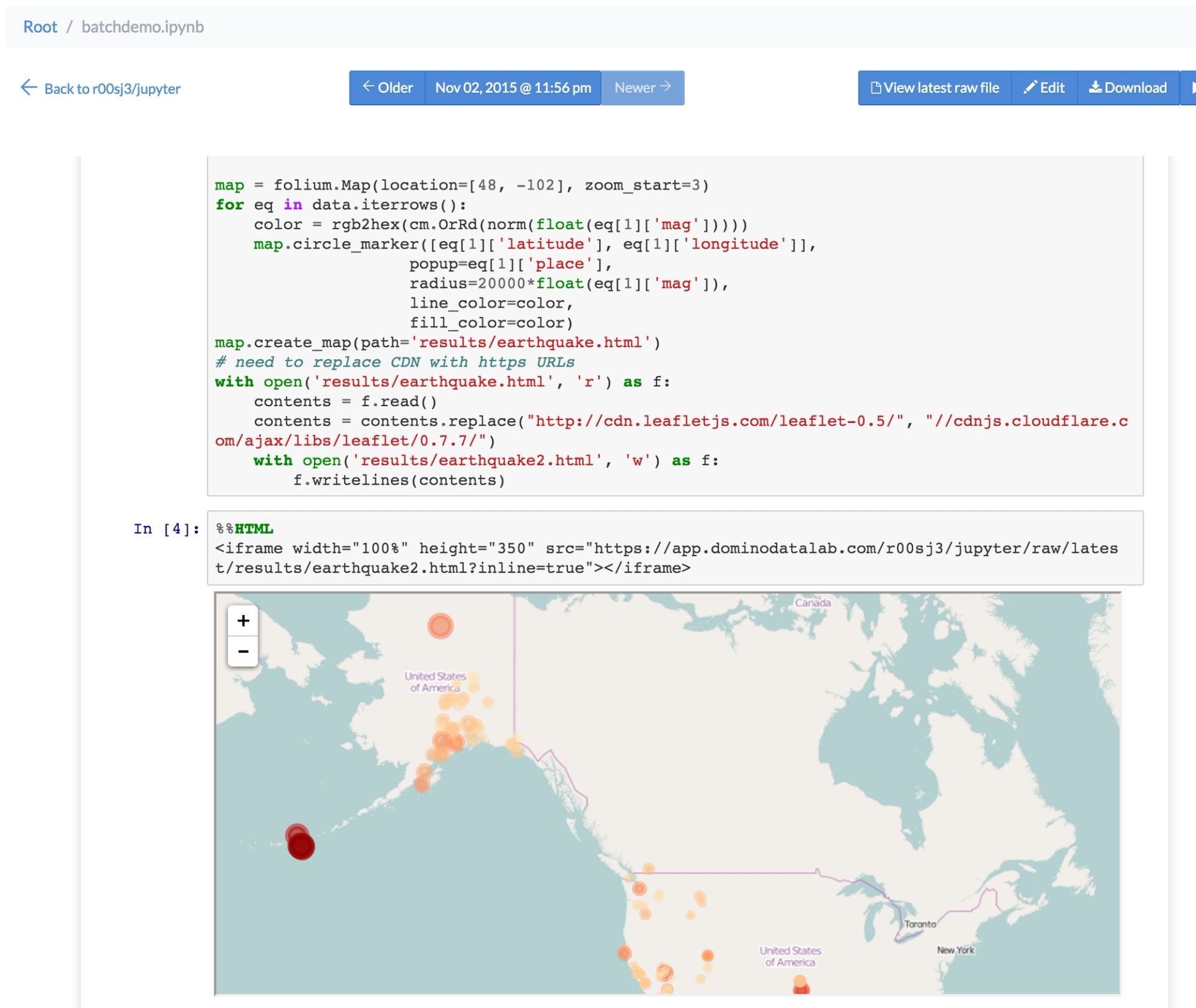
Let's say that you have to regularly send a folium map to your colleague's email with all the earthquakes of the past day.
To be able to do that, you first need an earthquake data set that updates regularly (at least daily). There is a data feed that updates every 5 minutes. Then, you can use Jupyter to write the code to load this data and create the map.
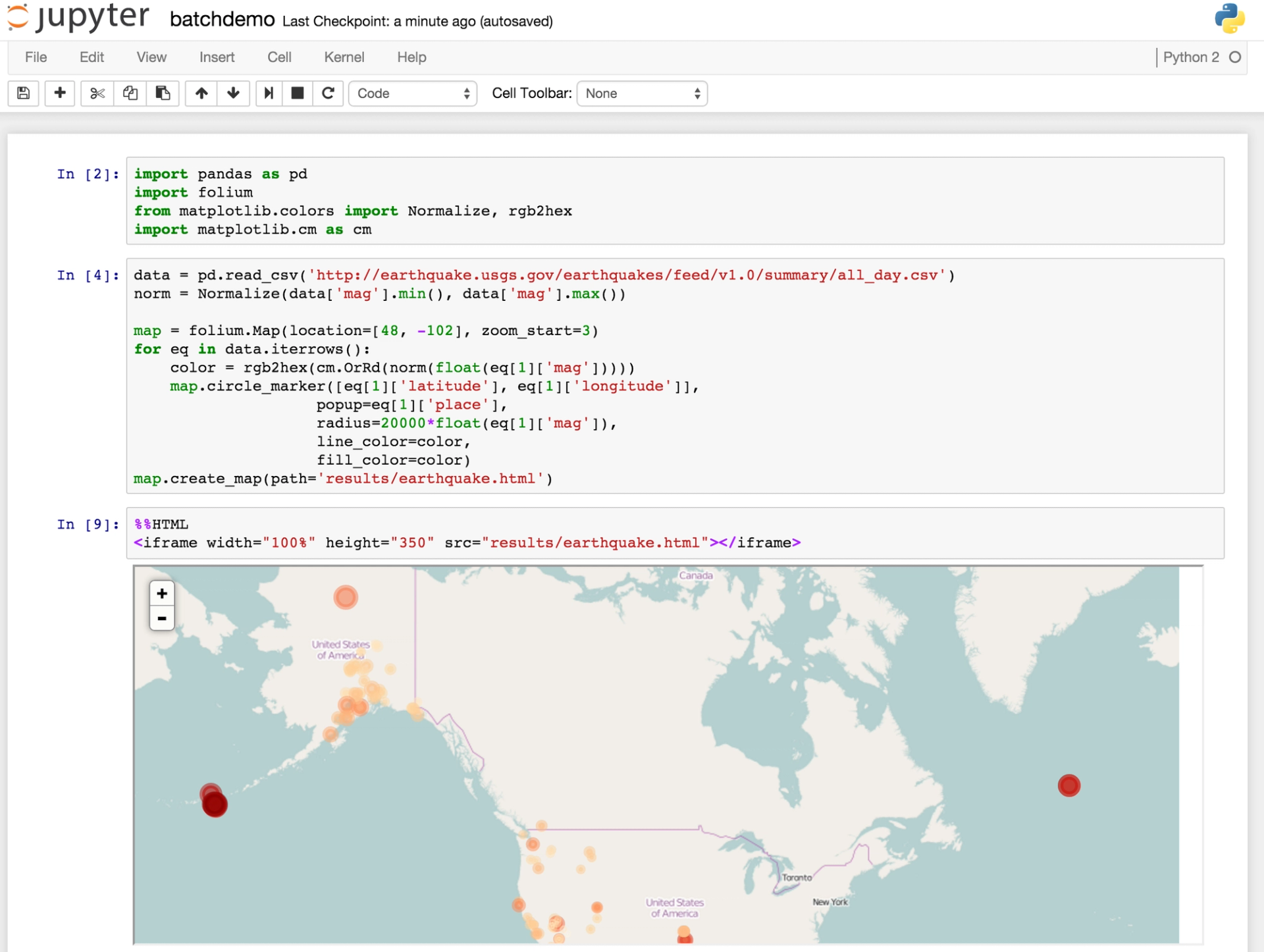
Domino lets you schedule any script to run on a regular basis, and this works for ipynb files just like anything else. When it runs a scheduled execution of batchdemo.ipynb, Domino will calculate the notebook and update its cells with the newest results.
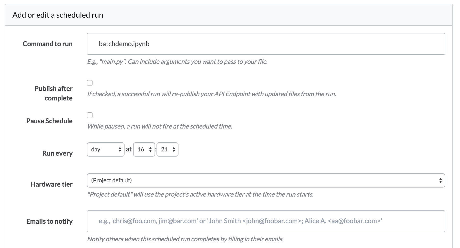
Collaborators can visit the page to view the updated notebook in the browser — without running a Jupyter server. So your notebook has become as a dashboard that's always up to date.
A step further is combining magics pipelining and turning the whole notebook into a HTML report. This next example shows how you can first use a shell script to retrieve a webpage (https://www.sfgate.com) that you visualize in a wordcloud with Python. Then, as part of the scheduled run, it is converted to a HTML page with the result of the run. You can set up your scheduled runs to automatically email any results (e.g., your notebook rendered as HTML) to your colleagues.
When you finish your notebook with inline visualizations, create a shell script that is similar to:
ipython nbconvert --to html pipelinedashboard.ipynbAfter scheduling this shell script, the result will be a regular HTML version of the last run of your notebook.
Looking for more tricks for your Jupyter notebooks? See our guide on creating interactive dashboards in Jupyter notebooks.
Watch the 15 minute on-demand demo to get an overview of the Domino Enterprise AI Platform.
In this article
Watch the 15 minute on-demand demo to get an overview of the Domino Enterprise AI Platform.